Translate
Monday, September 23, 2013
First Day of Autumn
Okay, so I'm a day late. I was playing with copper leaf and Lumiere metallic acrylics last night and came up with this one so I thought I'd share it.
Wednesday, September 11, 2013
An 'Ah HA!' Moment
I managed to finish my 'Clowder of Cats' sketch but lost interest before I could start painting. It happens sometimes. I'll probably come back to it eventually but in the meantime I had one of those 'ah HA!' moments that makes me wonder why I didn't think of it long ago. I have solved the dilemma of ink painting on metal leaf.
This past summer I posted a couple of small paintings done on copper Simple Leaf. I loved the effect but the paintings were so delicate and scratched easily. Also the copper leaf did not like blending solution. Painting on the silver Simple Leaf was even more difficult and I never managed to create anything worthy of posting. It scratched just by breathing on it, I swear. Then two days ago the solution suddenly came to me. Why not apply the leafing to clear acetate, then paint on the flip side? The leafing would show through but be completely protected. Today I found time to experiment on an acetate display sleeve. First I had to find out if the alcohol ink would move and flow on acetate. Would it withstand rubbing alcohol and blending solution? Yes to both. Then I applied the Simple Leaf to the acetate, flipped it over and created a quick little painting. I even added a bit of line work with a Micron pen. A side note: the Micron pen went on better after the alcohol ink had been applied. I would like to try Krylon workable fixative next time to see what affect that will create. I love it when I have a rare moment of 'smart'.
Labels:
alcohol ink,
clear acetate,
copper Simple Leaf,
Micron pen,
simple leaf
Thursday, September 05, 2013
Clowder of Cats ~ composition
I'm currently working on the comp for a new painting. I'm doing it with my usual storyboard technique. Seems there are a few issues to work out such as certain subjects 'kissing'(meaning: barely touching) that don't work for me. I do like the loose, diagonal 'S' flow, though.
Tuesday, September 03, 2013
A Katydid & a Ladybug
![]() |
| 'Ladybug' and we all know one or two. |
![]() |
| 'Katydid' and she did come to visit me last summer. I was fortunate to snap a photo before she went on her way. |
![]() |
| It just never came together for me. |
![]() |
| My sketch |
Not all bright ideas pan out. I worked up a sketch on pad paper that looked like it might work. Alas, it did not. In the process of coming to that conclusion I used up a lot of ink and almost an entire bottle of Ranger blending solution which isn't cheap so I did the next best thing....I cropped it into two separate ink paintings. The original painting was my largest so far being 17" x 12".
I wanted to try out my new Ranger ink colors...Pitch Black and Pesto(green). Pesto behaves much like the rest of the Ranger inks (aside from the mixatives) but Pitch Black is thicker and it takes a lot of blending solution to make it move. From now on it will be used in smaller works until/unless I order more blender. I do love it, though. I works so well to tie the Micron line work into an ink painting, adds wonderful contrast and drama and it truly is pitch black.
Labels:
alcohol ink,
bugs,
cropping a painting,
insects,
Micron pen,
Ranger Pesto,
Ranger Pitch Black,
Yupo
Monday, August 26, 2013
Chorus Line ~ doodle art
What to do when one is temporarily without inspiration...doodle! Last night I doodled these frogs and the title came to me today.
BTW, I snapped this image with my new camera, a Nikon D3200. My oldest son had heard me complain about trying (and failing) to take sharp, clear photos of my larger paintings with my Canon Powershot S5IS which boasted 8 MP so he went out and bought me the Nikon. I can't complain now because my new Nikon offers 24.2 MP! What?! Thanks, James!
Friday, August 23, 2013
Back to School ~ complete
![]() |
| I scanned the completed painting. The colors are still off but better than the photos. There's no green in the painting even though it looks like it on my monitor and the colors are slightly softer. |
It took me awhile but I finally finished this. I did a few more pours, then applied liquid masking to some of the fish. The intention was to work on those fish separately after the masking was removed so they wouldn't blend into the background so much. Today I lifted some areas of ink, re-inked various lines, added gold and silver metallic Jacquard Lumiere paint to areas of the fish and also drizzled copper and gold Lumiere throughout the background. I also added a few ink lines with Micron pen to the background to tie it into my COI, the fish. I kept to my original palette of Ranger's Wild Plum, Sunset Orange, Purple Twilight, Watermelon, Peach Bellini and Cool Peri. I like the candy colors!
![]() |
| With masking applied(left) and after removal(right). Sorry for the poor quality images. These colors do not photograph well. |
Labels:
alcohol ink,
fish,
Jacquard Lumiere acrylic,
masking fluid,
Micron pen,
Yupo
Thursday, August 15, 2013
Back to School ~ WIP 3
![]() |
| First pour |
![]() |
| My color trial |
A quick update on this project. I'm posting my color trial and the first pour. I managed to do a second pour but it doesn't look like much yet so I'm going to hold off until I receive my supplies. I ran out of a few ink colors and blending solution so had to order more. Lucky for me Tim Holtz is having a sale on ink right now.
I really played with my trial sample. After inking a quick sketch and pouring the alcohol ink I added a few touches with Jacquard's Lumiere metallic acrylic paints...some gold to the fish scales and a few other Lumiere colors to the background. The Lumiere line of paint is a light body acrylic product that comes in some luscious colors. They are similar to fluid acrylics. Slightly thicker than fluid acrylics but still pourable.
Labels:
alcohol ink,
color study,
fish,
Jacquard Lumiere acrylic,
Micron pen,
Yupo
Wednesday, August 14, 2013
Back to School ~ WIP 2
I just finished transferring my drawing to Yupo and inking all the lines with Micron pen. I had a ton of fun coming up with patterns for the fish. It made me think of the first day back to school for human students, showing off their latest/hippest new duds. I also just sprayed everything with Krylon workable fixative and snapped a photo while it dries. This one is telling me it needs pinks, purples and oranges for a palette. I'll have to do some trials on Yupo scraps before deciding what will work best.
Labels:
fish,
Micron pen,
patterns,
workable fixative,
Yupo,
zentangles
Monday, August 12, 2013
Back to School (fish) ~ sketch
I've started on yet another ink/Yupo project. This time it's a school of imaginary fish. I thought it would be fun to add some Zentangle patterns on the fish in place of scales. The sketch isn't complete yet but it's coming along nicely.
Something I've discovered about myself...I work better when I have the TV on and it's within view. While I don't have to pay attention to what's on I do love the distraction of the noise and the action. I know many if not most artists prefer no distractions while creating and if not peace and quiet, they at least like to have music playing in the background. Not me. I'm like a teenager that can't concentrate on their homework unless they have the stereo blaring and music videos running. Over the past several months my studio has gradually migrated back to my kitchen table so I'm closer to the TV set and I'm much happier! Go figure.
Sunday, August 11, 2013
The Timekeeper's Cottage ~ complete
SOLD
Although it doesn't look like I made any changes, I made a few. I used blending solution to bleed some background color into the lilies and the cat. They looked too stark before, at least to my eye. The image doesn't show it but I also added some Pearl Mixative to the large key and the hour glass to bring them both out of the background. Fighting the urge to fiddle anymore, I put my inks down and called this complete. Some of the ink colors are as difficult to photograph as they are to scan. An example is the 'neon' blue in the upper left corner. That passage isn't anywhere near as 'violent' IRL. The Moon isn't as muddy as it appears here either. I also decided not to re-ink the areas where the Micron pen was washed away by the alcohol inks. I like the lost edges.
Note: The only problem with using rubbing alcohol with Ranger inks is it's tendency to dull the shiny finish. I'm going to apply several coats of Krylon gloss UV protectant varnish to bring back the shine and make the colors appear more vibrant.
Labels:
alcohol ink,
blending solution,
cat,
clock,
cottage,
Micron pen,
Moon,
Sharpie pen,
watch,
Yupo
Saturday, August 10, 2013
The Timekeeper's Cottage ~ WIP 3
Nothing is more scary or knot-in-the-stomach exciting as spending hours drawing, transferring and inking a piece only to turn little tiny bottles of alcohol ink loose on what you painstakingly created with absolutely no idea what will happen. I thought watercolor was unpredictable but this medium trumps it hands down. As I've worked with these inks and have come to know how they can react with each other I went in with a vague idea of what I wanted to happen but knew it may not become a reality. This piece is roughly 10 1/2" x 17" and painted in portrait format (obviously). Alcohol ink dries incredibly fast so the challenge was to keep it moving while I added various colors and 17" is a long run. Anything could and did happen as these inks moved down the Yupo. Some cool textures formed and some very interesting secondary colors appeared.
![]() |
| Right after the pour. The masking is still in place. Yikes! |
Labels:
alcohol ink,
cat,
cottage,
masking fluid,
pouring alcohol ink,
rubbing alcohol,
Yupo
Tuesday, August 06, 2013
The Timekeeper's Cottage ~ sketch
While I was still working on Thistle Downs I began this sketch and completed it this afternoon. I've dubbed it 'The Timekeeper's Cottage' because I wanted to add an old clock and it kind of went from there. I also liked the idea of the oversized key and keyhole and of course I had to get a cat into the picture somewhere. Not sure how all that ties into a timekeeper but it's my drawing so I can add whatever I choose! Question: Has a pre-painting sketch ever told you what colors it needs (?) because this sketch is telling me it needs blues and purples. I'll have to sort out my palette and see what works best, though.
I was introduced to a new term recently....Zentangles. It's basically doodle art taken to an entirely new level. I discovered that various patterns have names and are typically done with Micron pen. The pattern I added to my crescent moon is a zentangle. It will receive more line work once I start inking my drawing on Yupo. I'll leave a link for anyone interested in experimenting with zentangles. I believe anyone that works with pen and ink could incorporate some of these patterns into their work to create added interest.
http://tanglepatterns.com/tag/zentangle
Labels:
cat,
clock,
cottage,
keys,
sketch,
timekeeper,
watch,
work in progress,
Yupo,
zentangles
Sunday, August 04, 2013
House on Thistle Downs Drive ~ complete (?)
SOLD
I think I'm going to call this complete. Once poured alcohol ink is on the Yupo, the less manipulating it receives the better. I could easily fiddle this to death with a brush. For colors I used Ranger's Terracotta, Willow and Cloudy Blue. I saved the white of the dragonfly wings with masking fluid as well as a few other areas of the composition but the contrast was too great to leave all but the wings. Too many pristine white spots proved distracting. I did remove some ink with blending solution here and there and re-inked several lines which had faded during the inking process.
Friday, August 02, 2013
House on Thistle Downs Drive ~ WIP 3
Sorry to be MIA. After my last post I was hit with acute bronchitis and with my existing lung problems it really took me down. Yesterday was the first day I felt human again so I was able to get back to this project. This is Micron pen and black Sharpie on 144# Yupo. I ran into some major smudging problems which I didn't expect but decided to work with it rather than against it. (see some of the effects on the roofs, etc.). I've sprayed this with a few coats of Krylon workable fixative and it's ready for the alcohol ink. The workable fixative didn't entirely cure the smudge problem so I have no idea what will happen when I turn the ink loose on this. It's either going to be really cool or really awful. Stay tuned....
Labels:
Micron pen,
mushroom houses,
Sharpie pen,
work in progress,
Yupo
Thursday, July 18, 2013
Garlic Harvest
Here's my harvest hanging out on newspaper on my treadmill. Garlic has to cure for 3-4 weeks before getting a clean up and heading to the table or being made into a braid.
I wish I had some artwork to post but I haven't felt very creative the past few days. This heat wave we're experiencing has raised hob with my breathing and yesterday I woke up with laryngitis, probably from spending too much time near the AC. I knew I had to harvest my garlic before the predicted rain arrived so I waited until almost 10pm last night to venture out and get it done. At least the temps were tolerable at that time and unbeknownst to me my Cheap Joe's order had been delivered and was lying on my porch. It would've laid there all night had I not gone out.
Last Fall I planted three varieties of garlic, 2 hard neck and 1 soft neck. All did pretty well and it was a successful harvest. For those that have never grown garlic, the hard neck varieties produce scapes which are the stems and flower buds and these must be removed so all the plants' energy goes into the bulbs. Garlic scapes make delicious pesto. I cut the scapes earlier in the month and made a batch which is almost gone already. Wonderful on pasta (of course) and this pesto is also great on burgers.Monday, July 15, 2013
House on Thistle Downs ~ color trial 2
Too much? I think so. I could go hog wild with the colors on a smaller, less complicated painting but I estimate the finished piece planned will be approx. 15" x 10" (at least) so all these colors would probably be overwhelming . I had to try, though. I also discovered I need supplies, mostly more Micron pens, so I put in an order last night. I'll have plenty of time to play some more while I wait for them to arrive.
Sunday, July 14, 2013
House on Thistle Downs ~ WIP color trial
Last night I did a quick sketch on a scrap of Yupo with Micron pen and Sharpie, then sprayed with a generous coating of Krylon workable fixative. Today I chose a palette of Ranger's Willow and Terracotta alcohol ink and did a pour, letting the colors mingle. Sharpie ink will bleed slightly when alcohol is applied and it creates a grey/blue color which I think works well with this palette. The workable fixative keeps the alcohol ink from spreading out and taking over. In short, it makes it slightly more manageable. I did drop in some rubbing alcohol with my oiler boiler to get the ink moving in the right direction. I noticed a few interesting textures appeared as the ink dried which I really liked. I'm not sure how that happened but suspect the workable fixative may have had something to do with it. I plan to try a few other color options but I really like this one at the moment.
Friday, July 12, 2013
House on Thistle Downs Drive ~ WIP 2
Last night and today I've been tweaking my original sketch. Well, actually I drew an entirely new sketch and played with the angles and textures. I added a few whimsical touches as well. I'm not finished with it yet but I wanted to post an update and see it on the monitor. Mistakes can become glaring on a computer screen that aren't so apparent on the easel. I worked with a lot of charcoal and Micron pen to see what this might look like upon completion. While studying Lumila's work I noted that success with this style depends a lot on the right distribution of small(fine) and large(heavy) textures, variations of mark making and shapes. It's about throwing perspective to the wind and simply putting things where the artist wants to see them. This style suits me on so many levels. I love whimsy, I'm lousy at perspective and it should fit nicely into my goal of creating a consistent body of work. Win, win.
Labels:
charcoal,
Earl Young,
house,
Micron pen,
sketch,
whimsy,
work in progress
Thursday, July 11, 2013
House on Thistle Downs Drive ~ sketch
Yes, it's my first house. "What?!" you say? She just posted about creating a consistent body of work! Trust me, there's method to my madness...I think.
I drew the sketch last night from a wonderful photo reference courtesy of Ted Duckworth of Charlevoix. I had already been considering doing a series featuring Earl Young's 'mushroom houses' (as they are affectionately named by the locals) but there was one on Thistle Downs Drive that I especially love but wasn't quite sure if it was a true Earl Young house. When I saw Ted's photo on Facebook I knew it must be a sign. It's a difficult house to photograph because of it's location which is on Round Lake where the channel empties into the harbor. The majority of the house spills down over a steep hill to a lovely yard and a run of boat docks, the main entrance is butted up to Thistle Downs Drive which is really no more than a short, dead end alleyway.
Today I did some research and discovered it was the original creation of Earl Young's daughter, Virginia Young Olsen who went on to design several homes based on the style of her father homes. My search lead me from the internet to a real estate agent to the local Historical Society and finally to the actual owners, Lowell & Sharon Blossom. I had a lovely conversation with Mr. Blossom and learned the house was built in 1957. The Blossoms purchased it in 1997 and the following year began to add on but not without talking Virginia (the original designer) into being the design consultant first. They wanted to keep the 'Mother Goose' (Lowell's term) sensibility intact while adding space. He told me he had to do a lot of convincing to get Virginia onboard but obviously the effort was worth it. The project was completed in 2000 and the result is spectacular.
Back to the consistent body of work now. I've decided to stick with the alcohol inks for a time and see where this medium takes me. I'm also a fan of the Russian artist, Ludmila Shambina http://ilemle.ru/shambina/text.html. I love her crazy landscapes and buildings. If you follow the link I posted, scroll down to the third painting featured to see the work that has inspired me most. Her website is entirely in Russian and from what Bing translator gave me, I believe she works on watercolor paper and rice paper but I can see this done with Micron pen and alcohol ink, possibly on Yupo. I need to do some experimenting which is my next project. The house on Thistle Downs lends itself perfectly to such interpretation but I would rather not go quite that far afield in respect for this beautiful home and all the Blossom family has done to preserve it's integrity.
Labels:
Earl Young,
house,
mushroom houses,
sketch,
Virginia Young Olsen
Sunday, July 07, 2013
Creating a Body of Work
The subject of this post is something that I've pondered for quite some time. Do I have a legitimate body of work? I'm not entirely sure at this point. I found a YouTube video on Col Mitchell's Facebook art page that addressed this very subject and that I will share with my readers today. Truth be told I tend to bore easily, lack discipline and become easily distracted by yet another style, subject, etc. For example, I recently found the most amazing artwork that fascinated me. How did this artist do this?! She had created textures in either paint or ink I had never seen before and I was enthralled. Unfortunately I neglected to bookmark the website and I can not find it again! I don't recall her name or how I stumbled onto her work in the first place so for the last few days I've been scouring the net, hot on the hunt and with no luck. How much painting have I gotten done? None! Anyway, I digress....
Today I've been asking myself "What do I have to offer the art world that is unique to me, that I am passionate about and that would keep me focused?" Well, I never tire of Nature and organic shapes, I adore texture of any kind and love to incorporate it into my work. I shy away from anything that is/seems tedious to paint and I seek to work with more freedom of expression but I like to also add at least a small element of realism to satisfy the part of me that needs things to make obvious sense. I may add to this list but I already have enough to narrow down my options and find a direction. The trick for me will be to stay on that path for a month, a year...who knows?
I hope you will take a few minutes to watch this video. There are many ways to create a consistent body of work.
Today I've been asking myself "What do I have to offer the art world that is unique to me, that I am passionate about and that would keep me focused?" Well, I never tire of Nature and organic shapes, I adore texture of any kind and love to incorporate it into my work. I shy away from anything that is/seems tedious to paint and I seek to work with more freedom of expression but I like to also add at least a small element of realism to satisfy the part of me that needs things to make obvious sense. I may add to this list but I already have enough to narrow down my options and find a direction. The trick for me will be to stay on that path for a month, a year...who knows?
I hope you will take a few minutes to watch this video. There are many ways to create a consistent body of work.
Thursday, June 27, 2013
Roots ~ continued
This is the third in my series 'Roots'. The inspiration for this painting was a connecting of generations. My memories as a child watching two generations of my extended family roughing it together in the wilderness, reaching out and creating the ties that bond, not bind.
The hunting camp I mentioned in my last post was what they call 'primitive', a large old army tent with a very long, makeshift dining table and handmade bench seating (old tree stumps became bench legs) that ran the length on both sides. Our only heat source was a wood burning stove made from a 50 gallon metal drum and enough stove pipe to clear the top of the tent. The latrine was dug by hand and a board with a hole cut in the middle served as the toilet seat. There was very little privacy but we managed. At night we all slept together in the tent, each one in his/her own army cot topped with a sleeping bag. There was water to be carried by bucket from the creek for cooking and washing up and to make the family favorite...swamp water pancakes. The adults and the kids worked side by side to get the chores completed with no bickering or whining from either side. It was Heaven on Earth to me.
Wednesday, June 26, 2013
Roots ~ alcohol ink on Yupo
After a very detailed batik it was time to get back to basics and create ink paintings that allow the inks to do what they do best...flow, blend, form the most fascinating organic shapes and are a perfect medium to render tree roots.
I grew up in a family that are avid outdoorsmen and hunters. I spent a great deal of time in the northern Michigan woods with them so I was around trees a lot. My dad's family owned a piece of wooded property in the eastern part of the state that served as their hunting camp. In the surrounding forest was a creek and some swamp land and I loved to venture down there and play. It was magical. Moss covered logs, lot of ferns, weird looking fungi and partially uprooted trees whose exposed roots created perfect dwellings for all manner of elves and fairies and anything else my young mind could conjure up. Since then roots have held a special fascination for me. They also remind me of the happiest family time I can remember. This small series is my homage to 'roots' in all its connotations.
Sunday, June 23, 2013
Willow Emerald ~ alcohol ink faux batik
SOLD
After much tweaking I'm calling this damselfly done. It's a Willow Emerald and my reference photo was courtesy of Paul Sherman from PMP. Lots of teeny tiny detail work (read time consuming) but it looks pretty darn good IRL. Scans don't always tell the true tale, even after much adjusting in a photo editor. It's only 5"x 7" so I was just about cross-eyed afterward. To take a break I started what I hope may be a small series titled 'Roots'. I'm painting directly on the Yupo with Ranger alcohol ink, allowing the inks to do their thing with a little help from a bamboo skewer here and there. I'll be posting some of my results soon. Stay tuned....
Labels:
alcohol ink,
damselfly,
dragonfly,
faux batik,
waxed paper,
Yupo
Thursday, June 20, 2013
Gizmo Sunbathing ~ sketch
I decided I should get back to the inks for awhile so last night I prepped some waxed paper with black ink for faux batiks. I treated the paper with Krylon's 'Make It Acid Free' spray this afternoon and while I was waiting between coats (btw, I only apply one coat to each side)I sketched my cat Gizmo sitting in one of the front windows soaking up the heat from the sun. She's black furred so she really gets hot in a short amount of time and it seems to send her into a Zen-like mode. Her eyes are barely half open but I know she's looking at nothing and she remains perfectly still until the sunbathing session is over which isn't long. I took the opportunity to scribble a quick sketch on a scrap of paper with a black ballpoint pen. Now to look for inspiration for my next batiks!
Sunday, June 09, 2013
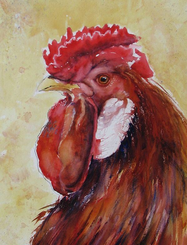
Hostile Takeover ~ fighting roosters
I had an idea of adding fighting roosters to my corporate chicken collection. Somehow it seemed appropriate. Anyway, I thought if I planned to paint them I should see them in action so I browsed some Youtube videos. No illegal cock fights to the death, just barnyard quarrels. It was fascinating to watch these birds spar off. They mean business! Each rooster will fan it's neck feathers out to create an impressive frill or mane as the first act of aggression. With heads down they circle each other, looking for an opening much like human wrestlers. Then the feet with those sharp talons and leg spurs will start to fly. The loser was bested when the opposition was able to plant himself on the other's back. I do know some roosters will fight to the death but thankfully the pair I watched did not.
I couldn't help but look at all the various roosters online and found a breed, the Asil or Aseel that is bred specifically for it's aggression. It's bred in the Middle East and is a rather odd, almost prehistoric looking bird. Tall, very small breasted and very long legged, it's a formidable looking creature:
http://indianrooster.blogspot.com/2011_01_01_archive.html
This painting was a quicky. I did a freehand sketch directly on my working paper and worked fast with broad, expressive strokes to hopefully capture the action and violence. This is mostly transparent watercolor, a touch of India ink and Caran D'Ache water soluble crayon.
Thursday, June 06, 2013
Board Meeting ~ complete
I had planned to paint this as a work in progress but it's been so gloomy lately I couldn't get decent photos of the steps. Finally I decided to forge ahead or this painting would never be finished and I completed this last night. And today we have sunshine! Perfect timing (for once).
The chickens (and one rooster) were painted with transparent watercolor, the background is tinted gouache. As for the steps/tips, chicken feathers(or any feathers for that matter) equal a nightmare for me. I hate painting tedious details so I made short work of them. With my easel at a sharp angle, I applied my various mixtures of watercolor in the approximate areas they belonged, letting them run and blend as they will. I came back when the paper was completely dry and lifted out a feather here and there, hopefully to create the illusion that I did much more than I actually did. The lifting also helped give the chickens contour and volume. My entire palette consisted of FUB, Quin. gold, burnt sienna, Quin. red and white gouache. I tinted the white gouache with Quin. gold for the background and applied it with a 1/2" synthetic flat in crisscross strokes. I love using gouache for my backgrounds because I can get a very painterly effect that works well in contrast to the watercolor.
Regarding my new Silver Black Velvet brushes, I was very happy with them. Especially with the rounds. They hold a nice sharp point so I didn't have to use so many different brushes to get the job done. They carry more water than straight synthetics but are stiff enough to control. I highly recommend them to artists who want more from their brushes but don't want to spend a fortune.
Note: my reference photo is courtesy of photographer Anita Guinane from PMP
Note #2: It seems I can't get a decent photo of this painting although not w/o lack of trying. I hope the background looks like a soft ocher on other monitors and not neon greenish yellow like on mine. *sigh*
Thursday, May 30, 2013
Board Meeting ~ WIP 1 (more chickens)
I've had this drawing completed for 4 days but have been waiting for my new brushes to arrive before starting to paint. I ordered 4 Silver Black Velvet brushes and I'm anxious to try them out. They are a Taklon synthetic/squirrel hair combination that I've been looking at for months. Jerry's Artarama is running a sale so I took the leap and ordered a med. Jumbo round, a #8 & #10 round and a 1/4" dagger striper. I do love my synthetic sables(great spring) but they have limitations and my one squirrel quill is wonderful but sometimes too soft for my needs. I'm hoping the Black Velvets will be the best of both worlds. I'll post my review after the painting is completed.
Thursday, May 23, 2013
Rooster 2 ~ 'Middle Management'
SOLD
I painted this fella 3 days ago but it's been so gloomy I couldn't get a decent photo until today. Our sun came back along with much cooler weather. This back & forth with the temps is raising hob with my sinuses and my nose is running like a tapped tree but I know it won't last and summer will come soon.I named my last rooster 'The CEO' and in keeping with the same theme I should call this one 'Middle Management'. It's not a position I would ever hope to hold. A slam sandwich between upper management and the hourly workers, it's maximum stress. I have a very dear friend that works in middle management and although this rooster doesn't resemble her in any way(thank God for her), if her stress level ever took form I think it would look something like this.
Btw, this particular rooster is a Polish Crested and I love the wild 'do' it's sporting. I didn't exaggerate it at all...honest!
Labels:
gouache,
India ink,
Rooster,
transparent watercolor
Sunday, May 19, 2013
Rooster 1 ~ 'The CEO'
Sorry again to be late in posting an update. I'm refurbing and downsizing my garden beds and with my lung issues it takes the wind out of my sails in more ways than one. I wanted to get back to the watercolors for awhile and found some wonderful chicken photos on Paint My Photo that needed to be painted. Always on the lookout for a new approach to a subject, I stumbled onto Jon Lovett's blog. He's an artist I admire very much and I was taken with a few chicken paintings he posted. He managed to capture the craziness, silliness and potential danger these lowly birds possess with a limited palette and wild, expressive brush strokes.
This rooster was painted from a photo submitted by Gary Jones from PMP. I think he looks like he could be a CEO of some Fortune 500 company. Regal and in charge on the outside, ready to draw blood should competition get in his way. Painted with a palette of Quin. Gold., Quin. red and French Ultramarine with white gouache and India ink.
Wednesday, May 08, 2013
Homemade Stencils
Often I've wished I had a particular stencil for a project but couldn't find exactly what was needed online. Also I knew I may only use it once or twice so why pay a hefty price? One of my friends is an avid scrapbooker and she suggested, "why not use cardstock and coat it with Mod Podge?" Why not indeed! She has a Cricut so she cut out various shapes for me to try. For this demo I cut my own. I used 90# cardstock and cut out my pattern with an Exacto knife. Then I coated both sides with one coat of mat Mod Podge, allowing the first side to dry completely on waxed paper before covering the opposite side. This makes the stencil fairly waterproof so it can be rinsed off after use. I tried out my dragonfly stencil with Speedball silkscreen ink and a roller first with so-so results. I washed off the Speedball ink and tried again with metallic fluid acrylic and a makeshift stencil brush with slightly better results. Note to self: make sure the stencil is completely dry before reuse so the paint doesn't run under the stencil.
Note: 2nd image down>Notice how clean the stencil is after being covered with black Speedball ink. I just rinsed it under running water and voila!
Tuesday, May 07, 2013
Faux Batik Sunflower 2
I chose to revisit Faux Batik Sunflower using a different palette of colors. Also I used walnut ink in place of India ink during the process. The walnut ink toned the entire piece of waxed paper and gave it an antiqued look which, of course I totally obliterated with my color choices. Next time I will work with the result and not against it.
Next post: I will show you how to make stencils with 90# cardstock and Mod Podge.
Labels:
alcohol ink,
faux batik,
sunflower,
walnut ink,
waxed paper,
Yupo
Friday, May 03, 2013
One More Ink Painting on Copper Leaf
I'm finding that Simple Leaf is very delicate and can scratch easily. The silver leaf goes down on Yupo like a mirror (without burnishing) and is slightly resistant to the inks. Even after I allowed the ink to dry for a full day I could wipe it off with a dry finger and a little rubbing. I had used Tim Holtz blending solution on the silver leaf and that seemed to compromise the adhesion to the Yupo. When it was lightly scratched the leaf came off with the ink. I tried several (6) coats of Krylon UV gloss varnish spray in hopes of eliminating the problem. It helped but wasn't a perfect solution. At this point, I believe the blending solution is the problem. It doesn't play well with Simple Leaf on Yupo. Things fared better on the copper leaf so I was able to produce one decent painting.
FYI, these paintings are miserable to scan or photograph. The purple is actually blue.
Tuesday, April 30, 2013
Krylon 'Make It Acid Free'
I have had questions put to me and my own concerns about working with alcohol ink on waxed paper. How archival could these paintings be? From my online searches the coating wax is described as purified paraffin but I can find nothing about the paper that is used in the process. Is it acid free? Probably not and because I crumple the paper to expose it I felt I needed to address this issue. I found Krylon's 'Make It Acid Free' spray
, (link) available at Dick Blick or Jerry's Artarama in the US. I crumpled my paper, then treated both sides with this spray before applying the inks. I found no difference in the way the inks reacted on the treated waxed paper and feel much better about the longevity of my faux batik ink paintings.
Labels:
acid free,
alcohol ink,
faux batik,
krylon spray,
waxed paper
Monday, April 29, 2013
Alcohol Ink on Copper Leaf
Another experiment and I think this has definite possibilities! I applied Mona Lisa copper Simple Leaf with Mona Lisa leaf adhesive to a 5" x 7" piece of Yupo. I then applied the inks, hoping to create a semi-abstract seascape at sunset. The inks reacted well on the copper leafed surface giving me slightly more control than on plain Yupo. I was even able to apply ink in a more painterly fashion to the sky area with a small flat brush. I did add a little rubbing alcohol to the lower portion to get ink moving but it didn't seem to affect the leaf at all. I also like the texture the leaf created when applied. I've got another piece in the works using silver Simple Leaf. The silver leaf went on with much less texture so we'll see what I can do with that.
Labels:
alcohol ink,
copper Simple Leaf,
seascape,
Yupo
Sunday, April 28, 2013
Back to the Inks
Butterfly I
5" x 7"
April 2013 has not been a productive month for me. I managed to create more paintings than usual, all of which landed in File 13. It seems that not only trying a new style but also a new subject has proved folly for me. I had hopes of whipping up a Shirley Trevena style still life but that didn't happen. In the meantime a laundry list of to-dos was piling up behind me so I had to stop and take care of business. I didn't expect to lose Digby either but it happened and I've needed a few days to grieve. It really threw me for a loop to be honest. Maybe as I get older these things hit harder.
Art is good therapy so I got out the one medium that gives me the most pleasure at the moment and painted this butterfly using my faux batik technique .
Note: My reference photo was courtesy of Veronique on Paint My Photo.
Labels:
alcohol ink,
butterfly,
faux batik,
Micron pen,
speedball ink,
waxed paper,
Yupo
Wednesday, April 24, 2013
With Heavy Heart...
...I had to say goodbye to my cat, Digby today. I gave him several nicknames over the years but 'Bubba' seemed to stick. He was a rescue, less than a year old, when he came to live with us permanently. He'd lost trust in humans but once we resocialized him we couldn't ask for a better cat. I live in a park and he became quite a fixture here among the other residents. Everybody knew Digby because he was everybody's friend. In the warm months he would make his rounds of the park and do his 'sociables', visiting anyone that was home and had an open door he could wander through. He never overstayed his welcome, so I was told, and kept his visits brief. He adored kids, even the little ones that pulled his tail, and would head anywhere he heard kids playing. One summer the neighborhood kids must have been playing with squirt guns filled with colored water. Digby came home with his white fur covered in pink and blue splotches. I wiped him off but he must have rejoined the games because he showed up more than once that day sporting pink and blue fur. He was gentle and patient with me, slept in bed next to me and once he discovered how great a lap was he became 'the lap monster'. He left me alone if I was busy but when the day was done and I sat down on the sofa to watch TV it was 'lap time' and he was a great lap warmer in winter, a wonderful companion and a very special kitty. I will miss him so much.
Subscribe to:
Posts (Atom)