Translate

Sunday, December 31, 2017

2018


To all my visitors I wish you good health, far more joy than sorrow and an abundance of creativity in the coming new year.

Sunday, December 24, 2017

Merry Christmas to All


I want to wish all my visitors a very Merry Christmas and thank you all for supporting me and my art. Every visit and comment is encouragement to me.

Saturday, December 16, 2017

Here Comes Santa Claus


I finally got Santa completed. Actually two were completed, exactly alike. I've posted what I think is the best of the two. What I thought was going to be a quick little portrait turned into much more and I learned a few things along the way not the least of which is how to store my acrylic paint and preserve it after it's been squeezed from the tube. I can't believe I didn't come up with this idea sooner! I'm using a disposable plastic container with lid as my palette which is capable of keeping the paint usable up to 3-4 days. When it's dried out all I have to do is use a plastic palette knife to scrape it away and voila!...I have a nice clean palette for the next project.

Sunday, December 10, 2017

Making Cards


Quick update. Every December I struggle to come up with something unique in way of a birthday card for Betsy, my best friend since 4th grade. As luck would have it I stumbled onto a series of whimsical paintings on Pinterest to fit the bill. I took inspiration from these gems to create this bit of fun. I know she's going to love it. I'm also working on a few Christmas cards. I don't send them anymore but to just 2 people and I like to paint them myself. I'll be posting those soon...I hope.

Monday, November 20, 2017

Bundle Up #2


The second installment in my new series based on women's coats and accessories. Sorry for the lag in updates. After my last post I could not find traction for some reason and I hope whatever was going on with me has passed for a good long time.

Thursday, November 02, 2017

Bundle Up


It's so cold and wet outside these days. Today is particularly cloudy and dark on top of everything else and we still have winter to look forward to. Blah! Anyhoo, it's what inspired this collage. A colorful coat! Nothing better than a nice warm coat to keep the chills at bay. This is mostly painted tissue paper and painted drawing paper with a little soft pastel for shading.
.

Saturday, October 28, 2017

Mixing Mediums and Trying Out a New Palette


Fall and foul weather has finally arrived in Michigan. My good mood has gone south with the geese so I've been experimenting instead of starting a new project. I haven't worked with watercolor on gesso coated paper in ages so that was on my to-do list. I did wind up adding a little acrylic but very little and then I used soft pastel to the mix with some interesting results.

This painting is pure acrylic.

I also did a quick landscape, totally from imagination using a color palette which I found online. The Fall colors are uninspiring this year so I had to pull from other sources.

Friday, October 13, 2017

40th Birthday Card


Sorry to be MIA. Life gets in the way sometimes. I did just complete a birthday card for my youngest. My baby is turning 40 this coming Tuesday. Ugh! Where did the years go?! It's a little collage, some Micron pen and acrylic paint on artist grade kraft paper. It's a fairly good likeness.

Friday, September 29, 2017

On a More Serious Note


I took the ladies to a more serious side of things. I'm calling this 'Billie Does Burridge' because I was hugely(is that a word?) inspired by one of Robert Burridges' mixed media pieces. I love his work! This was done on a 9" x 12" canvas with acrylic paint and cut paper collage. My palette was heavy on the warm colors so I added some pale blue for relief. Hope you like.

A few in process shots

Saturday, September 23, 2017

Idiosyncratic Fashionistas ~ my current muses


These ladies are a constant source of inspiration for me. I'm referring to Jean and Valerie, women of a certain age that call themselves the Idiosyncratic Fashionistas for obvious reasons. I love their philosophy on growing older (with verve!) and they refuse to become invisible just because they are no longer young. And don't think they haven't been noticed! Follow the link to see their latest accomplishment.

Anyhoo this is another little pen and watercolor...I'm still playing. I'd like to try something a little more serious just to see if it could work. That's coming up next.

Sunday, September 17, 2017

Test Composition ~ the ladies


I'm trying out a new comp with my ladies. I like this one but it needs to be amped up I think. It needed a border so I painted a random pattern with walnut ink, then applied pieces of tissue paper over top glued down with gloss medium. When dry I went over that with white acrylic. I like it. The walnut ink did bleed in some spots when I was applying the tissue paper. Not too happy about that. BTW, I did post my first 3 sketches on Facebook and requested feedback. I got some interesting replies. The feedback was useful.

Thursday, September 14, 2017

3 Ladies ~ watercolor sketch


I started a fairly large painting last week and it's fought me every inch of the way since. I finally walked away to take a breather and instead did this little sketch. It felt nice to get out the watercolors again. I added some stenciling for fun.

Sunday, September 03, 2017

Fabulous ~ rough sketches


When I first saw my photo reference online the word 'Fabulous' popped into my head so that will be my working title until further notice. I had snagged this image quite some time ago because I knew I wanted to do something with it but wasn't sure what. I finally had some ideas, maybe too many. That's why the variety of sketches. Anyhoo I did a Google image search, found the photographer/s and contacted them. These ladies generously granted me permission to use a few of their photos for inspiration. Don't you just love the attitude? This is SO in my wheelhouse. These are just rough sketches to help me toss around ideas. They all could work but what is my main intention. At this point I'm leaning toward the top comp. Sometimes less conveys more.

Friday, September 01, 2017

'Greaser'


Inspired by yet another photo from franklin's PMP gallery the concept seemed fairly obvious. Young guy lighting a cigarette, an intense stare through dark eyebrows, a defiant attitude...a greaser! If you were born in the 1950's or 60's you surely have heard this term. 'Greaser' began as a racial slur, then a term for auto mechanics aka grease monkeys and finally as I came to know it was a reference to 'bad boys' that dressed in dark jeans, black boots or shoes and white socks. Always white socks. And they slicked their hair back with some sort of pommade or grease. Possibly Vasoline. They looked tough, acted tough and had a certain dangerous beauty about them. It's a good thing I was too young to date when greasers were in their heyday. I love me a bad boy.

This painting began as a continuous line drawing. I prepped my paper by gluing down pieces of white tissue paper making sure I didn't create too much texture. I transferred the drawing then used a calligraphy pen and some thinned down black fluid acrylic to outline everything. I don't like the look of a marker for these paintings anymore. I'd like to get away from the cartoon-y look a bit. I had traced my original drawing onto tracing paper so I could get an idea of placement and then added torn paper collage..mostly images of 1950's hot rods. I do have one image of an old A & W drive-in that was added in the upper right corner. The image spoke to me of that era.

 FYI, I found a great way to age images. Grey scale first, use your photo editor's effects options to switch the color to 'sepia', then lower the color saturation level to get a vintage look. Voila!

Monday, August 21, 2017

Cat w/Black & Orange


Completed. I've had the reference photo (Kenya M / PMP) for quite some time. Not sure why it took me so long to tackle it. When I first saw it I was struck by the palette and the graphics in the background. Consequently I've held fairly true to this reference. Although I'm happy with my results, since I've started working in a more graphic style, painting more realistic is much less satisfying. I am anxious to get back to my continuous line drawings, sketches (yes, you heard it correctly, the woman who said I'll never be a sketch artist) and the sheer thrill of creating something unique. I have a  wonderful idea for a new painting but I have to get permission to use some photos first. I managed to track down the photographers and a way to contact them. I've got fingers crossed they will respond back and give me the go ahead. Wish me luck!

Almost forgot...the Cat w/Black & Orange was painted with alcohol ink and acrylic paint on paper.

Tuesday, August 15, 2017

Establishing Values ~ lights and darks

My drawing/study

This is a preparatory necessity when beginning any painting, IMO. I like to find my lightest lights and darkest darks right at the get go. I've found a useful tool in my photo editor that makes this job very easy. BTW, I use Irfanview but I'm pretty sure every photo editor has a similar feature. I use 'decrease color' set on '2' which automatically greyscales my reference photo and reduces it to just two values. I've saved a few screen caps so you can see what I mean.


Saturday, August 12, 2017

The Clarinet Player


Inspired by yet another photo from franklin on PMP here is the clarinet man. The reference photo attracted me for a few reasons. I was also a clarinet player all through high school, in the orchestra and the marching band. I even earned first chair one year which is an honor. Oddly when I graduated I put my clarinet away and never played it again. This painting also goes with a more recent musically themed painting I completed, The Cellist .

I took a few photos of my process as I went along.

I fashioned a 'fabric' for the vest by gluing little triangles of
magazine pages randomly about the area. Tedious to say the least but worth it.


These thumbnails were color studies todetermine my color scheme.

Saturday, August 05, 2017

Girl w/the Black Hat ~ WIP


I've been fiddling away at this one for the better part of a week. I could not bring myself to 'cartoon' her up so I went more realistic. I loved her pale skin tones with her red hair and I wanted to preserve her delicate features. Realism = fiddling for me. At times I was regretting my decision but now I'm glad I stuck with it. I think the BG could be tweaked. Maybe a stencil treatment...something. I haven't decided.

Saturday, July 29, 2017

Drawing People Faces


I've got two more victims on the drawing board, both inspired by more photos courtesy of frankin (PMP).  I liked the idea that their hands made it in the photo but I was concerned I might have problems rendering them. It's been a long time since I drew a pair of hands. Boy, was I wrong. Much to my surprise the hands turned out to be fairly easy. The girl's hat however became a nightmare. I don't like ellipses. Or they don't like me. Whatever.....anyhoo it's taken me two days and I'm still not entirely happy with the hat but I'm going to make do.

Above: the man drawing 1. the original drawing   2. a continuous line drawing

the girl 1. & 2. two tries. I never did conquer the hat. I finally resorted to tracing the darn thing.

Wednesday, July 26, 2017

The Cellist ~ complete


I did manage to finished this up yesterday but it was too late to photograph it. Sadly it's so dark and gloomy here today this took on a rather greyed down appearance but I did the best I could in my photo editor.

I'm quite pleased with the way things turned out. It all came together 1-2-3. Love when that happens! I'm happy with the textures, the colors and fun mood of the piece. Her hair got the same treatment as the border. The only difference, I used oranges and reds on the tissue paper. I used all Daniel Smith colors. A tip: try laying on a wet wash of DS Perinone Orange, then dropping on a bit of DS Duochrome Hibiscus and letting them both mingle on your substrate. Gorgeous. I had toned down the border with a layer of white acrylic (see prior post) but I wanted another border treatment. I taped off where I wanted to create another border effect, then lifted some of the white acrylic with 70% alcohol. Voila!

Tuesday, July 25, 2017

The Cellist ~ WIP 2


Another quick update. I'm hoping to finish this today. We'll see. I had no clear idea where I was going with this when I started. I'm letting this painting tell me what it needs. All I know for sure? This is fun!

Sunday, July 23, 2017

The Cellist ~ WIP


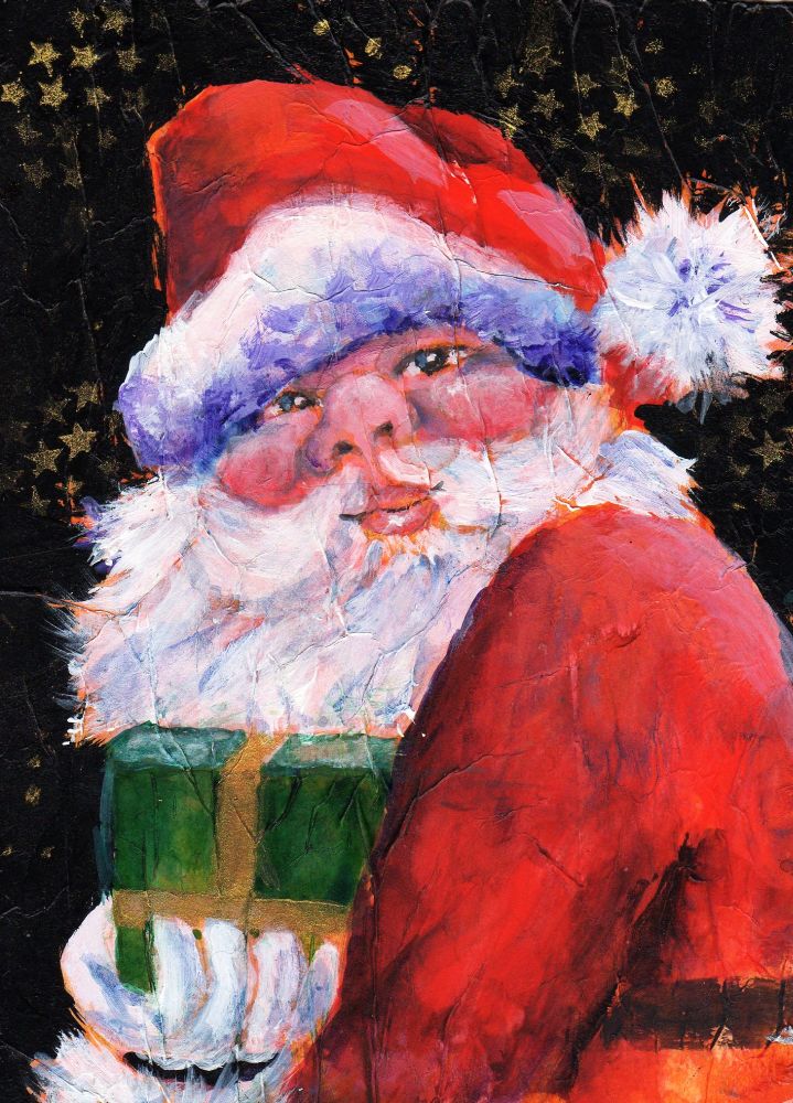
Quick update. This is my latest project inspired by a photo I found on PMP submitted by franklin. I'm always trying new things and this time I decide to stain tissue paper with pure watercolor and tear into pieces which I then adhered to my working paper. I chose various violets and golds, one of my favorite palettes. I think the effect is quite nice but I'll have to knock it back a bit for this application. I don't want the border to distract too much from my COI.

Sunday, July 16, 2017

Self Portrait ~ complete

After tweaks


I finished this yesterday but took a day to give it a good 'look'. I didn't take any more progress shots unfortunately. Once I started painting I was in the zone and didn't stop until I'd almost completed it.

When I started painting I wasn't quite sure what direction I was going to take this. I let the painting tell me instead. Am I happy? I can't say I'm not. It's a bit more cartoon-y than I had envisioned but I see that it's the thicker black outlines that create that effect. I seem to have a tricky face to capture and harsh lines around certain facial features create a loss of likeness. Another thing I need is a better brush for fine line work with acrylics. Too much Micron pen for me. I really didn't want that look however I am very happy that it turned out as well as it did seeing how this is a portrait which I rarely paint and I'm still learning how to work with acrylics. Note to self: maybe less texture next time if I want smooth line work.

I did wind up tweaking this. The missing line work on the face just looked wrong.

Friday, July 14, 2017

Self Portrait ~ WIP


In keeping with the collage portrait theme I'm doing a self portrait. I'm trying to remember to take photos as I work. So far, so good. ;)

Monday, July 03, 2017

A Redheaded Girl


Recently I've been interested in people's faces. Painting them, that is. I did a search of PMP and found some wonderful photos of men, women and young people to use as references and this is my first go. This lovely girl was not a redhead but I felt she should be. In fact I think all women should be a redhead at least once in their lives. I was for about 10 years and I loved every minute.

My approach was to start by adhering bits of tissue paper to my substrate, in this case an 8" x 8" piece of 140# watercolor paper. I wanted to create texture. When all was dry I used a couple of my homemade stamps to stamp most of the surface. I transferred my drawing to my paper, then added pieces of magazine pages to the girl's hair. With my palette in mind I began painting with acrylic paints and this is my result. It turned out the way I had envisioned so I'm pretty satisfied. 
I think for my next project I'm going to do a self portrait. It's something I've never done.


Reference photo courtesy of Neil A. Kingsbury (PMP)

Saturday, June 17, 2017

Image Transfer w/Inkjet on Print Paper


I really didn't intend to wait so long between updates. We've experiencing an ongoing heatwave that has raised Cain with my lungs, even with the AC going. Of course the humidity piled on so I've spent the past few weeks just trying to breath. It's almost impossible to focus on art under these circumstances but I did get one new collage completed. I'm calling it 'Bohemian Sunset'. I also tried something completely new.

I was browsing Youtube videos or Pinterest, not sure which and saw mention of using printer paper and a laser printer to create image transfers. ummmm....maybe I can use my ink jet printer instead. Let's see what comes of this.

 Here I've applied a layer of gel medium to a piece of 140# watercolor paper, the reason being I want the layer of gel medium to protect the surface of the wc paper while I rub away the excess printer paper. I used the image of a butterfly, cut out and coated with more gel medium, then laid face down and left to dry.


And this is my result after wetting down the printer paper and rubbing it away. The inkjet ink did transfer. I like it! It's not crisp and clear but it has a funky appeal. Kinda vintage.


I thought this turned out really cool. I printed out the same image three times, then applied them one a time, allowing each to dry completely and applying a coat of gel medium between each addition. Some areas of the images got rubbed away so I added a suggestion of the missing part with Micron pen. Very vintage.