Translate

Showing posts with label acrylic paint. Show all posts

Friday, February 16, 2018

Channeling ~ complete


I finally was able to get a decent photo of this piece finished. The differences are subtle and may not be as noticeable in the image as they are IRL but I'm calling this done. I'm including a quick sketch of my next collage. I'm going to call this 'Still Life with Drawbridge'.


This is a familiar scene in my hometown during the summer months. The bridge goes up every 1/2 hour on the dot so the boat traffic can pass and the vehicle traffic can plan around this. It still creates a huge bottleneck because the main drag is a state highway and traffic can pile up fast.

Tuesday, February 13, 2018

Channeling ~ WIP


I'm almost done with this latest collage. There's still a little tweaking to be done. It was inspired by the man made channel (aka Pine River) in my own town. It connects Lake Michigan with Round Lake creating a safe harbor for ships and boats. I've taken photos along the way to create a work in progress beginning with the very first sketches. Most of the papers are homemade including blue crystalline paper for my lake water. The rest are magazine pages and a few prints I made from images I found online.

Saturday, December 16, 2017

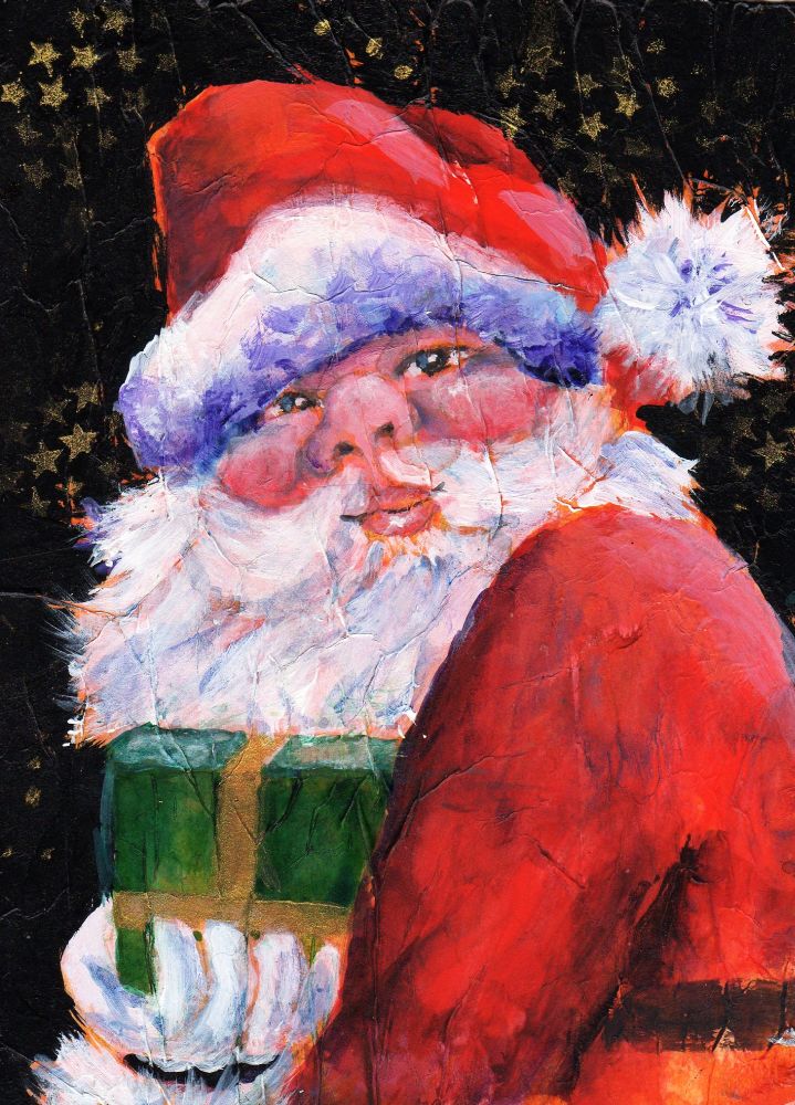
Here Comes Santa Claus


I finally got Santa completed. Actually two were completed, exactly alike. I've posted what I think is the best of the two. What I thought was going to be a quick little portrait turned into much more and I learned a few things along the way not the least of which is how to store my acrylic paint and preserve it after it's been squeezed from the tube. I can't believe I didn't come up with this idea sooner! I'm using a disposable plastic container with lid as my palette which is capable of keeping the paint usable up to 3-4 days. When it's dried out all I have to do is use a plastic palette knife to scrape it away and voila!...I have a nice clean palette for the next project.

Sunday, December 10, 2017

Making Cards


Quick update. Every December I struggle to come up with something unique in way of a birthday card for Betsy, my best friend since 4th grade. As luck would have it I stumbled onto a series of whimsical paintings on Pinterest to fit the bill. I took inspiration from these gems to create this bit of fun. I know she's going to love it. I'm also working on a few Christmas cards. I don't send them anymore but to just 2 people and I like to paint them myself. I'll be posting those soon...I hope.

Monday, November 20, 2017

Bundle Up #2


The second installment in my new series based on women's coats and accessories. Sorry for the lag in updates. After my last post I could not find traction for some reason and I hope whatever was going on with me has passed for a good long time.

Thursday, November 02, 2017

Bundle Up


It's so cold and wet outside these days. Today is particularly cloudy and dark on top of everything else and we still have winter to look forward to. Blah! Anyhoo, it's what inspired this collage. A colorful coat! Nothing better than a nice warm coat to keep the chills at bay. This is mostly painted tissue paper and painted drawing paper with a little soft pastel for shading.
.

Friday, October 13, 2017

40th Birthday Card


Sorry to be MIA. Life gets in the way sometimes. I did just complete a birthday card for my youngest. My baby is turning 40 this coming Tuesday. Ugh! Where did the years go?! It's a little collage, some Micron pen and acrylic paint on artist grade kraft paper. It's a fairly good likeness.

Friday, September 29, 2017

On a More Serious Note


I took the ladies to a more serious side of things. I'm calling this 'Billie Does Burridge' because I was hugely(is that a word?) inspired by one of Robert Burridges' mixed media pieces. I love his work! This was done on a 9" x 12" canvas with acrylic paint and cut paper collage. My palette was heavy on the warm colors so I added some pale blue for relief. Hope you like.

A few in process shots

Sunday, September 17, 2017

Test Composition ~ the ladies


I'm trying out a new comp with my ladies. I like this one but it needs to be amped up I think. It needed a border so I painted a random pattern with walnut ink, then applied pieces of tissue paper over top glued down with gloss medium. When dry I went over that with white acrylic. I like it. The walnut ink did bleed in some spots when I was applying the tissue paper. Not too happy about that. BTW, I did post my first 3 sketches on Facebook and requested feedback. I got some interesting replies. The feedback was useful.

Friday, September 01, 2017

'Greaser'


Inspired by yet another photo from franklin's PMP gallery the concept seemed fairly obvious. Young guy lighting a cigarette, an intense stare through dark eyebrows, a defiant attitude...a greaser! If you were born in the 1950's or 60's you surely have heard this term. 'Greaser' began as a racial slur, then a term for auto mechanics aka grease monkeys and finally as I came to know it was a reference to 'bad boys' that dressed in dark jeans, black boots or shoes and white socks. Always white socks. And they slicked their hair back with some sort of pommade or grease. Possibly Vasoline. They looked tough, acted tough and had a certain dangerous beauty about them. It's a good thing I was too young to date when greasers were in their heyday. I love me a bad boy.

This painting began as a continuous line drawing. I prepped my paper by gluing down pieces of white tissue paper making sure I didn't create too much texture. I transferred the drawing then used a calligraphy pen and some thinned down black fluid acrylic to outline everything. I don't like the look of a marker for these paintings anymore. I'd like to get away from the cartoon-y look a bit. I had traced my original drawing onto tracing paper so I could get an idea of placement and then added torn paper collage..mostly images of 1950's hot rods. I do have one image of an old A & W drive-in that was added in the upper right corner. The image spoke to me of that era.

 FYI, I found a great way to age images. Grey scale first, use your photo editor's effects options to switch the color to 'sepia', then lower the color saturation level to get a vintage look. Voila!

Monday, August 21, 2017

Cat w/Black & Orange


Completed. I've had the reference photo (Kenya M / PMP) for quite some time. Not sure why it took me so long to tackle it. When I first saw it I was struck by the palette and the graphics in the background. Consequently I've held fairly true to this reference. Although I'm happy with my results, since I've started working in a more graphic style, painting more realistic is much less satisfying. I am anxious to get back to my continuous line drawings, sketches (yes, you heard it correctly, the woman who said I'll never be a sketch artist) and the sheer thrill of creating something unique. I have a  wonderful idea for a new painting but I have to get permission to use some photos first. I managed to track down the photographers and a way to contact them. I've got fingers crossed they will respond back and give me the go ahead. Wish me luck!

Almost forgot...the Cat w/Black & Orange was painted with alcohol ink and acrylic paint on paper.

Saturday, August 12, 2017

The Clarinet Player


Inspired by yet another photo from franklin on PMP here is the clarinet man. The reference photo attracted me for a few reasons. I was also a clarinet player all through high school, in the orchestra and the marching band. I even earned first chair one year which is an honor. Oddly when I graduated I put my clarinet away and never played it again. This painting also goes with a more recent musically themed painting I completed, The Cellist .

I took a few photos of my process as I went along.

I fashioned a 'fabric' for the vest by gluing little triangles of
magazine pages randomly about the area. Tedious to say the least but worth it.


These thumbnails were color studies todetermine my color scheme.

Saturday, August 05, 2017

Girl w/the Black Hat ~ WIP


I've been fiddling away at this one for the better part of a week. I could not bring myself to 'cartoon' her up so I went more realistic. I loved her pale skin tones with her red hair and I wanted to preserve her delicate features. Realism = fiddling for me. At times I was regretting my decision but now I'm glad I stuck with it. I think the BG could be tweaked. Maybe a stencil treatment...something. I haven't decided.

Wednesday, July 26, 2017

The Cellist ~ complete


I did manage to finished this up yesterday but it was too late to photograph it. Sadly it's so dark and gloomy here today this took on a rather greyed down appearance but I did the best I could in my photo editor.

I'm quite pleased with the way things turned out. It all came together 1-2-3. Love when that happens! I'm happy with the textures, the colors and fun mood of the piece. Her hair got the same treatment as the border. The only difference, I used oranges and reds on the tissue paper. I used all Daniel Smith colors. A tip: try laying on a wet wash of DS Perinone Orange, then dropping on a bit of DS Duochrome Hibiscus and letting them both mingle on your substrate. Gorgeous. I had toned down the border with a layer of white acrylic (see prior post) but I wanted another border treatment. I taped off where I wanted to create another border effect, then lifted some of the white acrylic with 70% alcohol. Voila!

Tuesday, July 25, 2017

The Cellist ~ WIP 2


Another quick update. I'm hoping to finish this today. We'll see. I had no clear idea where I was going with this when I started. I'm letting this painting tell me what it needs. All I know for sure? This is fun!

Sunday, July 16, 2017

Self Portrait ~ complete

After tweaks


I finished this yesterday but took a day to give it a good 'look'. I didn't take any more progress shots unfortunately. Once I started painting I was in the zone and didn't stop until I'd almost completed it.

When I started painting I wasn't quite sure what direction I was going to take this. I let the painting tell me instead. Am I happy? I can't say I'm not. It's a bit more cartoon-y than I had envisioned but I see that it's the thicker black outlines that create that effect. I seem to have a tricky face to capture and harsh lines around certain facial features create a loss of likeness. Another thing I need is a better brush for fine line work with acrylics. Too much Micron pen for me. I really didn't want that look however I am very happy that it turned out as well as it did seeing how this is a portrait which I rarely paint and I'm still learning how to work with acrylics. Note to self: maybe less texture next time if I want smooth line work.

I did wind up tweaking this. The missing line work on the face just looked wrong.

Friday, July 14, 2017

Self Portrait ~ WIP


In keeping with the collage portrait theme I'm doing a self portrait. I'm trying to remember to take photos as I work. So far, so good. ;)

Monday, July 03, 2017

A Redheaded Girl


Recently I've been interested in people's faces. Painting them, that is. I did a search of PMP and found some wonderful photos of men, women and young people to use as references and this is my first go. This lovely girl was not a redhead but I felt she should be. In fact I think all women should be a redhead at least once in their lives. I was for about 10 years and I loved every minute.

My approach was to start by adhering bits of tissue paper to my substrate, in this case an 8" x 8" piece of 140# watercolor paper. I wanted to create texture. When all was dry I used a couple of my homemade stamps to stamp most of the surface. I transferred my drawing to my paper, then added pieces of magazine pages to the girl's hair. With my palette in mind I began painting with acrylic paints and this is my result. It turned out the way I had envisioned so I'm pretty satisfied. 
I think for my next project I'm going to do a self portrait. It's something I've never done.


Reference photo courtesy of Neil A. Kingsbury (PMP)

Friday, May 19, 2017

Harbor Town


SOLD

The title of this new collage is Harbor Town. It was inspired by another artist's work actually. I came across a collage while surfing on the 'net' that was full of rectangles and triangles and lots of red, white and blue. I immediately thought of the harbor in my own home town. Charlevoix is a popular summer tourist destination and is loved by natives and tourists alike who own boats because of it's beautiful natural harbor which can be accessed via a short channel and a trip under a draw bridge.

This collage is more representational that my others although I tried to make sure there was just enough wabi sabi to keep it interesting. Yes I learned a new phrase...wabi sabi. 

Ummm...looks like I need to touch those wave crests with some white paint. They look a little yellow on screen.


Wednesday, April 05, 2017

Crocus Collage


I just put the finishing touches on my latest collage and managed to take some decent photos even though it's so gloomy here. This one was an experiment. I got an idea in my head and decided to give it a whirl. I wanted the crocus to look delicate so I made some crystalline paper without color. This time I coated both sides of the tissue paper with gloss medium and it made it much sturdier. When the paper was completely dry I used a couple of stencils to add the poke-a-dots. I had started out by rolling on black acrylic paint over the entire surface of my paper aka substrate. Then I created my background with torn paper collage. For the blooms I painted each petal with white acrylic paint and gave them all a coat of gloss medium so I could add color with alcohol ink. I wanted the color layer underneath the surface. The crystalline paper was added after color was applied petal by petal and when that was dry I used sepia fluid acrylic to outline everything. I will say it looks great at a distance but appears kind of dirty up close due to the addition of the sepia acrylic. I do love the outlined look, though.