Translate

Showing posts with label gouache. Show all posts

Sunday, August 03, 2014

Color Theory ~ split comp 3


I fear it's going to get a whole lot of ugly around here until I get this split comp thing down. I have no idea if this is good or bad. I'm working from Quiller's personal color wheel and using his suggested tube colors. For blue/green he prefers Phthalo Turquoise, which I happened to have in stock. For the analogous compliments I had Quin. Red, Alizarin Crimson and I had to make my own red/orange from Cad. Orange and Quin. Red. These are a combo of colors I never in a million years would've chosen for a painting. I threw in some white gouache to create a few opaque colors.


Once I have the colors I must decide how best to distribute them throughout the painting. Which colors should be neutralized? Which should stay pure? Lordy! On top of that, many other widely varying secondary colors can be created. For instance, Quin. Red and Phthalo Turquoise make a stunning blue/violet which can be used to neutralize the orange/red.

Note: I got the idea for this landscape from a photo I saw on Paint My Photo. I liked the strong horizontal lines. I think the straight line through the lower third of the piece is actually a bike path in reality but I loved the effect it lent to this landscape. 

Friday, August 01, 2014

Color Theory ~ pt. 2

In my second color study Yellow Ochre was used as the dominant, Ultramarine Violet and Prussian Blue as intermediates and Ultramarine Blue as the subordinate.
In this color study I used Prussian Blue and UB as the dominant colors, Yellow Ochre as the intermediate and Ultramarine Violet as the subordinate.


Here are a couple of split comp paintings recently completed. This time I used a semi neutral, in this case Yellow Ochre. Then I selected Ultramarine Blue, a teriary color and the compliment of Yellow Ochre. Within the range opposite of Yellow Ochre on the color wheel, I chose Ultramarine Violet(a secondary color) and another semi neutral, Prussian Blue. In hindsight I should've chosen Indigo blue because Prussian Blue lies just outside the correct range of hues.


Before I go on I'd like to make a correction. I mistakenly called DS Undersea Green a teriary color in my previous post. It probably should be considered a semi neutral, maybe even a neutral. Whatever it is, it's a combination of Ultramarine Blue and Quin. Gold Deep. It's neutral qualities worked well with my previous palette plus I like the color!


Sunday, July 27, 2014

Color Theory


Landscapes (the bane of my existence) made fun by using a split comp palette and some imagination.

Because I've never received any formal art education, I've never studied color theory although I have a basic understanding. I can't count the times it's been a struggle to choose a palette for a particular painting. Painting with complimentary colors is something I do enjoy and I've found color combinations I like just by trial and error.

I had forgotten I bought the book 'Color Choices: Making Sense Out Of Color Theory' by Stephan Quiller. While browsing through the book I was blown away by his dynamic landscapes. The paintings I kept coming back to were painted with a split complementary palette so I had to try my hand at it. Simply put, I chose a color(green gold) and found it's complement (red violet...I used DS Quin violet) on the color wheel. Then I looked at the analogous colors of red violet. Analogous colors are those hues that are next to each other on the color wheel. I chose to go toward the more blue hues like blue violet(which I mixed myself) and Indathrene blue. I did add one tertiary hue which was DS Undersea green. If you're not familiar with it, it's an olive-y green.

Arrows indicting my split complimentary colors

Quiller also combines gouache with transparent watercolor. I have one tube each of white and black gouache that have languished in a drawer for a few years. I keep the white on hand just in case a highlight is lost and the black had never been opened. I got them both out and used them to lighten and darken my watercolors. Who knew painting with gouache was so much fun! Tinting gouache with transparent watercolor opened up a whole new world for me. It compares to getting new art supplies without spending a dime.

I won't go into everything I found extremely helpful in Quiller's book but in summary, I highly recommend this book to any artist, especially if they struggle with color. Mr. Quiller breaks down color theory so it's understandable without becoming boring.

Monday, November 11, 2013

Mighty Mack ~ complete


I finished this up yesterday but found myself futzing around with it today until I told myself to "stop it, Billie!" I can't say I'm not glad it's done, though. I will see straight lines in my nightmares probably for weeks.

I was really impressed with neutral tint while painting the bridge. The tower is mostly neutral tint and it created a lovely rich black that was easy to lift and move with a damp brush. Up until now I'd only used it to mix with various colors to lower their chroma without changing the hue. Now I know it can stand on it's own and do it well. It still came in handy to desaturate the 'orange blossom' in the lower left corner while still allowing it to glow. I think the painting truly came to life when I added the white gouache highlights to the suspension cables on the right. So here it is...my Mighty Mack, silhouetted against a stormy sky! I hope it looks as foreboding as it does IRL.                                            


Thursday, June 06, 2013

Board Meeting ~ complete


I had planned to paint this as a work in progress but it's been so gloomy lately I couldn't get decent photos of the steps. Finally I decided to forge ahead or this painting would never be finished and I completed this last night. And today we have sunshine! Perfect timing (for once).

The chickens (and one rooster) were painted with transparent watercolor, the background is tinted gouache. As for the steps/tips, chicken feathers(or any feathers for that matter) equal a nightmare for me. I hate painting tedious details so I made short work of them. With my easel at a sharp angle, I applied my various mixtures of watercolor in the approximate areas they belonged, letting them run and blend as they will. I came back when the paper was completely dry and lifted out a feather here and there, hopefully to create the illusion that I did much more than I actually did. The lifting also helped give the chickens contour and volume. My entire palette consisted of FUB, Quin. gold, burnt sienna, Quin. red and white gouache. I tinted the white gouache with Quin. gold for the background and applied it with a 1/2" synthetic flat in crisscross strokes. I love using gouache for my backgrounds because I can get a very painterly effect that works well in contrast to the watercolor.

Regarding my new Silver Black Velvet brushes, I was very happy with them. Especially with the rounds. They hold a nice sharp point so I didn't have to use so many different brushes to get the job done. They carry more water than straight synthetics but are stiff enough to control. I highly recommend them to artists who want more from their brushes but don't want to spend a fortune.

Note: my reference photo is courtesy of photographer Anita Guinane from PMP

Note #2: It seems I can't get a decent photo of this painting although not w/o lack of trying. I hope the background looks like a soft ocher on other monitors and not neon greenish yellow like on mine. *sigh*

Thursday, May 23, 2013

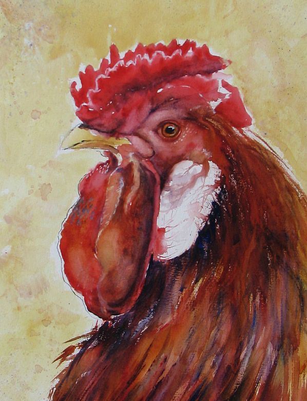
Rooster 2 ~ 'Middle Management'

SOLD
I painted this fella 3 days ago but it's been so gloomy I couldn't get a decent photo until today. Our sun came back along with much cooler weather. This back & forth with the temps is raising hob with my sinuses and my nose is running like a tapped tree but I know it won't last and summer will come soon.

I named my last rooster 'The CEO' and in keeping with the same theme I should call this one 'Middle Management'. It's not a position I would ever hope to hold. A slam sandwich between upper management and the hourly workers, it's maximum stress. I have a very dear friend that works in middle management and although this rooster doesn't resemble her in any way(thank God for her), if her stress level ever took form I think it would look something like this.

Btw, this particular rooster is a Polish Crested and I love the wild 'do' it's sporting. I didn't exaggerate it at all...honest!

Sunday, May 19, 2013

Rooster 1 ~ 'The CEO'


Sorry again to be late in posting an update. I'm refurbing and downsizing my garden beds and with my lung issues it takes the wind out of my sails in more ways than one. I wanted to get back to the watercolors for awhile and found some wonderful chicken photos on Paint My Photo that needed to be painted. Always on the lookout for a new approach to a subject, I stumbled onto Jon Lovett's blog. He's an artist I admire very much and I was taken with a few chicken paintings he posted. He managed to capture the craziness, silliness and potential danger these lowly birds possess with a limited palette and wild, expressive brush strokes.

This rooster was painted from a photo submitted by Gary Jones from PMP. I think he looks like he could be a CEO of some Fortune 500 company. Regal and in charge on the outside, ready to draw blood should competition get in his way. Painted with a palette of Quin. Gold., Quin. red and French Ultramarine with white gouache and India ink.
 

Saturday, May 05, 2012

Goldfish ~ Oriental Style

I've been browsing through Youtube looking at Japanese and Chinese painters in action. Some very incredible work going on over there! The style is so simple but so effective. There's a real art to keeping things simple. Every line means something and not a one is wasted.


Watching these artists, I was inspired to try my hand at goldfish. I know I keep saying I would love to paint fish but never seem to make it happen. Well, today I painted goldfish. I'm still working in a small format so this one went quick. Little space forced me to keep the detail to a minimum. This is mostly walnut ink with a bit of gouache and transparent watercolor here & there. I actually cropped the painting to include the Chinese word for 'goldfish' in the finished piece but my photo editor would not recognize the symbols. I finally just added it in English.

Friday, February 10, 2012

Red Screech Owl ~ complete


I just completed the finishing touches on my owl painting. I didn't do much more with the owl but did tweak the birch trunk a bit. I added another knot and some white gouache to simulate the look of birch bark. Also I was able to get a more accurate photo. My thanks to Steve Haas for the wonderful reference photo as well.

Sunday, January 29, 2012

Feeeed Us, Seymour!


I had loads of fun painting this one. It's a type of floral I don't recall seeing any other artist render in any medium before although I'm sure some have.

I love Venus fly traps. These little carnivorus beauties are near and dear to my heart. I always had one or two when I was growing up. I loved to feed them tiny bits of raw hamburger and the occasional fly and watch their 'jaws' close around the prey. It was fun to stick my finger in those jaws, too.

For my palette I used vivid green, perylene green, perylene maroon, dioxazine purple, Quin. red, pyrrol red and aureolin yellow. I tinted some white gouache to add a few highlights. I also used salt, a piece of plastic wrap and some splattering to add background interest.

Sunday, June 12, 2011

Learning to Paint a Landscape (skyscape?)

Original image

Tweak #1 (I ramped up the contrast)

Tweak #2 (Looks like a dust storm)

Tweak# 3 (Tornado skies. I can almost hear the warning sirens when I look at this)

I have never produced a landscape painting to my satisfaction...ever. Why this subject seems so difficult for me is a mystery but I've made it my goal this summer to tackle the beast. My interest in the genre was recently rekindled when I received the latest issue of Watercolor Artist and was pleased to see one of Z. L. Feng's landscapes featured on the cover. I absolutely love his landscape paintings, especially how he handles foliage and his use of color. I have a link to his website on my link list if anyone is interested. I suggest you take the time to check out his work. You won't be sorry.

I also received an email notice for the June challenge on Paint My Photo website. This month the subject is skies. The rules...any medium may be used but the sky must take up 3/4 of the total painting. Landscapes that are mostly sky can be very dramatic and exciting so I threw together a little sketch and gave it a whirl. I did spend time online looking at cloud formations prior to starting which helped but I couldn't find a reference photo I liked so this attempt is from imagination. I worked wet into wet with a leftover mixture of indigo, Quin. violet and Payne's grey, then floated in some white gouache and a little raw umber to create a stormy sky. I'm fairly happy with my cloud work. It's the stuff on the ground where I seem to stumble. Overall though, not bad for a start. I did play in my photo editor with the original image to see what other effects I could produce.

Sunday, May 15, 2011

Lucy & Ethel Revisited

I felt Lucy & Ethel looked a bit drab so I got to work with some magenta, Quin. gold and gouache. I created this panorama for comparison. The 'after' is on the left.

It's been ages since I've failed to update my blog for over a month so apologies to my followers and visitors. April shot by like a comet it seems and other things got in the way of painting. I did manage to ready some pieces for the gallery and get them delivered. I also took time to pull some older paintings and look them over. I thought Lucy & Ethel needed a facelift but fear I may have tweaked them to death, always a danger when revisiting a painting. At this point I'm just plain tired of looking at them so I've begun another drawing for a new piece. I hope to spend more time painting in May. I just have to get the momentum going again.

Wednesday, December 15, 2010

Winter Scene on Matboard


One surface I love to use for painting is matboard, not to be confused with mountboard. Whenever I mention matboard in a post I'm referring to the paper plyboard that is normally cut to frame a piece before the actual glazing and external frame is added. This time I decided to try working on the reverse side of the board. This side has a small amount of texture to it and it looks like it might be more absorbent. I wanted a soft muted appearance for my winter landscape so I coated the entire surface with white gouache and let it dry before beginning my painting. This worked to soften my colors as I painted and allowed for better lifting where needed.

When a painting is completed many artists clean their palettes and begin again with fresh paint. I like to dabble in 'palette muck', the leftover colors that have inadvertently run together. I've discovered some amazing greys this way and for certain applications the low chroma colors that the muck can produce are perfect. This scene was painted entirely with muck. I finished it off with white fluid acrylic 'snow', spattered on with an old toothbrush.

Friday, July 02, 2010

Mice Dreams~ Completed


I need to stop working on this right now before I tweak it to death. Sometimes you just have to put the brush down and walk away. I have no idea what I will title this either. I'll worry about that later. The overall look of this is softer IRL but this image is fairly close.

Note: Margaret Bartlett has suggested a title and I think it works. 'Mice Dreams'

Monday, June 28, 2010

Bored


I'm not bored but this cat sure looks bored. I liked my Sepia cat enough to try another. I did use a reference photo this time (courtesy of Yod Barro on Wetcanvas) and it shows, IMO. I think it's lacking the same spontaneity as the first painting because I focused on the photo too much. I love the reference photo but the cat's head is at a tricky angle so I needed guidance with the eye placement. However, once that was established I probably should've put the ref away. I used the same palette...DS Undersea green and warm sepia with white gouache added for the whiskers and the catchlight in the eye.

I tried two different crops...one closeup and one vertical and narrow with the subject at the very bottom. I think I like the second best. It's different.

Saturday, June 26, 2010

First Chicken


Done on the last piece of scrap paper with the last of the leftover paint...mostly quin violet, Undersea green and warm sepia with some gouache added for the white feathers. Forgive the blue and green blobs at the bottom. They were already there when I started. I hate to waste anything, especially if I can use the materials for practice. I've got some eggs from this very chicken in my frig which I intend to photograph and paint so for me the age old question, "Which came first? The chicken or the egg?", has been answered.

Thursday, June 24, 2010

The Sepia Cat


I can't seem to stop playing in the paint lately! I've been using up leftover paint and bits and pieces of w/c paper lying around. This is another of my attempts to paint a cat without benefit of a prior pencil sketch or reference. I did rough in the right eye(viewer's right) but the rest is all done freehand. I mixed up some warm sepia with DS Undersea green and just winged it. I ran out of room on the paper so sadly this poor cat has no ears. I recently ordered some gouache and a fine line Sumi drawing brush from DS. I love this brush! The gouache came in handy for the whiskers, too.