I'm always on the lookout for ways to add texture to some of my paintings. Today I experimented with this product and I highly recommend it to artists that prefer to work on paper like myself. It's flexible, as the label states, so it won't crack on flexible surfaces. Up to this point I've been relying on Liquitex gesso to get a degree of texture but there's a lot of moisture in gesso and it takes a long time to dry. Also it's rather runny, causing the paper to buckle, and has to be worked and reworked with a palette knife or other tool to produce an interesting surface. However this product is thick, easy to mold and dries much faster. It's also possible to get a high degree of texture not possible with acrylic gesso. I created this sample floral to see how well the modeling paste accepted watercolor and ink. It behaved very similar to gesso. Paint was pretty easy to lift but I think the surface tended to stain a bit more. If a non porous surface was needed a coat or two of high gloss gel medium over the modeling paste would accomplish that.
Translate
Showing posts with label India ink. Show all posts
Sunday, November 09, 2014
Liquitex Flexible Modeling Paste ~ product review
I'm always on the lookout for ways to add texture to some of my paintings. Today I experimented with this product and I highly recommend it to artists that prefer to work on paper like myself. It's flexible, as the label states, so it won't crack on flexible surfaces. Up to this point I've been relying on Liquitex gesso to get a degree of texture but there's a lot of moisture in gesso and it takes a long time to dry. Also it's rather runny, causing the paper to buckle, and has to be worked and reworked with a palette knife or other tool to produce an interesting surface. However this product is thick, easy to mold and dries much faster. It's also possible to get a high degree of texture not possible with acrylic gesso. I created this sample floral to see how well the modeling paste accepted watercolor and ink. It behaved very similar to gesso. Paint was pretty easy to lift but I think the surface tended to stain a bit more. If a non porous surface was needed a coat or two of high gloss gel medium over the modeling paste would accomplish that.
Sunday, June 09, 2013
Hostile Takeover ~ fighting roosters
I had an idea of adding fighting roosters to my corporate chicken collection. Somehow it seemed appropriate. Anyway, I thought if I planned to paint them I should see them in action so I browsed some Youtube videos. No illegal cock fights to the death, just barnyard quarrels. It was fascinating to watch these birds spar off. They mean business! Each rooster will fan it's neck feathers out to create an impressive frill or mane as the first act of aggression. With heads down they circle each other, looking for an opening much like human wrestlers. Then the feet with those sharp talons and leg spurs will start to fly. The loser was bested when the opposition was able to plant himself on the other's back. I do know some roosters will fight to the death but thankfully the pair I watched did not.
I couldn't help but look at all the various roosters online and found a breed, the Asil or Aseel that is bred specifically for it's aggression. It's bred in the Middle East and is a rather odd, almost prehistoric looking bird. Tall, very small breasted and very long legged, it's a formidable looking creature:
http://indianrooster.blogspot.com/2011_01_01_archive.html
This painting was a quicky. I did a freehand sketch directly on my working paper and worked fast with broad, expressive strokes to hopefully capture the action and violence. This is mostly transparent watercolor, a touch of India ink and Caran D'Ache water soluble crayon.
Thursday, May 23, 2013
Rooster 2 ~ 'Middle Management'
SOLD
I painted this fella 3 days ago but it's been so gloomy I couldn't get a decent photo until today. Our sun came back along with much cooler weather. This back & forth with the temps is raising hob with my sinuses and my nose is running like a tapped tree but I know it won't last and summer will come soon.I named my last rooster 'The CEO' and in keeping with the same theme I should call this one 'Middle Management'. It's not a position I would ever hope to hold. A slam sandwich between upper management and the hourly workers, it's maximum stress. I have a very dear friend that works in middle management and although this rooster doesn't resemble her in any way(thank God for her), if her stress level ever took form I think it would look something like this.
Btw, this particular rooster is a Polish Crested and I love the wild 'do' it's sporting. I didn't exaggerate it at all...honest!
Labels:
gouache,
India ink,
Rooster,
transparent watercolor
Sunday, May 19, 2013
Rooster 1 ~ 'The CEO'
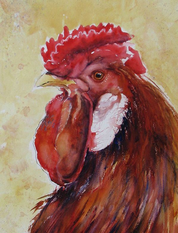
Sorry again to be late in posting an update. I'm refurbing and downsizing my garden beds and with my lung issues it takes the wind out of my sails in more ways than one. I wanted to get back to the watercolors for awhile and found some wonderful chicken photos on Paint My Photo that needed to be painted. Always on the lookout for a new approach to a subject, I stumbled onto Jon Lovett's blog. He's an artist I admire very much and I was taken with a few chicken paintings he posted. He managed to capture the craziness, silliness and potential danger these lowly birds possess with a limited palette and wild, expressive brush strokes.
This rooster was painted from a photo submitted by Gary Jones from PMP. I think he looks like he could be a CEO of some Fortune 500 company. Regal and in charge on the outside, ready to draw blood should competition get in his way. Painted with a palette of Quin. Gold., Quin. red and French Ultramarine with white gouache and India ink.
Wednesday, January 09, 2013
Demo ~ faux batik on waxed paper w/alcohol ink
I've received requests to post a demonstration of this technique. I had hopes of doing a video demo but the image quality of the test videos I ran with my current camera weren't the greatest so I've done a photo demo instead.
1.) I suggest you cut your waxed paper no more than 1"- 1 1/2" larger than your backing paper. The backing paper is the substrate you'll be gluing your finished batik onto.
2.) Crumple the waxed paper into a ball, smooth it out, then crumple once more. You want the little creases evenly distributed across your paper. Try to avoid long, straight creases.
3.) Image no. 3 shows the amount of crumpling I prefer.
4.) Ready for the India Ink. I use black India ink(full strength) and an old, stiff bristle brush to spread the ink. I suggest working on two layers of waxed paper underneath your painting to protect your work surface as the alcohol ink will bleed through. One tip: Slip a piece of white paper cut the size of your finished painting underneath both layers of protective waxed paper so you have a size guideline.
5.) The India ink has been spread out and at this point I wait a few minutes to allow the ink to settle into the creases before wiping away the excess with plain water and paper towels. As you can probably see, I also use my fingers to work the black ink into the creases.
6./7./7.1) A few views of the waxed paper after the excess ink has been wiped away. In view #7 you can see I slid a piece of 5" x 7" paper underneath so I know where the borders of my finished painting will be.
8.) If you choose a drawing to use for the painting it can also be placed underneath the waxed paper so it's visible. I used a black Micron .o8 pen to go over all my lines so they were easier to see.
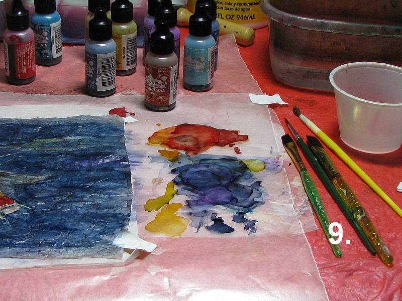
9.) Once I'm ready to paint, I place a small bowl of rubbing alcohol and another of clean water nearby to wash my brushes after each use. Also for cleaning brushes when switching colors. I mix my own colors by dropping the alcohol inks onto the protective waxed paper and picking the ink up with my brush. Use inexpensive brushes for these paintings as alcohol ink isn't very healthy for your good sables, etc.
10.) My painting is now finished and is ready to be glued to the backing paper.
11.) I apply Mod Podge with an old brush to the backing paper(in this case, a piece of Yupo) in a thin, even coat...
12.) and position my painting over the Yupo, making sure it's placed exactly where I want it. Then I use a soft brayer to press it into the glue, working out any trapped air bubbles. I also check for any places that may need another dab of glue, usually the corners. Lastly, I use a pair of scissors to trim away the excess waxed paper and the painting is complete.
NOTE: The koi fish painting has been sold.
Labels:
alcohol ink,
brayer,
demo,
faux batik,
India ink,
koi fish,
Mod Podge,
waxed paper
Wednesday, January 02, 2013
Alcohol Ink on Waxed Paper ~ faux batik
I wanted to create a batik-like effect for this painting so I used crumpled waxed paper for this purpose. After crumpling the waxed paper I applied black India ink to one side, allowing the ink to settle into the 'crumples' before wiping away all the excess ink with plain water. When it was dry I flipped the paper over and used alcohol ink to create my painting. I then mounted it onto 140# hotpress w/c paper with Mod Podge, using a brayer to work out all the air bubbles. I'm calling this one 'Winter Aspens'.
Labels:
alcohol ink,
aspens,
brayer,
faux batik,
India ink,
landscape,
Mod Podge,
waxed paper
Sunday, March 21, 2010
Purple Cat


Hey, why not? I've finally used up all the paint on my latest palette, too! This colorful kitty was painted freehand, wet-into-wet on #140 Fabriano Uno. I added some violet Bombay ink with a pen and nib after the painting was dry. I wound up with a few unplanned 'blobs', one right on the cat's face. I'm a menace with bottled ink and nibs. :(
Labels:
India ink,
purple cat,
transparent watercolor,
wet into wet
Subscribe to:
Posts (Atom)