Translate

Showing posts with label composition. Show all posts

Friday, February 16, 2018

Channeling ~ complete


I finally was able to get a decent photo of this piece finished. The differences are subtle and may not be as noticeable in the image as they are IRL but I'm calling this done. I'm including a quick sketch of my next collage. I'm going to call this 'Still Life with Drawbridge'.


This is a familiar scene in my hometown during the summer months. The bridge goes up every 1/2 hour on the dot so the boat traffic can pass and the vehicle traffic can plan around this. It still creates a huge bottleneck because the main drag is a state highway and traffic can pile up fast.

Sunday, September 17, 2017

Test Composition ~ the ladies


I'm trying out a new comp with my ladies. I like this one but it needs to be amped up I think. It needed a border so I painted a random pattern with walnut ink, then applied pieces of tissue paper over top glued down with gloss medium. When dry I went over that with white acrylic. I like it. The walnut ink did bleed in some spots when I was applying the tissue paper. Not too happy about that. BTW, I did post my first 3 sketches on Facebook and requested feedback. I got some interesting replies. The feedback was useful.

Sunday, April 23, 2017

Birthing an Abstract Collage


I'm not quite ready to deliver yet but it won't be much longer. This is basically my process...try this one, try that one...no try another NO! NOT THAT! Ah, that works better. Yes, yes...okay.

There is method to my craziness. The rules of composition still apply and thankfully can guide me until I feel more confident to try something more daring. Know the rules before you break the rules. I love a good mix of texture, form and color and one of the things I'm enjoying most working on these collages is how easy it is to experiment with color, always something I can improve upon.

Wednesday, February 05, 2014

Garlic ~ thumbnail sketches


I've been on a bit of a hiatus. This winter has been rough on my lungs and I really haven't been in a very creative mood as a result. I finally bucked up and drew these simple thumbnail sketches the other night. I'm thinking of a small, garlic themed series. I've painted a garlic braid (ristra) before but I've never painted the scapes. When the scapes first appeared in my garlic patch I was quite enamored with them. For those that aren't familiar, they are the stems and flower buds of hardneck garlic and they look like graceful, long necked birds. They appear almost overnight and begin to coil around in the most amazing way. I haven't decided what medium I'd like to use yet. I'm thinking pen and wash. 

BTW, I'm happy to report the client loved the portrait (JUGGS). Yes! I found out later that this is his 40th anniversary gift to his wife. And here I thought it was for Valentines Day. I'm kinda glad I found out about the anniversary after the fact. It would've added that much more pressure.      

Thursday, September 05, 2013

Clowder of Cats ~ composition


I'm currently working on the comp for a new painting. I'm doing it with my usual storyboard technique. Seems there are a few issues to work out such as certain subjects 'kissing'(meaning: barely touching) that don't work for me. I do like the loose, diagonal 'S' flow, though.

Monday, February 04, 2013

Red Hat Ladies 2 ~ WIP


I've just started a second 'Red Hat Ladies' after running into a slight problem. I had planned on doing two separate portraits as companion pieces for the original RHL (link) but discovered the leftover illustration board wasn't large enough for my purpose. I had forgotten I cut a strip from one side to use for painting trials so was left with an odd sized, square-ish piece to work with. Normally I would've gone back to the alcohol inks until I found a solution but that isn't an option at the moment. Finally a lightbulb went on in my head and I came up with this composition. This is just a photo of my drawing on tracing paper and, once again, I realize how much I would dearly love to have a lightbox, especially when working with human faces. Capturing the correct facial expressions of these lovely ladies is crucial to this piece and freehanding was challenging but I tried to keep it to a minimum. I'm really posting this so I can see it online to see if it 'works'. I invite my visitors to feel free to chime in with their opinions.

Friday, August 10, 2012

The Good Ship Rhino ~ WIP 2


This project has begun to turn into a monster, literally and figuratively. As the ideas increase, so has the size of the sketch and my teacup has sprouted tentacles. I now have this taped to my biggest mounting board on my tabletop easel on the kitchen table. I snapped these photos just now so I could post a quick update. I've made some changes to the original sketch and added an overlay of tracing paper showing some possible additions.

Wednesday, August 08, 2012

Wreck of the Good Ship Rhino & a Shag ~ WIP


Inspired by the work of Yuri Laptev, I recently visited Paint My Photo (link) to gather some ideas. I haven't been on this site for ages and was amazed at the quantity and quality of photographs in their gallery. Over 1600 images, all copyright free. I found a wonderful image of a rhino, resting in a zoo enclosure, and saved it to my on-site 'favorites'. Later I stumbled onto another image of a beached fishing boat, falling into decay. The overall shape and angle of incline reminded me of the rhino. I did a tracing of the boat, then overlaid that onto the rhino image and they meshed perfectly. An idea was beginning to form. I added the cormorant later. Whenever I include a new 'critter' in my artwork I like to learn a little bit about it first. Googling revealed that the slang term for a cormorant is a shag. Cool!

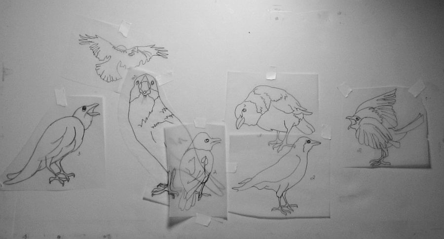
I'm now in the process of creating what I like to call a storyboard. Whenever I create a piece from multiple images I like to work on tracing paper. Each element is drawn or traced onto separate scraps of paper so they can be moved/removed and adjusted into various compositions on a board. Because the tracing paper is transluscent every layer is always visible. An example of this process can be seen in the WIP Cawcus (link) , a painting I completed last year. I'm currently jotting down more ideas for this project in a small notebook as they come to me. It should be fun to see this evolve and what comes of it.

Sunday, July 29, 2012

Making Friends ~ completed


I managed to lower the 'heat' by removing some of the ink. I dropped in some Pool, a very cool blue. It's a potent color so I tried not to over-do it. A shadow was created beneath the center cat for a horizontal element in an otherwise diagonal composition.

I made a few corrections and additions. The painting was much too 'hot', the red/orange too intense so I lifted some of the color between the cats in the foreground with a small amount of rubbing alcohol on a paper towel. I did this not only for esthetics but also to highlight the 'exchange' between these two animals. The little onlooker in the background is for composition sake. I guess this cat decided to hang back and watch the goings on.

Having my own cats and watching their behavior when another, strange cat approaches I think I've succeeded in recreating the posturing that takes place. Cats are very territorial and are slow to accept another cat on their turf. They're very selective when making new friends. The 'new' cat usually approaches cautiously with a curious, slightly submissive attitude if it's interested in joining the group. I've been witness to various outcomes of these exchanges...some good, some not so much.

I added this image to my Imagekind Gallery. It looks amazing on canvas so I hope you will stop by and check it out: http://www.imagekind.com/Making-Friends_art?IMID=b7ccce70-9ce3-4ff3-a237-6eefbd11deb4

Friday, August 05, 2011

Sizing Up A Comp ~ Part 3


The past few days I've been slooowly adding things to this composition. I compare prepping a comp for a full sheet painting to giving birth. Committing to a full sheet is a huge deal to me as all my supplies are precious. Wish that wasn't the case but it is. I want to take the utmost care in planning with the hope that the outcome will be a success and I will be rewarded with something of which I can be proud.

Taking my time and looking at each addition to see if it works in the overall scheme of things is crucial. The tall daisy on the right needed some tweaking. That long straight stem was too harsh and looked like the mast on a sailboat listing in the wind...with a flower on top. I softened the angle by curving it slightly. I also added another large daisy bloom in the lower left corner in hopes that would create depth. Surprisingly both large daisies look about the same size in the image even though one is over three inches wider than the other. Camera distortion maybe?

It has become obvious to me this will be a WIP for awhile so I'll probably start working on some other, smaller projects just to keep my brushes wet.

Wednesday, August 03, 2011

Sizing Up a Comp ~ part 2


I've added another frog to the picture and put a blossom on the end of that big stem on the right. I took numerous photos of my own shasta daisies and will continue to refer to them when adding additional daisies. The way it's going this will turn out to be a full sheet when completed.

Conclusion: This project was taking too long, using up too much tracing paper and looks like a crazy quilt. I finally broke down and called our local print shop. Kwikie Print has become Village Graphics(not sure when that happened..I need to pay more attention when I'm in town) and they now offer more services including enlargement of drawings. My tracing paper quilting days are over!

Sunday, July 31, 2011

Sizing Up A Composition


I've got a new piece brewing already. One of the members of my Michigan garden forum posted photos of tiny tree frogs sitting on her shasta daisies and generously agreed to share them with me for a painting. I'd like to make this at least a half sheet, maybe larger. I'm trying to determine how large I want each frog in relationship to the others within the composition I have in mind. This is a compilation of two separate images so I will need to do some adjusting.

I used edge detection in Irfanview and traced my line drawing onto tracing paper. BTW, I use my PC monitor as my lightbox. I then taped the tracing paper to a scrap piece of foamcore and am posting a photo so I can size things up(pun intended). Pretty rough at this point. PSP is outside my budget and I've about given up on my Elements 6. I think it's been corrupted. Whatever it's malfunction, it's just too darn frustrating to try and put together a comp with it. I'll have to use some ingenuity or just do it the old fashioned way and make umpteen drawings until I'm satisfied. I'll also need to take some photos of my own daisies to complete the scene.

Friday, June 17, 2011

Landscape #2 ~ Complete


Here I attempted to highlight the shapes I saw when looking at the reference photo. The obvious focal point in this painting is the area of paper left white in the small rectangle, center of image.

I just finished this one. It's loosey, juicy and kinda messy but I wasn't planning on offering it for sale so it doesn't matter. I think this has potential as a do-over. I like the composition and the colors. I switched to the quill of a feather for some of the fine branches, did the rest with the squirrel quill brush. Bit of a sloppy job but I'm not concerned in this case. Colors and color placement are so important to a landscape but composition even more so. Where the various values are placed is critical, too. At completion it's all got to make some sort of sense no matter how creative I wish to be. I operate primarily on instinct being self taught so if it looks 'right' I just go with it.

Saturday, January 22, 2011

Cawcus~Developing composition

3.)More size adjustments, more birds, more 'attitude'. I think this will be the final composition. I can individualize each bird more as I paint them.

2.)Here I've adjusted the sizes of a few birds, corrected the feet and played with attitude(posturing).

1.) I tightened the grouping so the birds relate more to one another.

I seem to be slow out of the starting gate this year artwise. Looking back over previous years I see this is a pattern for me. Maybe I tend to be more thoughtful and not as impulse and consequently less productive in midwinter. In the meantime, I've been staring at my storyboard and knew something was 'off'. I just couldn't put my finger on it so I decided to let things marinate for awhile.

I was watching the finale of The Housewives of Beverly Hills a few nights ago(inspiration can come from the darnest places) and the episode ended in a huge explosion of verbal dynamite. This particular group altercation took place at a large gathering, a birthday party actually. Long story short, it was interesting to observe how various individuals reacted to the con-flab. It gave me some added inspiration to apply to my composition. I've added more birds, grouped them more tightly and adjusted their sizes and attitudes. I decided I wasn't concerned about realistic size relationship(perspective), leaving larger birds behind smaller birds. I've also experimented, painting with a different medium...Speedball ink. DS Iridescent Electric blue watercolor paint applied over black Speedball ink makes a pretty convincing crow. Who knew?

Monday, September 13, 2010

Beach Babies~commission

I wanted these children to relate more to each other within the scene, possibly by connecting their shadows or their footprints in the sand. I drew a rough sketch of the background on a sketch pad, then each child separately on small bits of tracing paper so I could move them around and try different placements. It was a little like playing paper dolls. By bringing the boy closer to his sister and lowering his position his left hand 'fit' into her right hand perfectly. Issue solved.

The reference photo

I've received a commission to paint this adorable scene of two siblings, a sister(age 3) and her brother(age 14 months) enjoying a day at the beach. Even though I've only painted one child(a portrait) and I've never painted a beach scene, how could I resist this? I have until Christmas to complete this commission so I plan to take my time and hopefully do these babies justice.

Tuesday, August 31, 2010

Plotting a Painting of Peacock Orchids


I put the original photo into Irfanview, greyscaled it, then selected 'emboss'. Much to my delight(!) the nepeta in the foreground (which I plan to include and was dreading painting) looked just like textured acrylic gesso so the gesso will definitely play a part in this piece.

Art Nouveau? Needs a fancy graphic border.


I have a wonderful stone aggregate birdbath that didn't make it into the original photo. Ummm.....

I have not been updating my blog much lately but I have been working. Mostly I've been printing and packaging notecards for the Artists Market. Labor Day weekend is basically our last hoorah for tourist season, then art sales tend to drop off drastically during the winter and card sales have been really good this season. I also chose the photo I posted August 21st as a reference for a painting. I loved the comp, the lighting and I especially liked the silhouette of the grasshopper showing through one of the leaf blades. To me, it's little unexpected details like this that make a painting special. I've also played around with a couple of possible additions. See above.

Nick Simmons has mentioned several times that a painting will tell you what size it needs to be. In the case of the peacock orchids my usual working size of 16" x 20" wasn't going to cut it. Right now I estimate this painting will probably wind up taking roughly a full sheet....22" x 30". I've been itching to paint in a larger format lately but have been dragging my feet. I have nowhere to store this large of a painting, nothing to safely store it in and because my studio is so small, hardly any room to even paint it. Minor issues........

Friday, July 16, 2010

My Sunflowers~WIP value study


I finished my value study. I was most interested to see if I still had good distribution of the lightest and darkest values after making my changes and I believe I do. There's nice undulating horizontal flow, my eye isn't lead out of the picture in any direction nor are there areas that grab attention away from the composition as a whole. The main focal point is the dead sunflower on the viewer's left which was my intention.

Wednesday, July 14, 2010

My Sunflowers~ WIP Update

I think this will be the final drawing. There is good movement throughout, interesting shapes in the corners and nothing pops out at me that seems 'off'. Next will be a value study.

After removing the extra bloom I noticed two leaves came together to form an almost symmetrical shape which at first I thought looked kinda cool. After looking at the drawing for awhile I realized my eye went immediately to that shape and stopped so that needed to be addressed.

The arrow is pointing to another bloom tucked behind the two in front. Too much going on in such a small area, IMO so it had to go.

I think I'm finally satisfied with my drawing. I did a fair amount of editing and made other changes. I've never done anything quite this complicated before and I'm beginning to doubt I'll be able to paint this in a loose style. I don't want to go too realistic either so I'll be walking a fine line once I start actually painting.

Sunday, June 27, 2010

Photographing Eggs


I like this composition the best so far. Love the subtle orangey reflection on the green egg shell and the angle of the shadow from the carton.


Is not as easy as I thought it would be. I have six lovely eggs from a friend's hens. The reddish brown eggs are from her Isa Brown hen, the green are from one of her Araucanas. Sunlight has been at a premium here lately and when it peeks out it doesn't stay long so it's a rush to shoot in good lighting. Since I had the eggs in the frig they immediately began to 'sweat' once they hit warm air and eggs tend to roll around a lot! No hiding a piece of masking tape under them to hold in place either as the surface of the shells was too wet. Once they came to room temperature I had lost any hope of decent light but I did get a few shots w/o all the condensation on the shells.

Friday, April 16, 2010

In The Mood for Hollyhocks


Actually I'm in the mood to paint something in a long, narrow format and hollyhocks came to mind. I doodled up a sketch last night, working from memory. Today I found a photo I took of some double hollyhocks I grew a few years ago. I think the photo may already be on my blog somewhere but I'm too lazy to go hunting. The light source isn't the best so I will have to work that out in the sketch and I see I forgot what lovely large sepals hollyhocks sport. Now to decide if I want to do this painting loose style, more realistic, on paper, on gesso, on matboard....decisions, decisions.