Translate

Showing posts with label texture. Show all posts

Saturday, December 16, 2017

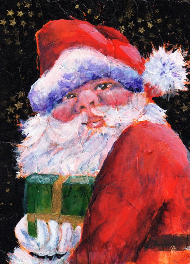
Here Comes Santa Claus


I finally got Santa completed. Actually two were completed, exactly alike. I've posted what I think is the best of the two. What I thought was going to be a quick little portrait turned into much more and I learned a few things along the way not the least of which is how to store my acrylic paint and preserve it after it's been squeezed from the tube. I can't believe I didn't come up with this idea sooner! I'm using a disposable plastic container with lid as my palette which is capable of keeping the paint usable up to 3-4 days. When it's dried out all I have to do is use a plastic palette knife to scrape it away and voila!...I have a nice clean palette for the next project.

Sunday, December 10, 2017

Making Cards


Quick update. Every December I struggle to come up with something unique in way of a birthday card for Betsy, my best friend since 4th grade. As luck would have it I stumbled onto a series of whimsical paintings on Pinterest to fit the bill. I took inspiration from these gems to create this bit of fun. I know she's going to love it. I'm also working on a few Christmas cards. I don't send them anymore but to just 2 people and I like to paint them myself. I'll be posting those soon...I hope.

Monday, July 03, 2017

A Redheaded Girl


Recently I've been interested in people's faces. Painting them, that is. I did a search of PMP and found some wonderful photos of men, women and young people to use as references and this is my first go. This lovely girl was not a redhead but I felt she should be. In fact I think all women should be a redhead at least once in their lives. I was for about 10 years and I loved every minute.

My approach was to start by adhering bits of tissue paper to my substrate, in this case an 8" x 8" piece of 140# watercolor paper. I wanted to create texture. When all was dry I used a couple of my homemade stamps to stamp most of the surface. I transferred my drawing to my paper, then added pieces of magazine pages to the girl's hair. With my palette in mind I began painting with acrylic paints and this is my result. It turned out the way I had envisioned so I'm pretty satisfied. 
I think for my next project I'm going to do a self portrait. It's something I've never done.


Reference photo courtesy of Neil A. Kingsbury (PMP)

Tuesday, May 31, 2016

Trilliums in Bloom


Love the neat texture. It adds so much interest.
With the plastic wrap in place. I saved my whites with liquid fisket.

The woods around these parts are currently carpeted in wild trilliums and it's a glorious sight.  I wanted to pay tribute to this flower that blooms for such a short time, often alongside wild forget-me-nots, with a small painting.

I pulled out a trick I haven't tried in years...saran wrap aka plastic wrap. It's a cool way to add some interesting effects/texture.  Simply cut pieces of the wrap and place on your wet paint. Make sure the paint is really wet or nothing will happen. You can then manipulate the wrap any way you wish. Also don't remove the wrap until the paint is thoroughly dry or all your lovely textures could be lost. By adding the forget-me-nots I was able to try out my new tube of watercolor, Periwinkle by American Journey.

Thursday, September 25, 2014

Rusty Gate Post ~ WIP 3


More work done on this piece. So far it's been figuring out how to recreate the look of many layers of peeling paint and rust without spending a ridiculous amount of time on fiddly detail work. I've added more cracked egg shells but think I've reached the limit of that on the actual post. I will probably add egg shells to the fence posts, though. I've also got some ideas for a finer cracked paint texture for smaller areas. I toned down the blue cast in the background. It doesn't show up much in the image but I have been laying in some foliage growth behind the gate post. I'll be adding more after the post in complete.    

Monday, March 24, 2014

Experiment ~ acrylic gesso and gloss gel medium on matboard


...and finished with Ranger alcohol ink. I've wanted to give this a try to see if it would work and I'd say it was successful. I used a dried bloom of a large ornamental grass and embedded it with Liquitex acrylic gesso onto 3/16" white matboard. I've done this before with dried oak leaves (link) . I then gave it a coat of Liquitex Gloss Gel medium diluted with a little water. When that was dry I rubbed walnut ink over the entire surface and wiped away the excess. The walnut ink ran into all the nooks and crannies and gave the piece an antiqued look. I could've stopped there but I wanted to see how Ranger ink behaved on the gloss medium so when that was dry I gave this another light coat of gloss medium. It served to preserve the effects of the walnut ink and gave me a slick surface to apply the alcohol ink. Then I added the ink and found it moved well on the gloss surface. I had a bit more control than on Yupo but the effects were basically the same. I used Ranger's Caramel, Clover and Copper mixative.

Thursday, June 24, 2010

Texture


I'm calling this 'Sunset on Pluto'. I don't know if Pluto even has a sun much less a sunset but that's what popped into my head when this was dry.


Love the little tendrils the paint forms working wet into damp. Nick Simmons calls them dendrites(sp?).


Here I didn't wait for the dried perm yellow to fully reconstitute before pouring. After the painting was dry I brushed away the tiny 'chunks' of paint to reveal what I thought looked like a field of yellow daisies.


Even though watercolor has the ability to be reactivated on the palette after drying , some colors like cerulean blue like to remain in nugget form no matter how much water you add so I left them on the paper. I liked the look! I think I also see the ubiquitous cat hair that seems to show up in all my paintings.


One of my favorite tricks to create texture involves spraying a fine mist of water over (not directly on) damp paint. This creates tiny blooms that add a neat effect. I'm not sure if it's visible in this image, tho. The purple you see is Dioxazine Purple fluid acrylic by Da Vinci. I applied it straight from the bottle onto wet paper. After it was dry I dripped on some cerulean blue watercolor, fully reconstituted. Applied onto the dry fluid acrylic, it retained it's vibrancy and it's semi-opaque qualities created a really cool passage in the painting.

Here fluid acrylic is interacting with straight watercolor, wet into damp. It's fun to play with your paint and you can learn a great deal in the process.

When you mention watercolor I doubt most people immediately think 'texture'. Sure, you can take a brush and recreate texture...the textures found in nature, in man made objects, etc. What I find intriguing is the exciting and often times unexpected textures that simply happen when working with watercolor. I'm also discovering that those same wildly interesting textures can be achieved with fluid acrylics used as watercolors.

I had some yogurt cups on the shelf in my studio that contained long dried watercolor from a pour I had done last year. I almost threw them out as there was nothing but a thin crust of dry paint left in them. Then I thought ...well, I'll try to reconstitute them and see what happens. When I think texture in watercolor I think of Ann Blockley's book, Watercolour Textures . I've referred to this book on my blog more than once. Her beautifully textured backgrounds in the book make her subjects almost incidential....almost. Somehow she manages to balance the subject matter and the background so the subject is not lost but rather enhanced by it. Anyhoo, I'm posting my results with the dried paint. No subject, just lots of pouring to see what happens.

Side note: Speaking of backgrounds...I received my August issue of Watercolor Artist yesterday. On the cover is a beautiful painting of bearded irises by Heidi Lang Parrinello. The actual painting is large...60" x 40", the attention to detail and skill involved in painting these irises is undeniable and must be stunning to see IRL but I have one problem with it...the background. I can only assume the problem lies with the crop for the cover but the over abundance of colorful and amorphous shapes in her background is extremely distracting and not only is it distracting but also looks so contrived. I suspect she did one heck of a lot of lifting to achieve that effect, too. I enjoyed looking through her portfolio on her website. She does seem to like busy backgrounds.

Tuesday, November 10, 2009

Berries & Birch~ Round 2 Completed!

I've included a few closeups to showcase the texture. You should be able to see where I added some white colored pencil to highlight the ridges. Love the icy feel the pencil lends.


This is the completed painting. I managed to tweak the original image so it looks closer to the real thing.


I've finished the tree trunks and the background and I'm ready to remove the mask so I can paint the berries.


It's done(!)although now that I see it on screen a few places need a little cleanup. I had lots of fun working with the tissue paper/gesso texture. I think I came as close as possible to matching the results I got in Elements using the watercolor filter. I didn't go quite as dark for fear of it looking dreary. For my palette I used Payne's Gray, indanthrene blue, neutral tint and a little burnt sienna on the bark and DS Pyrrol red, perm. yellow and more burnt sienna for the berries. To bring out the texture I used various colored pencils lightly rubbed across the ridges in certain areas which gave me yet another idea.

I've been admiring Sandy Maudlin's watercolor batiks on rice paper and wondered if it might be possible to create a reverse batik technique, if you will, using the tissue paper/gesso texture. Instead of applying ink into cracks in hardened wax, why not highlight the ridges in the gesso with a dark color producing roughly the same effect? I may have to explore this further.