Translate

Sunday, April 13, 2014

Raven ~ complete?


I finally got this one done...I think. I hope she reads as a black cat because there is very little black in this painting. It's mostly Carbazole violet, Quin. violet, Cobalt blue deep and Moonglow. I only used the neutral tint to tone down the other colors. I cut it 1/2 & 1/2 with Carbazole violet to make my 'black'. Even Moonglow will go quite dark if used with enough strength. I did wind up playing with my color study and gave it a overall wash of yellow ochre. The results were pleasantly surprising and seemed to unify the entire painting without taking anything away or causing a distraction. I'm not sure yet if I want to go this route with the current painting.

Monday, April 07, 2014

Raven ~ color study


I've tried two different palettes and I think this one is the best. I did a couple of hasty drawings. The first I went kinda crazy. I used turquoise, green and a black I mixed from Burnt sienna and FUB. Not good. For this trial I did an under painting with various purples including DS Moonglow, one violet and cobalt blue deep. For the black I used straight neutral tint. I really love neutral tint. It produces a nice rich black and lifts easily. I went over my under painting with the tint after it was dry and lifted out my highlights/whiskers/etc. back to the under painting colors. Purple suits Raven. She was great at walking across my paintings, tracking whatever color she'd stepped in first. One particular painting that got the Raven treatment involved purple cat tracks. I still have that painting. I just can't seem to part with it. Also it happened to be a painting of another cat and that's when I decided purple and cats go together. A minor epiphany at the time. 

Saturday, April 05, 2014

Raven ~ drawing


I was looking through some old picture folders a few days ago and stumbled onto a photo of Raven I had completely forgotten I'd taken. I still don't remember taking that particular shot but it's clear enough to use for a portrait. Even though she's been gone since 2007 I haven't painted her portrait because I didn't think I had any decent photos of her. Not that I didn't try but black cats are difficult to photograph. I've always felt bad that I've never honored her memory in this way. She was the most beautiful black cat I've ever seen. Fur like silk and her eyes were the most incredible shade of green/gold with a bit of turquoise around the irises. Her ears were big and round. When she ran she would fold them back against her head and she looked like she was flying. For that reason my youngest son named her Raven. I hope I'm able to capture her beauty and spirit in a portrait.

Thursday, April 03, 2014

Merganser ~ complete


SOLD
I finished this up last night. Today it's gloomy so not the best photo. My Canon has a noise reduction feature that seems to have brought out the blue tones in the paint which aren't that noticeable IRL. Also my monitor shows all the greens as various shades of lime. Not sure how they appear to others. Maybe someone will stop by and let me know. Oh well. Here it is, warts and all.

Note: I've discovered I've been misspelling the name of the duck. It's 'merganser with an 'S', not a 'Z'. 

Tuesday, April 01, 2014

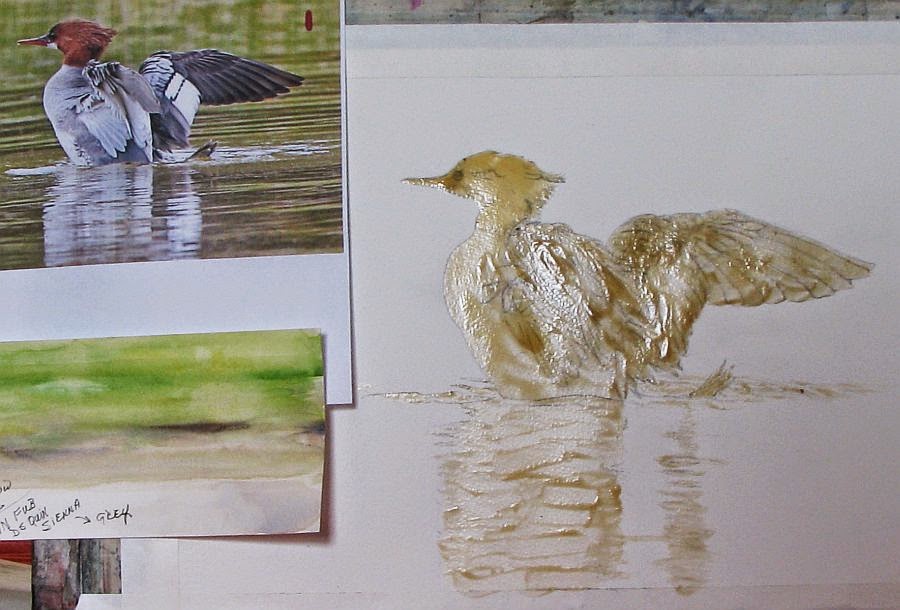
Merganser ~ WIP 2


I'm posting an update on my merganser. I will admit, I was dragging my feet on this. All those feathers! Somehow it's coming together even though I lost a lot of my drawing when I removed the masking and (as usual) I didn't take the time to redraw what was lost before beginning to paint. Patience was never one of my virtues and it's bit me in the rear end more than once. I'm calling this duck done. Now all that is left is the reflections in the water.

My palette is limited. I used W/N FUB and DS Quin. Sienna for my greys, browns and blacks. The water is W/N Sap green and D/R Indian yellow. I toned down the chroma of the Sap green with a little Quin Sienna in some areas.

Monday, March 24, 2014

Experiment ~ acrylic gesso and gloss gel medium on matboard


...and finished with Ranger alcohol ink. I've wanted to give this a try to see if it would work and I'd say it was successful. I used a dried bloom of a large ornamental grass and embedded it with Liquitex acrylic gesso onto 3/16" white matboard. I've done this before with dried oak leaves (link) . I then gave it a coat of Liquitex Gloss Gel medium diluted with a little water. When that was dry I rubbed walnut ink over the entire surface and wiped away the excess. The walnut ink ran into all the nooks and crannies and gave the piece an antiqued look. I could've stopped there but I wanted to see how Ranger ink behaved on the gloss medium so when that was dry I gave this another light coat of gloss medium. It served to preserve the effects of the walnut ink and gave me a slick surface to apply the alcohol ink. Then I added the ink and found it moved well on the gloss surface. I had a bit more control than on Yupo but the effects were basically the same. I used Ranger's Caramel, Clover and Copper mixative.

Saturday, March 22, 2014

Merganser ~ drawing


I may have been silent for awhile but I have been working on a few projects. One project is an experiment and is still in the works. I'll be posting about that in the near future. I did get this drawing of a merganzer duck completed and it's ready for transfer to working paper. I will probably be using watercolor to complete this one.

I'll never forget the moment I saw my first merganser. It was a very large female with her brood of 10-12 duckings. She was resting on a large flat boulder near the shoreline of Lake Michigan, her babies scurrying all around her. Mergansers have a impressive auburn 'DA' on their heads and I thought she was the most amazing duck I had ever seen. I can only hope to do this duck justice with paint.

Note: My reference photo is courtesy of Sandy Witvoet, an avid birdwatcher and fellow gardener. Sandy has a Michigan birding site, complete with interactive forum. If you are interested in joining or would just love to see all the incredible photos on the site, please check out Michigan Birding Network .

Sunday, March 09, 2014

Mr Doob Crows


I'm feeling much better but my time away from my art has left me searching for renewed inspiration. I've browsed my photo files but found nothing that excites me so today I played with Mr Doob. The weather here in northern Michigan has begun to shift from arctic tundra conditions to something near normal and it's brought out a flock of crows which I've enjoyed sketching. My sketches are crude so I decided to try my hand at some digi art. For those not familiar with Mr Doob (link) it's a free digital art program that tests not only your drawing skills but your skills at maneuvering a computer mouse as well. If you follow the link I provided, click on the color wheel icon on the menu at the top of the page to use the sketching features. I did put the top image into GIMP photo editing program to 'feather out' the feathers.

Sunday, March 02, 2014

A Cemetery Mink


Sometimes I don't feel like making happy, beautiful art. Sometimes it's fun to explore something a little darker in nature. For some odd reason I've had a quote from an unknown author running through my head lately and at the time I first read it, it evoked a visceral reaction that has stayed with me long afterward. It's from the book 'Silence of the Lambs' by Thomas Harris and although it was printed in italic(making the reader assume it's a quote) no author has been named. How delightfully mysterious. In context, it appeared as an errant thought/reaction FBI agent Clarice Starling, the heroine, had when observing the villain, Dr. Hannibal Lector during one of their encounters:

He's a cemetery mink. He lives down in a ribcage in the dry leaves of a heart.

How deliciously creepy! For all the descriptive passages I read regarding Dr. Lector, this quote made me truly feel the character. I thought of a black mink that had made a home by burrowing into an old grave and setting up home in a cage of rib bones, cushioned by rotting funeral garb. Makes perfect sense to a mink...right? As an analogy to a man though...well, it speaks volumes toward this character's 'creep factor'. But anyone that has read this book or seen the movie already knows 'creep' doesn't begin to describe Lector. One aside: I took a good friend to this movie when it first came out in a local theater. To this day I don't think she's forgiven me.

Wednesday, February 19, 2014

Need Spring!


Sorry I haven't been updating my blog lately. I've been battling lung issues for the better part of a month. Add to that, my doctor of almost 50 years retired the end of December so I've been shlepping myself to Urgent Care for treatment. Today I finally saw a new practitioner and will see my new official Dr. in March. I don't think I'm going to feel better until Spring, to tell the truth. Winter is always hard on my breathing and this year it's been worse than usual so I haven't been painting. I did find a photo I took last Spring of my weeping cherry tree so I thought I'd share it.

Wednesday, February 05, 2014

Garlic ~ thumbnail sketches


I've been on a bit of a hiatus. This winter has been rough on my lungs and I really haven't been in a very creative mood as a result. I finally bucked up and drew these simple thumbnail sketches the other night. I'm thinking of a small, garlic themed series. I've painted a garlic braid (ristra) before but I've never painted the scapes. When the scapes first appeared in my garlic patch I was quite enamored with them. For those that aren't familiar, they are the stems and flower buds of hardneck garlic and they look like graceful, long necked birds. They appear almost overnight and begin to coil around in the most amazing way. I haven't decided what medium I'd like to use yet. I'm thinking pen and wash. 

BTW, I'm happy to report the client loved the portrait (JUGGS). Yes! I found out later that this is his 40th anniversary gift to his wife. And here I thought it was for Valentines Day. I'm kinda glad I found out about the anniversary after the fact. It would've added that much more pressure.      

Monday, January 20, 2014

JUGGS ~ complete


It's finished! I fixed all the boo-boos and did a little clean up overall. The designs on the ladies' sweaters look more snowflake-y thanks to the Ranger alcohol mixatives and it's time to walk away. Put down my brushes and just walk-a-way. It is what it is and hopefully my client will like the results.

Sunday, January 19, 2014

JUGGS ~ WIP 3


This commission has taken over all my studio time. If I'm not tweaking it, I'm looking at it scanning for problems, adjusting values....the list goes on. After taking such care to not drop paint where it doesn't belong I still managed to put a red smudge on the BG. I can take care of that with a little white gouache fortunately. Last night I thought I finally had this where I wanted it but this morning I noticed a bit of black that has crept up onto the jawline of one of the women. Ok, it didn't creep. I accidentally put it there. And while this is going on, in the back of my mind, I'm thinking "This is a gift from a man to his wife. I know I'll never see her through his eyes. What if he hates this?!" I don't know how portrait artists do this sort of thing! Somehow I'm going to have to correct the jawline and then there are the snowflake details on the red sweaters to contend with and those I will deal with by using alcohol ink. I did a few test samples with the Ranger Pearl, gold and silver mixatives. I can add detail with the inks that pearlescent watercolors could never handle. They would disturb the red pigment and make quite a mess of things. BTW, sorry for the poor quality image. It's so gloomy here I can't get a decent photo, even with flash.

Sunday, January 12, 2014

JUGGS ~ WIP 2


Update: I've completed the background and started on the clothing. I used DS Payne's Grey mixed with FUB for the BG. Then I sprinkled on some table salt to create 'snowflakes'. I wasn't sure how much soaking the illustration board could handle so it was a heart pounding moment but it held up very well. I had discussed changing the BG with my client over the phone. The photo showed a Christmas tree, a fireplace...the list goes on. Too busy. Because I had been told the women meet at Christmastime I suggested a simple wintery, snow effect and he thought that sounded good. As it turns out it was the right decision.

I'm using Neutral tint mixed with the BG colors for the black vests, Perylene Maroon mixed with Pyrrol Red for the sweaters. The red mixture makes a nice, rich crimson. For the shadows I'm using more Neutral tint, then glazing over with the red mixture. Watercolor can be moved and pushed around on the plate finish fairly easy which is making my job easier, too.

Friday, January 10, 2014

JUGGS ~ WIP 1


I finally started painting this two days ago. I had to make some sketch revisions because the scanned image I'm using as reference isn't the best and it prints out even worse. It's times like this I wish I had a laptop I could mount within view. I've completed the faces and feel I've achieved a fair likeness of each lady. One face gave me a few fits but some faces are more complicated than others. It's too late and too dark now to continue so I'll wait until tomorrow. I don't trust myself to mix colors in the evening even though I have a daylight lamp. That will give me a day to decide if I want to tackle the background next or start work on the clothing.

Friday, January 03, 2014

JUGGS ~ a commission


Just before Christmas I received a call from the gallery. Apparently a fella saw my Red Hat lady paintings and wants a portrait painted in the same style. His wife has three close girlfriends and they have formed a group called 'Just Us Gorgeous Gals' aka JUGGS. I love it! They usually meet at Christmastime every year (from what I understand) and he provided a few photos I could use as reference. Not the best images but I think I can work with one of them. I've just finished the drawing and my Strathmore 500 plate illustration board arrived today. It's not something I usually keep on hand but it's great for portraits. The colors stay vibrant, similar to watercolor on Yupo only you have much more control of the paint. It's also great for fine detail work.

Tuesday, December 31, 2013

HAPPY NEW YEAR, EVERYONE!


I love to post animated fireworks each New Years Eve but I could find nothing this year on the 'net that wouldn't give my visitors and myself seizures so I went with this lovely wallpaper. I want to thank everyone for supporting me and my art this past year. You are the juice that keeps me going. Thank you!

Tuesday, December 24, 2013

Wednesday, December 18, 2013

A Faux Batik Xmas


Occasionally I will paint individual cards for Xmas. I find them labor intensive so I have to be in the mood and this year I'm in the mood. I decided to stick with my alcohol ink batik technique for a welcome change. These are not folding cards so I've used Yupo as my backing substrate. I'll be writing my message on the back of each card with Micron pen so they will need a coat of Krylon spray varnish to eliminate any smearing. I could not find my white fluid acrylic paint to create the snowy candy canes so I used White-out. It worked great but I had a devil of a time washing it out of my spatter brush. Here are a couple of my faves.

Friday, December 13, 2013

Pecking Order ~ complete


I mounted this on 144# Yupo two days ago but had to wait to get a photograph. The weather finally broke long enough to allow me to capture a decent photo of this piece. I took it outside today on a bright hazy, 5 degree F day...perfect for photographing art. Well, the temp wasn't perfect but tolerable and the lighting couldn't have been better. I added a digital 'frame' with my photo editor. The final dimensions are approx. 11" x 18". Hope you like!

Note: My photo reference was courtesy of Sharon Whitley on Paint My Photo.

Tuesday, December 10, 2013

Pecking Order ~ WIP 3


Sorry for yet another bad image. Between our dark days and the shine of the alcohol inks I'm having a devil of a time photographing this piece. Suffice it to say, it looks a whole lot better IRL. I'm just about ready to mount this on Yupo and give it a few coats of varnish but I thought I'd post it at this stage to show how it looks before I work out the puffiness with a brayer. I like that quilted effect for some subjects but not this one. I'll be using Mod Podge to adhere it to the Yupo. Mod Podge works very well because it stays tacky long enough to make adjustments before it dries.

I just noticed I may have missed a toe on one of the roosters. I also have a few areas that need to be lifted (colors that bled or accidently landed in the wrong spot). Hopefully I'll be able to take care of that with a Q-tip and blending solution.

Sunday, December 08, 2013

Pecking Order ~ WIP 2

With flash
Without flash

I'm trying to spend just a few hours at a time working on this to avoid breathing too many fumes but it's really difficult when I get in the zone. I've got the chickens finished but it's hard to tell from these images. I tried photographing twice, once with and once without flash and got varying results, neither of which turned out well. I used Ranger's Pearl mixative on the white chickens and the flash lit the ink up like crazy because this particular ink contains iridescent particles. Without flash the painting looks dull but the quilted effect from the waxed paper is less apparent. I decided I'm going to post both images because with all these gloomy days(and no sun predicted in the foreseeable future) I doubt I'll be able to do better before the painting is done.

Saturday, December 07, 2013

Pecking Order ~ WIP 1


'Pecking Order' is my working title for now. At least until I can come up with something better. My photo reference came from Sharon Whitley on PMP. This will be the largest faux batik I've done to date. I don't have the final measurements but will post them later. I took a quick photo when the clouds tried to part for a moment but the image could be better.

Instead of India ink I've used walnut ink to prime my waxed paper before applying the alcohol inks. Walnut ink tones the entire surface a nice shade of sepia and I love that look for certain subjects. FYI, for anyone that wants to try my faux batik technique , any shade of India type ink can be used. Because there is so much small detail in this drawing I taped my drawing directly under the waxed paper so all the lines would be visible, then added a layer of clear plastic wrap between the drawing and the waxed paper. There will be bleed through when the alcohol ink goes on and I wanted to protect my drawing. I've been battling lung issues more so than usual lately so I hope this comes together nicely and I tolerate the fumes well. We'll see.

Friday, November 15, 2013

'Sweet Tea' Goes Home


For those that follow my blog you may remember a challenging commission I took on last year titled 'Sweet Tea' . This past September the client was finally able to make the trip up north to take possession of the finished piece and I'm thrilled to report she was very happy with the results. Until then we had only communicated via phone and email so it was fun to have a true face to face with her and enjoy a good chat. Btw, this painting started life as 'Precious' but the sisters, who are all represented as children in the family portrait, actually held a title contest amongst themselves and it was changed to 'Sweet Tea'.

The painting was originally designed to hang in her Michigan home but because she and her husband winter in Florida they took it with them and she recently sent me photos of it framed and hanging in her Florida bedroom. What a nice surprise that the palette I chose goes so well with the southern décor, too! A few days ago I had a chance to talk to Marie, one of the eight sisters and an artist herself. (she's the one holding the paint brush in the painting) We had a wonderful chat and she also loves the painting. I'm awaiting the approval of only six more sisters.

Monday, November 11, 2013

Mighty Mack ~ complete


I finished this up yesterday but found myself futzing around with it today until I told myself to "stop it, Billie!" I can't say I'm not glad it's done, though. I will see straight lines in my nightmares probably for weeks.

I was really impressed with neutral tint while painting the bridge. The tower is mostly neutral tint and it created a lovely rich black that was easy to lift and move with a damp brush. Up until now I'd only used it to mix with various colors to lower their chroma without changing the hue. Now I know it can stand on it's own and do it well. It still came in handy to desaturate the 'orange blossom' in the lower left corner while still allowing it to glow. I think the painting truly came to life when I added the white gouache highlights to the suspension cables on the right. So here it is...my Mighty Mack, silhouetted against a stormy sky! I hope it looks as foreboding as it does IRL.                                            


Saturday, November 09, 2013

Mighty Mack ~ WIP 3


Latest update. I'm making progress slowly but surely. What I'm really glad about is the suspension cables. They don't look like writhing snakes(thankfully). I'm getting more confident with my brush strokes by working on this project, too. It's so dark and gloomy here I finally had to turn the lights on at 3:30pm so I took this photo with flash. Wow, does flash make every little flaw become glaring or what?! Anyhoo, I hope to have this completed in a few days. Does it look intimidating yet? I'm hoping ultimately to achieve 'foreboding'.
 

Wednesday, November 06, 2013

Mighty Mack ~ WIP 2


Sorry I've fallen off the grid for so long. It's been a tough month and I simply haven't felt like painting. I finally got back to this one a few days ago and I've been working on it a bit at a time. I must confess, all those straight lines are intimidating to me. I'm used to working with organic shapes and because I'm not confident creating such linear work I can feel my hand shaking the moment I pick up a brush. This is how a yardstick and watercolor pencils have become my new best friends.

I created the stormy sky with a mop brush, straight Ivory Black watercolor and lots of water. I didn't mix my own black on purpose because I wanted to blend the cadmium yellow portion of my sky into the storm clouds and didn't want to chance accidently producing some funky secondary colors. It can happen...trust me. I used an Ivory Black watercolor pencil to add the suspension cables. I haven't smoothed out the watercolor pencil lines with water yet but that will come next. I'm using neutral tint to rough in the shadows which still need more depth and of course, the tower structure needs paint as well. I plan to use white gouache to add highlights to the cables and I still have to find a fairly accurate match to the blue of the guard rails. The final hurdle will be recreating the lens flare on the top left of the tower.

Tuesday, October 29, 2013

Gizmo ~ 1995-2013


Yesterday I lost my last kitty, Gizmo to old age and illness and the house feels so strange now. No little furry 'people' to welcome me home and cuddle with me at night. I'm cat-less after almost 20 years and it's going to take me some time to get used to this new situation. I've only begun to grieve and I know it hasn't fully sunk in yet. I'm still stepping over food and water dishes that are no longer there and looking down when I'm cooking to make sure I don't step on the tails of little 'beggars' looking for a snack.

Gizmo was the youngest and the last to join my feline family. When I first saw her she was all huge eyes and big ears peering out of a little black ball of frizzy fur. We named her Gizmo after the Mowgli in the movie Gremlins because she looked so much like that character. She was shy, skittish, very sweet and that girl was quick on her feet! None of the other cats stood a chance of catching her if she didn't want to be caught. My Raven wasn't too happy about Gizmo coming to live with us but the two girls struck an uneasy peace over the years. Digby was more accepting and Gizmo adored him. When they were about a year old the grizzled old tomcat that lived several doors down came lurking and had cornered Digby on my porch, growling with mayhem on his mind. I heard the commotion and went to see what was happening. Digby was terrified and I wasn't sure quite what to do. Suddenly I saw a little black blur come from the back of the porch and Gizmo landed squarely on the old tomcat's back. The tomcat was as surprised as I was and he took off, squeezing through the porch railings and getting stuck in the process. That old tomcat left a lot of fur behind by the time he freed himself but he never came near my yard again...ever. Digby was left unscathed and Gizmo was the hero of the day. It was doubly surprising because Gizmo was normally so timid and I think she even surprised herself! I'm really gonna miss that little girl.
  

Monday, October 14, 2013

My Mighty Mac ~ sketch

The sketch
I'm not sure how much detail I will include
 in the final painting. Better to have more detail
available than I will need than not enough. I can
edit easier than add. Notice I lowered the horizon
line in the background in the lower left.
Cecile Graven made that suggestion & I think it works. 
This is the altered image enlarged to 15" x 23".
 Notice the dark area in the upper right(storm clouds?)
 I love the lens flare in the upper left and the brilliant
patches of light which creates a stark contrast to the
silhouette of the tower.

I've been monkeying around with this since my last post. I decided to enlarge the altered image and use that for my drawing. It didn't yield a lot of visual info regarding many details so I had to wing those myself. The enlarged drawing is approx. 15" x 23" but I'd like to take it up to 22" x 33". I sent an email to Framing4Artists requesting a quote on a custom Masonite panel with a cradle depth of 1 1/2" and the price was reasonable considering the cost of matting and framing a piece that size if done on paper. I've never worked on panel before so this would be a new experience for me. It will have to be primed with painters gesso and sanded. Not sure if that's doable for a winter project because I don't have a basement or other appropriate workspace. For now I plan to practice on w/c paper at the current size to get ideas for the final painting on panel.

Btw, one thing the enlarged altered image did provide was an idea for the background. When it printed out the sky in the upper right corner looked like dark storm clouds rolling in from the east and looking (appropriately) ominous. I think I'll also keep the lens flare on the left side of the tower. I like that effect!

Sunday, October 06, 2013

My Mighty Mac

After cropping the greyscaled image I put it into GIMP photo editor
 and played with the perspective to create
 an exaggerated towering effect.
It makes me kind of dizzy looking at this image
 so I think I'm on the right track.
Here I've greyscaled the bridge and cropped the lower portion
The original image


I'm referring to the Mackinac Bridge located exactly 50 miles north of my home. When I was just a kid I loved it when my family traveled across this bridge. With my Dad at the wheel of our '47' Chevy, I would plant myself in the back window looking upward and watch with glee as we passed beneath the huge towers. As an adult this mighty bridge has become mighty scary to me. I'm not sure when this shift occurred. Maybe it was the first time I was allowed to be at the wheel when we crossed. Wind is a huge issue on this bridge and if you're going even a tiny bit too fast you will feel the awful sensation of hydroplaning. I remember feeling like the car wasn't responding the way it should and my instincts told me to speed up and get off the bridge as fast as possible which is absolutely the wrong reaction to the situation. And did I mention, I'm afraid of heights, too? It's taken me years to conquer a 6' ladder and now I'm 199' above a huge body of water with a car that feels like it could careen out of control at any moment. Yea, I think that's when my love affair with the Mighty Mac ended. I'm not alone in my fear either. According to this blogger it's listed as one of the 10 scariest bridges in the world.

To be fair, it's an amazingly beautiful bridge and not responsible for my phobias but my intention is to project my own visceral reactions via a painting of the Mighty Mac. I have one other phobia that I plan to draw upon to create that sense of loss of equilibrium/panic. I also have megalophobia. It's an irrational fear of large objects and, in my case it's a fear of certain gargantuan manmade structures. It only rears it's head when one or more of my other fears is also in play, ie. fear of heights. Julie Christiansen, a wonderful photographer, was kind enough to give me permission to use a few of her bridge photos to use as reference. This will be an ongoing work in progress. By that I mean on again, off again over the coming winter. The painting must be large to convey the emotions and sensations I hope to project.




Saturday, September 28, 2013

The Mushroom Houses


Today has been one of those amazing autumn days in northern Michigan when the sun is shining and the weather is unseasonably warm. The perfect day to go out and take photos and give the new camera a test run. I chose this opportunity to snap some shots of a few Earl Young 'mushroom houses'. Although many of the homes are surrounded by lots of trees and foliage, most are visible enough to get a sense of their unique architecture. Built from local stone and boulders, each house is also unique in it's own way. Mr. Young was often known for using green mortar when constructing his homes. It resembles moss growing between the stones which adds to the natural esthetic.  

Friday, September 27, 2013

Barnyard Gothic ~ faux batik on waxed paper


The CEO is back for an encore. This time he's painted as a faux batik on waxed paper. I replaced the India ink with walnut ink and it toned the waxed paper so well I didn't bother painting a background. I'm not sure where I got the title but it seemed to fit somehow. Maybe because the walnut ink lends an antique affect to the painting.