Translate

Saturday, July 30, 2011

Garlic Braid ~ Complete


I just finished this a moment ago and wanted to post it so I could check for problem areas and make tweaks if necessary.

The braid and the loose stem tops were painted with DS Undersea green, burnt umber, raw umber, a little violet I mixed up with Crimson lake and mauve and various greys I made from palette muck. I removed the drawing gum and finished off the roots with a mix of mauve and burnt umber. The twine is also palette muck grey. I'm not going to do a background. I like this as just a simple vignette. I even left the Fabriano mfg. mark clearly visible which I've never done before. It seemed to work with this painting as part of the composition.

P.S. This is my first painting done entirely from life. Working from life has it's challenges but I enjoyed it much more than anticipated.

Friday, July 29, 2011

Garlic Braid ~ WIP 2


Quick update: I'm happy with the garlic bulbs at this point and am getting ready to start on the braided stems. I used a mixture of blues as my under painting, then glazed over that with a mix of mauve and burnt umber. I want to bring in some DS Undersea green where ever it will work. This needs some green, IMO.

I don't usually paint still life and rarely from life. I normally work from photos. This is certainly a new experience for me. I'm anxious to see if painting from life really makes that much difference in the final result.

Thursday, July 28, 2011

Garlic Braid ~ WIP

Just starting to add color. So far my palette consists of cerulean blue, phthalo blue, raw umber, mauve & a tiny bit of crimson lake. I used a little Pebeo drawing gum to mask the roots of the garlic beforehand.

My sketch

Braided softneck garlic hanging on my studio door knob over my painting smock

mid-July 2011~almost ready to harvest

I've been the moderator of a garden forum devoted entirely to Michigan gardeners for the past several years. In recent years the forum has seen more and more experienced vegetable gardeners join and I've learned so much from them. Being primarily a flower gardener I didn't know much about veggie gardening but these members got me fired up.

One member is a connoisseur of garlic and an expert at growing his own. He graciously offered to share a few bulbs from his private stock with me for planting. Since I had already planned to convert one of my flower beds into an edible garden I started with his garlic. It's easy to grow...peel and break apart the bulb, plant the largest cloves in the Fall and by the following July you have a lovely crop of the pungent bulbs. There's a bit more involved but not much.

After the bulbs were harvested and cured I made my first garlic braid and decided it was a worthy subject for a painting.

Tuesday, July 26, 2011

Photos From the Moon Garden ~ 2011


Last year I began refurbishing my Moon garden as it has been in need of some extra TLC for a few years. For those who have never heard of a Moon garden it's a type of theme garden devoted primarily to white flowering and/or night blooming plants, vines, etc. The aglaya daisies are especially beautiful this year and I've added a new variety of Asiatic lily called Eyeliner. Today I snapped a few photos I'd like to share with my followers and visitors.

Monday, July 25, 2011

Time to Loosen Up...again


My creative juices haven't been flowing in great abundance this year and I've noticed that I'm falling backwards in terms of painting style. I'm painting tighter and tighter and enjoying it less and less. I've never striven to achieve photorealism with watercolor because I simply don't have the patience it requires or the desire to try and tame this medium. I chose watercolor because of it's unpredictability but old habits die hard it seems.

Yesterday I cut a little bunch of Houttuynia cordata, 'Chameleon' (nicknamed 'Hot Tuna' by some gardeners) out of one of my flower beds and brought it in to pose for me. This plant is a great little ground cover if kept under control and serves to brighten up my flower beds when nothing is blooming. Apparently it's grown as an edible in China and Vietnam(according to Wiki) and has a slightly fishy taste so it's aka 'fish mint'. I just tasted a leaf and it reminds me of the white fish with citrus beurre blanc I had for lunch this past Saturday. (BTW, that's not a compliment to the taste of houttuynia)

Thursday, July 21, 2011

Fraise Des Boise ~ Complete


SOLD

Done! I decided the red of the berries was enough to break up all the green. I was afraid adding burnt sienna would 'muddy up the waters'.

This is fairly small...10" x 7". To complete the berries I did an underpainting using indigo mixed with a little crimson lake to indicate the shadows and create volume, then finished with a few washes of crimson lake to get that strawberry red color. There's probably more I could do to this but it's time to set it aside. I'll get it back out in a few weeks or months and if I still like the way it looks it'll be 'officially done'.

Wednesday, July 20, 2011

Fraise Des Boise ~ WIP 2


Quick update: I just removed the frisket film and am wondering if there's way too much green going on here. I'm not sure the few red berries left to paint will pull this one out of a dive. I'm posting this as much for myself as for my visitors to better spot any problem areas before continuing. I may add some burnt sienna to some of the leaves just to break the green up further.

Tuesday, July 19, 2011

Fraise Des Boise ~ WIP 1


Still today I had no idea how I wanted to go about painting this or what palette I wanted to use so I started by covering the blossoms and berries with frisket film to protect them. Then I began with a light overall wash of D/R Vivid green. I've added various greens I mixed up using indigo, Indian yellow, and perm. yellow to define the leaves. I also started working on some areas of the background and dropped in some WN Quin. gold while the paper was still wet to add interest and break up all that green.

Note:
I prefer Windsor Newton's Quin. gold to Da Vinci's because it's not so orange.

I scattered some salt in the viewer's upper left corner for effect but fear I may have over-done it. I plan to darken that corner later so I can tone it down then. Forgot to mention....I'm using #140 Fabriano Uno w/c paper.

Sunday, July 17, 2011

Fraise Des Boise ~ Study

After adjustments to composition. I added an extra berry toward the center and got rid of unnecessary detail.

After applying edge detection

Original photo

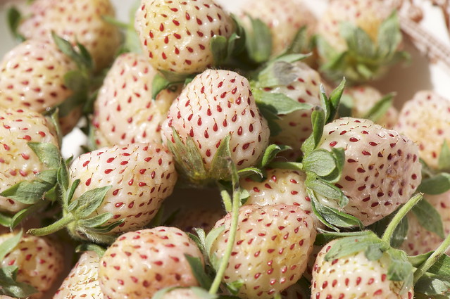
I've grown fraise des boise aka wild French strawberries aka alpine strawberries in my flower beds for years. I grow both a red and a white variety. Originally I planted them simply for ornamental purposes but discovered the tiny berries these plants produce (no bigger than an average person's thumbnail) all summer long have the most amazingly intense strawberry flavor.

This Spring I took a few photos when they were starting to set flower and a few baby strawberries were beginning to appear. Yesterday I decided to use the fraise des boise as a subject for a painting. I selected one of those photos and to save time applied edge detection to it in my photo editor, converted the altered image to negative and printed out a copy. Then I used pencil to make adjustments to the composition. I'm not sure how detailed I want to go with this one yet but better to have too much information than not enough.

Saturday, July 16, 2011

New Look For ArtByCrain Blog

My blog needed a facelift so I'm experimenting with Bloggers new templates, colors, etc. Warning: Be prepared to see some changes over the next few days.

Tuesday, July 12, 2011

Bearded Iris ~ Complete


This is one of those paintings that I could fiddle away at for days and days but I think it's time to call it done. It's already slightly overworked for my taste. Iris 'Chasing Rainbows' lived up to it's name. I think I used almost every color on my palette save for red.

Saturday, July 09, 2011

Bearded Iris ~ Update

After adding the background which defines the outer shape of the flower.

Here I've gone as far as I could before adding a background.

I finally knuckled down and got back to work on this one. I seem to have no self discipline this summer and it's not like I'm crazy busy either.

I worked some more on the standards (upper petals) of the flower, painted the bud and then wasn't quite sure what I wanted to do with the background. I settled on a mixture of Indathrene blue and Indigo with a dash of Indian yellow. I dropped in some extra Indian yellow and perm. yellow while the paint was still wet to break up all that dark green. I also spritzed the background with plain water to add a little more interest. Since the flower is so busy I wanted to avoid creating a busy background. More work to be done on the flower but I'm in the home stretch now.

Monday, July 04, 2011

Bearded Iris ~ WIP 1


The Iris Farm
5385 E. Traverse Hwy
Traverse City , MI 49684

After attempting to paint another landscape and failing miserably (several times) I lost my momentum. It happens. I hate when it happens but it happens. I always feel better when I have something on my easel and after just so long I was ready to paint anything just to get my brushes wet again. I found some photos from 2006 I had taken at the Iris Farm, six acres of prime farm land devoted entirely to just about any variety of bearded iris one can imagine. The farm belongs to William Alpers of Traverse City, Michigan and when the irises are blooming it's a sight to behold.

I chose a photo of bearded iris, 'Chasing Rainbows' as my subject. I love all the colors in the falls(side petals) and the deep ruffling. I hope I can do it justice.

Friday, June 17, 2011

Landscape #2 ~ Complete


Here I attempted to highlight the shapes I saw when looking at the reference photo. The obvious focal point in this painting is the area of paper left white in the small rectangle, center of image.

I just finished this one. It's loosey, juicy and kinda messy but I wasn't planning on offering it for sale so it doesn't matter. I think this has potential as a do-over. I like the composition and the colors. I switched to the quill of a feather for some of the fine branches, did the rest with the squirrel quill brush. Bit of a sloppy job but I'm not concerned in this case. Colors and color placement are so important to a landscape but composition even more so. Where the various values are placed is critical, too. At completion it's all got to make some sort of sense no matter how creative I wish to be. I operate primarily on instinct being self taught so if it looks 'right' I just go with it.

Thursday, June 16, 2011

Landscape #2 ~ WIP 1


Marilyn Campbell posted this photo of a beautiful wooded scene with a stream flowing through on Paint My Photo and I thought it looked like a perfect reference for my next landscape. I liked the composition, the range of values and the colors grabbed my eye. I'm posting my first update so I have a record of my progress. I'm working on a quarter sheet of Arches #140 CP paper with various brands of transparent watercolor and only a #2 squirrel quill. The purpose of using just the quill is to prevent me from adding unnecessary details. I want to keep this as loose and spontaneous as possible.

Sunday, June 12, 2011

Learning to Paint a Landscape (skyscape?)

Original image

Tweak #1 (I ramped up the contrast)

Tweak #2 (Looks like a dust storm)

Tweak# 3 (Tornado skies. I can almost hear the warning sirens when I look at this)

I have never produced a landscape painting to my satisfaction...ever. Why this subject seems so difficult for me is a mystery but I've made it my goal this summer to tackle the beast. My interest in the genre was recently rekindled when I received the latest issue of Watercolor Artist and was pleased to see one of Z. L. Feng's landscapes featured on the cover. I absolutely love his landscape paintings, especially how he handles foliage and his use of color. I have a link to his website on my link list if anyone is interested. I suggest you take the time to check out his work. You won't be sorry.

I also received an email notice for the June challenge on Paint My Photo website. This month the subject is skies. The rules...any medium may be used but the sky must take up 3/4 of the total painting. Landscapes that are mostly sky can be very dramatic and exciting so I threw together a little sketch and gave it a whirl. I did spend time online looking at cloud formations prior to starting which helped but I couldn't find a reference photo I liked so this attempt is from imagination. I worked wet into wet with a leftover mixture of indigo, Quin. violet and Payne's grey, then floated in some white gouache and a little raw umber to create a stormy sky. I'm fairly happy with my cloud work. It's the stuff on the ground where I seem to stumble. Overall though, not bad for a start. I did play in my photo editor with the original image to see what other effects I could produce.

Sunday, June 05, 2011

Dragonflies on Canvas~Complete


I've sure had fun with this one. I finished up the dragonflies yesterday but today thought it needed a little something else. I've had a 'thing' for metallics lately so I got out my gold Zig Painty and went to town.

Wednesday, June 01, 2011

Dragonflies on Canvas~WIP

This project seems to defy photographing. Everywhere light strikes an area of high texture it shows up as a white spot and the colors are nowhere near as garish as they appear but I did my best.

Jerry's Artarama ran a sale not long ago on pre-stretched, pre-primed canvases so I bought six 9" x 12" canvases with the intention of mounting and varnishing some of my watercolor paintings on them. There they sat, in the box they came in because I have no supplies to complete the job. A few days ago I decided to try my hand at coating one of these canvases with gesso and painting something with fluid acrylics. I protected my main subjects (the dragonflies) with masking fluid and just started painting...mostly amorphous, vaguely leaf and grass-like shapes and applying color with no thought of realism or 'sense' to placement of color. I'm ready now to remove the masking and complete the 'flies.

Sunday, May 29, 2011

Cherry Blossom Time~Complete ?


I wanted to keep the background fairly simple but wasn't sure how dark I wanted to go so I compromised by doing a little half and half. I used DS perylene green and Vivid green. I'm wondering if I should bring a little of the green into the flowers, possibly on the sepals to make them mesh better with the overall painting.

Friday, May 27, 2011

It's Cherry Blossom Time~WIP


...for my weeping cherry tree. It's been in bloom for over a week now and is still loaded with blossoms despite some recent windy weather. The blossoms make me think of those old time swing skirts with crinoline petticoats underneath. When the pendulous flowers sway in the breeze they look as if they are ladies dancing.

I decided to skip the sketch, go right for the paint & brushes and hope for the best. I'm using only DV cobalt blue deep, DV perm. rose and D/R Vivid green. Vivid green contains so much yellow I might as well be working with three primaries and they all combine to create enough variations in color for this project. I really do love working with a limited palette.

Tuesday, May 24, 2011

Pink Lady Slippers~experiment continues


Closeup 1

Closeup 2

I've been playing around with this painting, trying to see what effects would make this pop more. I toned down the red-violet in the background with some DS Iridescent blue, then added metallic gold ink. I used an oil based gold Zig Painty pen to outline areas of the flowers, leaves and stems, then applied some metallic gold ink from a stamp pad by tapping it through nylon window screening with an old brush trimmed flat to use as a stencil brush. I think it looks kinda cool!

Sunday, May 22, 2011

Pink Lady Slippers~WIP 2

Cropped


I'm still considering this a work in progress even though it looks completed albeit kinda sloppy. I want to experiment further with it to see what effects I can continue to create. I tried various mixtures of greens (both cool and warm), making different marks with the brush, working wet into wet, wet into dry, spraying, etc. I'm wondering if acrylic inks would give me more vibrant colors, possibly using a mixture of both watercolor and ink to achieve the look I'm after. I'd also love to get some metallics into picture.

Friday, May 20, 2011

Pink Lady Slippers~WIP 1


I had a drawing all set to go, then decided after seeing a dyed silk piece that inspired me to such a degree as to send me in a whole new direction. I have no idea if this will turn out well nor do I care at the moment. I loved the effect of the dyed silk painting so much I'd like to try and create roughly the same effect with watercolor on paper. I know it's going to take some experimenting and I also know I'm going to have some failures. I'm currently working on Arches #140 CP w/c paper but I may switch over to hotpress paper if I don't like the outcome. I did do a quickie sketch to get things started but I want to keep this fairly loose and spontaneous for the first go.

Sunday, May 15, 2011

Lucy & Ethel Revisited

I felt Lucy & Ethel looked a bit drab so I got to work with some magenta, Quin. gold and gouache. I created this panorama for comparison. The 'after' is on the left.

It's been ages since I've failed to update my blog for over a month so apologies to my followers and visitors. April shot by like a comet it seems and other things got in the way of painting. I did manage to ready some pieces for the gallery and get them delivered. I also took time to pull some older paintings and look them over. I thought Lucy & Ethel needed a facelift but fear I may have tweaked them to death, always a danger when revisiting a painting. At this point I'm just plain tired of looking at them so I've begun another drawing for a new piece. I hope to spend more time painting in May. I just have to get the momentum going again.

Monday, April 11, 2011

Moo.com Greeting Cards~Product Review


I was saddened to discover Imagekind no longer offers greeting cards so I decided to try Moo.com . I received my first order today and am pleased to report the quality is excellent. All pertinent information regarding the paper quality, dimensions of the cards, etc. is readily available on the site however I'd like to add my own list of pros and cons:

Pros
  • Quality of the images on the cards is excellent, colors true to life.
  • Each card comes with a standard white envelope or you can chose from an alternative assortment at extra cost.
  • Images are easily uploaded to the site, extra large files are not required.
  • Moo offers an image editing and preview feature so the customer has more control over any cropping that may occur.
  • Regular cost is very reasonable. Moo.com is currently running a 25% off sale on all printed products which unfortunately ends today.
  • Moo requires a minimum order of 25 cards but the customer can include more than one image in the 25 cards.
  • Moo allows the customer to remove their logo from the back of the cards and replace it with their own or any text or image they chose.
  • Customer service is great. I emailed Moo twice with questions and they got back to me in a very timely manner.
_________________________Cons________________________
  • The cards are an odd size, smaller than a standard 5" x 7" greeting card and slightly larger than a notecard. I like to present my cards in an acetate sleeve and was unable to find a sleeve that would fit these cards correctly. I had to order 5" x 7" sleeves from another source and will have to make some adjustments with tape.
  • When creating your cards using multiple images per batch of 25 it's not possible to edit the back of each card so including separate titles for each image is not possible.

Sunday, April 10, 2011

Julie's Morels~Complete

I just completed this and I'm pretty happy with the outcome. I stayed with my original palette and continued to play until I was satisfied. It's fairly easy to adjust color on gesso as the surface isn't terribly absorbent so lifting is easy. I'll probably wind up float mounting this in a black frame.

Saturday, April 09, 2011

Julie's Morels~WIP 1


Two things came together to inspire this piece..morel hunting season(soon to arrive here in northern Michigan) and an idea I recently hatched to embed leaves and grass in gesso to create texture. I love working on gesso with watercolor and I love lots of texture.

Julie Christianson is a fabulous local photographer and I've known her for many years. She had posted an image on Facebook of a morel she snapped, probably last hunting season. Since I can no longer traipse through the woods to hunt them myself I asked her if I could use some of her images as references and she generously obliged. For my visitors that have never heard of a morel mushroom I found this on Wiki: http://en.wikipedia.org/wiki/Morchella

I'm working on matboard, the size is small...roughly 5" x 7". I applied a light coat of Liquitex acrylic gesso to the board and used a palette knife to create some background texture. Then I coated dry leaves in gesso and applied them to the board while it was still wet. Today I added a second coat of gesso thinned with a little water and let that dry. Afterward I penciled in my mushrooms and protected them with masking fluid. My palette so far consists of DS Undersea green, DV raw umber, DS Quin gold deep and a little Prussian blue.

Friday, April 08, 2011

Peacock Orchids~Complete

SOLD

Finally(!)I'm calling this one done. I did manage to get a better photo of it today but I'm still not entirely happy with the shot. I seem to have problems photographing larger paintings. Not sure why either. Maybe 8 mega pixels isn't enough to capture small details at a greater distance or I need to experiment with the settings. Subtle shading on the white petals was also lost. I'll try to get some closeups to post after my camera batteries recharge.

Thursday, April 07, 2011

Spring Crocus


The first signs of life in the garden after a looong Michigan winter are the early Spring crocuses. Of course I'm always inspired to rush out and photograph them. Usually they tend to form clusters but today I was struck by one crocus that stood alone. I could see another just breaking ground at it's base but that one lone crocus was already standing straight and proud, petals open wide to the sun. I half expected to hear it shouting "Ta DA!".

Wednesday, April 06, 2011

Peacock Orchids~WIP 3

The actual painting isn't as blue as it appears here but I could not adjust the color accurately in my photo editor. The next bright overcast day we have I'll try to get a better image to post.

I started this painting back in October of last year. It's the one and only full sheet painting I've attempted. I had set it aside for reasons I can't recall at the moment and it's time to complete it. I detest leaving things unfinished and thought it would haunt me but it didn't. Now I know why...all those tiddly little leaves in the foreground. Patience is not one of my virtues however once I started working on them it became a Zhen exercise of sorts and not as laborious as expected.

I'm working primarily in DV fluid acrylics. The green is a mixture of Hookers green and Indigo. Once I'm satisfied with the foliage I'll apply a watercolor wash of DS Vivid green over the entire area to blend it with the background. The little spiky flowers still need attention and I'm sure I'll be tweaking other areas before calling it complete.