Translate

Monday, July 14, 2014

Miss Willmott ~ WIP 1


Yesterday I managed to transfer my drawing to working paper, in this case Arches 140# CP paper. I laid in some background color and today I started work on the flowers. It's difficult to get certain colors to appear correctly because they are so neutral. In fact, when I tried to scan my color study the scanner read it as a black & white photo so I had to photograph it. When completed, this painting will be approx. 21" x 9". Sorry the painting is photographed in pieces. I was too lazy to set up my easel and do a proper job of it.  

Saturday, July 12, 2014

Miss Willmott ~ color study

The final
First layer


This is the palette I have in mind. Very neutral colors with a decent range of values. I'm questioning my choice of a 'pop' color, which is Quin. violet, but it looks better IRL. I'm also using some negative painting on this sample. It's a much softer look. I am reminding myself along the way that white doesn't have to be truly white to appear that way. So far my main color choices are cerulean blue, permanent yellow and perylene green...all neutralized with either DS Moonglow or neutral tint.

Friday, July 11, 2014

Miss Willmott ~ sketch completed

A little confusion in the center but you get the general idea

Part deux

I completed the second half of my sketch and put the two together in a panorama using Irfanview. I used scanned images and, without the aid of Photoshop, I did the best I could to merge the two drawings. Not an exact match but I did my best. I have a palette in mind but I want to do a few color studies before committing to a larger painting.

Thursday, July 10, 2014

Miss Willmott ~ pencil sketch


Inspired by Miss Willmott, I drew up this sketch while watching another rerun of Jaws on the telly this afternoon. I'd like to paint this in a long(wide), narrow format so I need to sketch more blooms. I just ran out of space on my paper. To be continued on another sheet.......

Wednesday, July 09, 2014

Miss Willmott's Ghost Blooms Again


This has become an annual event in my moon garden. Miss Willmott's Ghost(eryngium giganteum) aka Giant White Sea Holly is a biannual plant that, once she matures enough to bloom, dies afterward but she's a prolific self seeder. This has been a stellar year with not one but six plants reaching maturity. The tallest are almost 3' high with many flower bracts. I hope to get more photos of her before she kicks the proverbial bucket. One plant has popped up in the middle of my Golden Tiara hosta, another in my August Moon hosta, and there's no digging her out without causing major harm to the hostas. Miss Willmott has a very deep and tough taproot. I may have to take some cuttings. I just harvested about 20 garlic scapes and together, they might make an interesting a floral arrangement.   

Friday, July 04, 2014

Fancy Goldfish ~paper sculpt complete


I just put the finishing touches on this. I chose the warm palette because the coffee filters took on a yellowish appearance when the gloss medium was completely dry. I added two wooden beads I found for the eyes. The beads were red so I gave them a coat of Adirondack Pitch Black alcohol ink and glued them in place with Mod Podge. The entire piece is mostly Adirondack alcohol ink. I did add some DS Duochrome Hibiscus watercolor to the scales and DS Pearlescent Shimmer watercolor to the smaller fins. Painting on gel gloss medium is a unique experience. The watercolor pigments became permanent as soon as applied, which surprised me. I did have more control over the alcohol ink, though.

Wednesday, July 02, 2014

Fancy Goldfish ~ color study


Sorry for the delay with an update but I've been having fun trying out a few mediums on some trial samples. So far, I've tried Jacquard Lumiere acrylic, alcohol ink and watercolor and I'm still going. It's been an interesting (to say the least) education. I really should be more bold with my experiments! I've also tried out a couple of different palettes...some pinks and golds, some greens, blues and purples. Not all scanned well so I can't show them all and because I've used duochrome watercolor and some metallics, I doubt they would photograph much better. I've used blending solution, alcohol and water(applied w/spray bottles), rubbed and manipulated the inks and paints with a brush and my fingers...what's next? To my visitors...which palette appeals most? I'm open to opinions.

Monday, June 30, 2014

Fancy Goldfish ~ paper sculpt WIP 2


I've just completed the sculpting process. Yes! The head was formed using another coffee filter and the scales near the tail portion were created from printer paper with a hole punch. The scales on the forward area of the body were fashioned from 90# card stock using the same hole punch. I added another fin that drapes below the chin area using more printer paper. Now it's time to let things dry. The gel medium is still tacky and probably will be for a day or two. If we get the rain they're predicting it may take longer. In the meantime, I'm going to create a few sample sculpts so I can try out various palettes and mediums. 

Sunday, June 29, 2014

Fancy Gold Fish ~ paper sculpt WIP 1


I fell in love with a gorgeous fantail goldfish I saw online so I decided to use it has inspiration for my next attempt at paper sculpting. I had the brilliant (?) idea to use coffee filters for the long, flowing fins. I think it worked out fairly well but now I'm not sure how to tackle the body of the fish. This will take some more thought. I'm working on Yupo again, using gloss gel medium as my glue and sculpting medium. I did use facial tissue for the small side fins. I wanted them to appear more delicate.

I drew a simple sketch directly on the Yupo with pencil to guide me. I can still see the sketch through the layer of tracing paper I put down for my background (because I didn't want the background to be naked Yupo). That was a huge relief. Otherwise I would be flying blind.  

Friday, June 27, 2014

Blown Glass Rooster


I can't think of a title for this so I'll call it what it is....a glass rooster. It's a little tschotske that came from my parent's old house. I have no idea where they got it but it's a colorful little thing. I drew and painted this from life. I scanned the painting because it's small...roughly 5" x 9" so every little boo-boo shows up and the colors are a bit blown out. It was a fun exercise and I enjoyed getting my brushes wet again. I'll be on to another sculpted paper project tomorrow and it may take a few days before I have anything to show. I'll have to wait for each coat of gel medium to dry and I don't want to rush things. 

Saturday, June 21, 2014

Alcohol Ink on Sculpted Paper


I've planned on trying this for months and finally got to it the last few days. This is sculpted paper on Yupo Col Mitchell style (link) using tracing paper and gel gloss medium. The little bird was cut from Yupo and glued in place with Mod Podge. I wish now I had taken a photo before I applied the ink so you could see the sculpt work. This is only about 4 1/2" x 5 1/2" and is really too small a format to get terribly creative. I just wanted to see if I could do it at all. I've said many times how I love to add texture to my work and this is certainly one exciting way to do just that.

Wednesday, June 18, 2014

Cornfield Crucifixion


SOLD
Sounds pretty glum, doesn't it? I also spelled the word 'crucifixion' wrong on my drawing. Oh, well. I'm having a time getting inspired. Another collage has gotten the best of me and I'm stuck on another project. Naturally my mind wanders to dark places. In this case, scarecrows. They have always 'creeped me out'. I think most folks see them as whimsical folk art-y creations meant to scare crows but I doubt they really work. Crows are pretty savvy. Creating a man-like 'thing' and hanging it on a cross in a cornfield has never set right with me. Anyway, it was something to draw while I think of something better.

Wednesday, June 11, 2014

Small Works ~ in progress


The rainy background is strips of newspaper glued to Yupo. The figure is soft pastel.
This one is still a work in progress. I'm not sure where its headed yet.

I'm working on a series of small 'creations' using various techniques I've been dying to try out. A little collage, some mixed media, ink...anything that floats my boat. Since these are all roughly 4" x 6", if a few fail it's no big deal. My style seems to be no style so why not go with that premise and see where it takes me. Last year I chose to stick with the alcohol ink but because my lungs have become so touchy I've been hesitant to play with these inks too often. I'm not planning to give them up by any means but I thought I'd mix things up a bit.  

Thursday, June 05, 2014

Digby Redux ~ complete


I finally settled on a palette for this one and after that, things went pretty fast. I've painted this on Fabriano 140# HP with a color combo I love...Quin. Gold, Carbazole Violet and Quin. Sienna. I added a little FUB to the violet and the camera really picked it up. Hopefully I'll be able to get a better photo with colors that are more true to life when the light is better. It's too sunny today. I worked from the original photo and the posterized version so it turned out slightly stylized but I kinda like it! 

Friday, May 30, 2014

Digby Redux ~ value drawing

Value drawing
Posterized version #2

Posterized version #1

And not a good value drawing, I might add. I half traced, half sketched his outline onto tracing paper. At the time I didn't plan to add much more to it. However, I started fooling around with a grade B graphite pencil and one thing lead to another. I loved this reference photo. A white cat backlit by the sun. Very dramatic. I wanted to get the values sorted out but tracing paper is not a good substrate for this mission. A large amount of graphite will almost fall off it and certainly wipes off at the slightest touch. I found as much on my hands as on the paper. I did wind up putting the original image into GIMP, greyscaled it and posterized it to get a better idea.

I never tire of including Digby in my artwork. He was a wonderful subject to photograph and wonderful companion to me for many years. In my reference photo he is waiting 'patiently' for me to open the door and let him outside. I can see his patience is wearing thin by the upward flick of the tip of his tail. Gosh, I miss him.    

Monday, May 05, 2014

Drawing Tip ~ Flip it!


If you work from photographs and struggle with certain subjects, here's a tip that may help. For example...I'm not the best at free handing people, especially faces. I usually resort to tracing or if a perfect likeness is called for, I will use a grid. Several years ago I spent a great deal of time on Wetcanvas.com in the Drawing & Sketching forum and participated in the weekly drawing challenges. The reference one week was a photo of a little boy and girl having a big hug with each other. Loved the photo but it scared me to death. It was not only people but children and the faces were at very odd angles. I flipped the image upside down in my photo editor and worked from that. Flipping reduced the subjects to nothing more than various shapes and lines that made no obvious sense to eye. Then I proceeded to simply draw what I saw. When completed, I flipped my drawing over and surprise! It looked a great deal like the photo. Why couldn't I have drawn this with the image right side up? Probably fear and an untrained eye my brain didn't trust. I wish I could remember who suggested this to me because I would love to credit them. Give it a go. You might surprise yourself, too. 

Sunday, May 04, 2014

Sketching Crows


We've had an abundance of crows in the park this year and I enjoy watching them interact. All the posturing that goes on and some seem to be holding conversations with each other. Intimate conversations. Backs hunched, heads close together...I can almost imagine them whispering secrets
only crows can share. They are such smart birds. I wonder if they gossip. One would think so watching them. I've spent time sketching these crows while I sat on my sofa and watched them out my front windows. I thought I'd share a few. They might find their way into a painting or two. Who knows.


Thursday, May 01, 2014

Sea Turtle 2 ~ complete


Once again, I can't seem to adjust the colors so you can see the turquoise without screwing up the other hues. It still appears too blue. Try to imagine the water the same color as the sample swatch I posted prior and there you'll have it. It's also really hard to recreate a painting in watercolor. I thought it might be interesting to see how I've advanced since the first version was painted but watercolor still has a mind of it's own it seems. There were many happy 'accidents' that occurred the first time around that were simply not gonna happen again. Ever try to recreate a happy accident? Forget about it. 

Thursday, April 24, 2014

Mixing Turquoise


Phthalos tend to be potent, staining colors. Almost violent. The addition of the Indian Yellow toned them down and brought out softer, green tones. Very aquatic.

Many Moons ago I painted a sea turtle from a photo ref on Wetcanvas. It was the first successful watercolor I ever painted and no one was more surprised than me that it turned out well. At the time I had only 10 paint colors, a small set of Robert Simmons synthetic sable brushes and no idea what I was doing. I managed to mix my own sea color, a lovely shade of turquoise, from D/R Phthalo blue,  Phthalo green and Indian yellow. I've got a request to recreate that same painting for a friend. The first sold a few years ago. Fortunately I have the same paints in the same brand (very important because colors can vary from mfg. to mfg.). Today I played with various mixtures to find the right shade and I think I've managed to do just that. I wish I could show a side-by-side comparison with the sample swatch but the image of the original painting appears too blue on screen for some reason. I'm just glad I remembered the 'recipe'.   

Sunday, April 13, 2014

Raven ~ complete?


I finally got this one done...I think. I hope she reads as a black cat because there is very little black in this painting. It's mostly Carbazole violet, Quin. violet, Cobalt blue deep and Moonglow. I only used the neutral tint to tone down the other colors. I cut it 1/2 & 1/2 with Carbazole violet to make my 'black'. Even Moonglow will go quite dark if used with enough strength. I did wind up playing with my color study and gave it a overall wash of yellow ochre. The results were pleasantly surprising and seemed to unify the entire painting without taking anything away or causing a distraction. I'm not sure yet if I want to go this route with the current painting.

Monday, April 07, 2014

Raven ~ color study


I've tried two different palettes and I think this one is the best. I did a couple of hasty drawings. The first I went kinda crazy. I used turquoise, green and a black I mixed from Burnt sienna and FUB. Not good. For this trial I did an under painting with various purples including DS Moonglow, one violet and cobalt blue deep. For the black I used straight neutral tint. I really love neutral tint. It produces a nice rich black and lifts easily. I went over my under painting with the tint after it was dry and lifted out my highlights/whiskers/etc. back to the under painting colors. Purple suits Raven. She was great at walking across my paintings, tracking whatever color she'd stepped in first. One particular painting that got the Raven treatment involved purple cat tracks. I still have that painting. I just can't seem to part with it. Also it happened to be a painting of another cat and that's when I decided purple and cats go together. A minor epiphany at the time. 

Saturday, April 05, 2014

Raven ~ drawing


I was looking through some old picture folders a few days ago and stumbled onto a photo of Raven I had completely forgotten I'd taken. I still don't remember taking that particular shot but it's clear enough to use for a portrait. Even though she's been gone since 2007 I haven't painted her portrait because I didn't think I had any decent photos of her. Not that I didn't try but black cats are difficult to photograph. I've always felt bad that I've never honored her memory in this way. She was the most beautiful black cat I've ever seen. Fur like silk and her eyes were the most incredible shade of green/gold with a bit of turquoise around the irises. Her ears were big and round. When she ran she would fold them back against her head and she looked like she was flying. For that reason my youngest son named her Raven. I hope I'm able to capture her beauty and spirit in a portrait.

Thursday, April 03, 2014

Merganser ~ complete


SOLD
I finished this up last night. Today it's gloomy so not the best photo. My Canon has a noise reduction feature that seems to have brought out the blue tones in the paint which aren't that noticeable IRL. Also my monitor shows all the greens as various shades of lime. Not sure how they appear to others. Maybe someone will stop by and let me know. Oh well. Here it is, warts and all.

Note: I've discovered I've been misspelling the name of the duck. It's 'merganser with an 'S', not a 'Z'. 

Tuesday, April 01, 2014

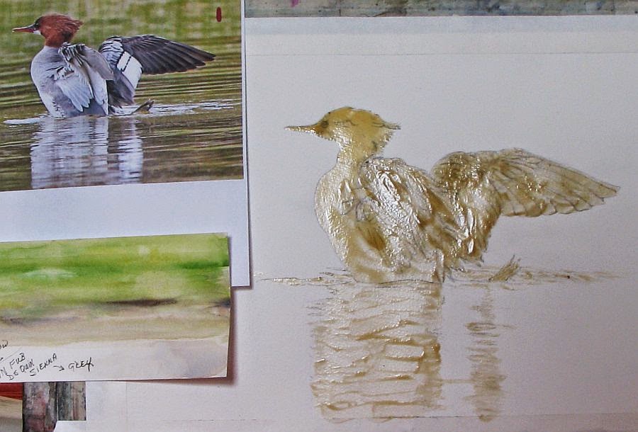
Merganser ~ WIP 2


I'm posting an update on my merganser. I will admit, I was dragging my feet on this. All those feathers! Somehow it's coming together even though I lost a lot of my drawing when I removed the masking and (as usual) I didn't take the time to redraw what was lost before beginning to paint. Patience was never one of my virtues and it's bit me in the rear end more than once. I'm calling this duck done. Now all that is left is the reflections in the water.

My palette is limited. I used W/N FUB and DS Quin. Sienna for my greys, browns and blacks. The water is W/N Sap green and D/R Indian yellow. I toned down the chroma of the Sap green with a little Quin Sienna in some areas.

Monday, March 24, 2014

Experiment ~ acrylic gesso and gloss gel medium on matboard


...and finished with Ranger alcohol ink. I've wanted to give this a try to see if it would work and I'd say it was successful. I used a dried bloom of a large ornamental grass and embedded it with Liquitex acrylic gesso onto 3/16" white matboard. I've done this before with dried oak leaves (link) . I then gave it a coat of Liquitex Gloss Gel medium diluted with a little water. When that was dry I rubbed walnut ink over the entire surface and wiped away the excess. The walnut ink ran into all the nooks and crannies and gave the piece an antiqued look. I could've stopped there but I wanted to see how Ranger ink behaved on the gloss medium so when that was dry I gave this another light coat of gloss medium. It served to preserve the effects of the walnut ink and gave me a slick surface to apply the alcohol ink. Then I added the ink and found it moved well on the gloss surface. I had a bit more control than on Yupo but the effects were basically the same. I used Ranger's Caramel, Clover and Copper mixative.

Saturday, March 22, 2014

Merganser ~ drawing


I may have been silent for awhile but I have been working on a few projects. One project is an experiment and is still in the works. I'll be posting about that in the near future. I did get this drawing of a merganzer duck completed and it's ready for transfer to working paper. I will probably be using watercolor to complete this one.

I'll never forget the moment I saw my first merganser. It was a very large female with her brood of 10-12 duckings. She was resting on a large flat boulder near the shoreline of Lake Michigan, her babies scurrying all around her. Mergansers have a impressive auburn 'DA' on their heads and I thought she was the most amazing duck I had ever seen. I can only hope to do this duck justice with paint.

Note: My reference photo is courtesy of Sandy Witvoet, an avid birdwatcher and fellow gardener. Sandy has a Michigan birding site, complete with interactive forum. If you are interested in joining or would just love to see all the incredible photos on the site, please check out Michigan Birding Network .

Sunday, March 09, 2014

Mr Doob Crows


I'm feeling much better but my time away from my art has left me searching for renewed inspiration. I've browsed my photo files but found nothing that excites me so today I played with Mr Doob. The weather here in northern Michigan has begun to shift from arctic tundra conditions to something near normal and it's brought out a flock of crows which I've enjoyed sketching. My sketches are crude so I decided to try my hand at some digi art. For those not familiar with Mr Doob (link) it's a free digital art program that tests not only your drawing skills but your skills at maneuvering a computer mouse as well. If you follow the link I provided, click on the color wheel icon on the menu at the top of the page to use the sketching features. I did put the top image into GIMP photo editing program to 'feather out' the feathers.

Sunday, March 02, 2014

A Cemetery Mink


Sometimes I don't feel like making happy, beautiful art. Sometimes it's fun to explore something a little darker in nature. For some odd reason I've had a quote from an unknown author running through my head lately and at the time I first read it, it evoked a visceral reaction that has stayed with me long afterward. It's from the book 'Silence of the Lambs' by Thomas Harris and although it was printed in italic(making the reader assume it's a quote) no author has been named. How delightfully mysterious. In context, it appeared as an errant thought/reaction FBI agent Clarice Starling, the heroine, had when observing the villain, Dr. Hannibal Lector during one of their encounters:

He's a cemetery mink. He lives down in a ribcage in the dry leaves of a heart.

How deliciously creepy! For all the descriptive passages I read regarding Dr. Lector, this quote made me truly feel the character. I thought of a black mink that had made a home by burrowing into an old grave and setting up home in a cage of rib bones, cushioned by rotting funeral garb. Makes perfect sense to a mink...right? As an analogy to a man though...well, it speaks volumes toward this character's 'creep factor'. But anyone that has read this book or seen the movie already knows 'creep' doesn't begin to describe Lector. One aside: I took a good friend to this movie when it first came out in a local theater. To this day I don't think she's forgiven me.

Wednesday, February 19, 2014

Need Spring!


Sorry I haven't been updating my blog lately. I've been battling lung issues for the better part of a month. Add to that, my doctor of almost 50 years retired the end of December so I've been shlepping myself to Urgent Care for treatment. Today I finally saw a new practitioner and will see my new official Dr. in March. I don't think I'm going to feel better until Spring, to tell the truth. Winter is always hard on my breathing and this year it's been worse than usual so I haven't been painting. I did find a photo I took last Spring of my weeping cherry tree so I thought I'd share it.

Wednesday, February 05, 2014

Garlic ~ thumbnail sketches


I've been on a bit of a hiatus. This winter has been rough on my lungs and I really haven't been in a very creative mood as a result. I finally bucked up and drew these simple thumbnail sketches the other night. I'm thinking of a small, garlic themed series. I've painted a garlic braid (ristra) before but I've never painted the scapes. When the scapes first appeared in my garlic patch I was quite enamored with them. For those that aren't familiar, they are the stems and flower buds of hardneck garlic and they look like graceful, long necked birds. They appear almost overnight and begin to coil around in the most amazing way. I haven't decided what medium I'd like to use yet. I'm thinking pen and wash. 

BTW, I'm happy to report the client loved the portrait (JUGGS). Yes! I found out later that this is his 40th anniversary gift to his wife. And here I thought it was for Valentines Day. I'm kinda glad I found out about the anniversary after the fact. It would've added that much more pressure.