Translate
Wednesday, May 08, 2013
Homemade Stencils
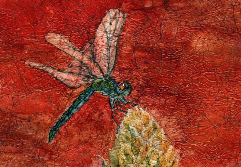
Often I've wished I had a particular stencil for a project but couldn't find exactly what was needed online. Also I knew I may only use it once or twice so why pay a hefty price? One of my friends is an avid scrapbooker and she suggested, "why not use cardstock and coat it with Mod Podge?" Why not indeed! She has a Cricut so she cut out various shapes for me to try. For this demo I cut my own. I used 90# cardstock and cut out my pattern with an Exacto knife. Then I coated both sides with one coat of mat Mod Podge, allowing the first side to dry completely on waxed paper before covering the opposite side. This makes the stencil fairly waterproof so it can be rinsed off after use. I tried out my dragonfly stencil with Speedball silkscreen ink and a roller first with so-so results. I washed off the Speedball ink and tried again with metallic fluid acrylic and a makeshift stencil brush with slightly better results. Note to self: make sure the stencil is completely dry before reuse so the paint doesn't run under the stencil.
Note: 2nd image down>Notice how clean the stencil is after being covered with black Speedball ink. I just rinsed it under running water and voila!
Tuesday, May 07, 2013
Faux Batik Sunflower 2
I chose to revisit Faux Batik Sunflower using a different palette of colors. Also I used walnut ink in place of India ink during the process. The walnut ink toned the entire piece of waxed paper and gave it an antiqued look which, of course I totally obliterated with my color choices. Next time I will work with the result and not against it.
Next post: I will show you how to make stencils with 90# cardstock and Mod Podge.
Labels:
alcohol ink,
faux batik,
sunflower,
walnut ink,
waxed paper,
Yupo
Friday, May 03, 2013
One More Ink Painting on Copper Leaf
I'm finding that Simple Leaf is very delicate and can scratch easily. The silver leaf goes down on Yupo like a mirror (without burnishing) and is slightly resistant to the inks. Even after I allowed the ink to dry for a full day I could wipe it off with a dry finger and a little rubbing. I had used Tim Holtz blending solution on the silver leaf and that seemed to compromise the adhesion to the Yupo. When it was lightly scratched the leaf came off with the ink. I tried several (6) coats of Krylon UV gloss varnish spray in hopes of eliminating the problem. It helped but wasn't a perfect solution. At this point, I believe the blending solution is the problem. It doesn't play well with Simple Leaf on Yupo. Things fared better on the copper leaf so I was able to produce one decent painting.
FYI, these paintings are miserable to scan or photograph. The purple is actually blue.
Tuesday, April 30, 2013
Krylon 'Make It Acid Free'
I have had questions put to me and my own concerns about working with alcohol ink on waxed paper. How archival could these paintings be? From my online searches the coating wax is described as purified paraffin but I can find nothing about the paper that is used in the process. Is it acid free? Probably not and because I crumple the paper to expose it I felt I needed to address this issue. I found Krylon's 'Make It Acid Free' spray
, (link) available at Dick Blick or Jerry's Artarama in the US. I crumpled my paper, then treated both sides with this spray before applying the inks. I found no difference in the way the inks reacted on the treated waxed paper and feel much better about the longevity of my faux batik ink paintings.
Labels:
acid free,
alcohol ink,
faux batik,
krylon spray,
waxed paper
Monday, April 29, 2013
Alcohol Ink on Copper Leaf
Another experiment and I think this has definite possibilities! I applied Mona Lisa copper Simple Leaf with Mona Lisa leaf adhesive to a 5" x 7" piece of Yupo. I then applied the inks, hoping to create a semi-abstract seascape at sunset. The inks reacted well on the copper leafed surface giving me slightly more control than on plain Yupo. I was even able to apply ink in a more painterly fashion to the sky area with a small flat brush. I did add a little rubbing alcohol to the lower portion to get ink moving but it didn't seem to affect the leaf at all. I also like the texture the leaf created when applied. I've got another piece in the works using silver Simple Leaf. The silver leaf went on with much less texture so we'll see what I can do with that.
Labels:
alcohol ink,
copper Simple Leaf,
seascape,
Yupo
Sunday, April 28, 2013
Back to the Inks
Butterfly I
5" x 7"
April 2013 has not been a productive month for me. I managed to create more paintings than usual, all of which landed in File 13. It seems that not only trying a new style but also a new subject has proved folly for me. I had hopes of whipping up a Shirley Trevena style still life but that didn't happen. In the meantime a laundry list of to-dos was piling up behind me so I had to stop and take care of business. I didn't expect to lose Digby either but it happened and I've needed a few days to grieve. It really threw me for a loop to be honest. Maybe as I get older these things hit harder.
Art is good therapy so I got out the one medium that gives me the most pleasure at the moment and painted this butterfly using my faux batik technique .
Note: My reference photo was courtesy of Veronique on Paint My Photo.
Labels:
alcohol ink,
butterfly,
faux batik,
Micron pen,
speedball ink,
waxed paper,
Yupo
Wednesday, April 24, 2013
With Heavy Heart...
...I had to say goodbye to my cat, Digby today. I gave him several nicknames over the years but 'Bubba' seemed to stick. He was a rescue, less than a year old, when he came to live with us permanently. He'd lost trust in humans but once we resocialized him we couldn't ask for a better cat. I live in a park and he became quite a fixture here among the other residents. Everybody knew Digby because he was everybody's friend. In the warm months he would make his rounds of the park and do his 'sociables', visiting anyone that was home and had an open door he could wander through. He never overstayed his welcome, so I was told, and kept his visits brief. He adored kids, even the little ones that pulled his tail, and would head anywhere he heard kids playing. One summer the neighborhood kids must have been playing with squirt guns filled with colored water. Digby came home with his white fur covered in pink and blue splotches. I wiped him off but he must have rejoined the games because he showed up more than once that day sporting pink and blue fur. He was gentle and patient with me, slept in bed next to me and once he discovered how great a lap was he became 'the lap monster'. He left me alone if I was busy but when the day was done and I sat down on the sofa to watch TV it was 'lap time' and he was a great lap warmer in winter, a wonderful companion and a very special kitty. I will miss him so much.
Sunday, March 24, 2013
Grandma's Singer ~ experimental
Okay....I think I finally got myself headed in a new direction. I'm not there yet by any means but I'm working on it. I have my grandmother's old Singer sewing machine and have always wanted to include it in a painting. I used to do a lot of sewing with it and am no stranger to those ole Jiffy patterns so one thing lead to another. I cut the last painting in half and flipped the pieces over. Waste not, want not and also it takes the pressure off to create something frame-worthy and allows me to relax and experiment.
Funny where inspiration can come from. I was looking online for different decorative patterns but found nothing I liked. Then I received a home decor catalog in the mail and found wonderful patterns on their selection of rugs. This is also a new composition for me but I think it works. My palette consisted of Ivory Black, Prussian blue, cerulean blue and Quin. pink. The pattern piece is diluted walnut ink and I added some silver leaf to the Singer and the bobbin in the lower left corner.
Wednesday, March 20, 2013
Studio Cat 2 WIP ~ a bust
Where have I been? Lost...totally. I admit it...this style change is not going to be easy for me. After spending an entire afternoon freehanding my sketch onto my working paper I began painting and it immediately got away from me. Foolishly I didn't realize it at the time. My first clue that I was headed in the wrong direction should've been the fact that I took so long with the sketch. So meticulous rather than expressive. At some point I noticed I had three separate paintings happening in one and, over a period of days, battled to tie it all together and (hopefully) rescue it. Too many ideas/styles equals no cohesion and no amount of color blending can bring it back from disaster so it's back to the drawing board.
(1.) I need to learn how to set up a proper still life. Don't rely totally on imagination.
(2.) Don't sweat the details. If it looks good in 2-D, leave it! It's about the basic shapes, not contour and volume ie. realism.
(3.) Don't choke up on the brush. Holding a brush near the bristle end tends to make one want to focus on fiddly details. Instead hold the brush high on the handle and be confident/expressive with the strokes.
(4.) Find interesting patterns/textures to incorporate. This is what makes Shirley's work so exciting and that's why I was drawn to it in the first place.
(5.) Not sure yet. Probably lots of practice with lots of failures. I hate failing but I seem to learn something from each disasterpiece I create.
Note: a good thing...I've been sketching more than I have in months and that's never a bad thing. I'm not a sketch artist nor do I aspire to become one but practicing observation and honing basic drawing skills is/should be the core of any good artist.
Tuesday, March 12, 2013
Metal Leaf on Watercolor Paper
I love metallics but am never sure how to incorporate them into my artwork effectively. Recently I purchased a few packages of Simple Leaf from Daniel Smith. I like it because it's cheaper than gilder's leaf and it doesn't require sealing to prevent tarnish. I chose silver and copper w/a bottle of Mona Lisa leaf adhesive. Last night I experimented on Fabriano 90# w/c paper and found the cotton rag drinks up the adhesive like crazy. In order to get the metal leaf to stick I had to apply it within moments of painting on the adhesive. Afterward I thought "WOW...is that bright and shiny!" To tone it down I tried some Ranger alcohol ink over the leaf and got some interesting results. It did tone down the brilliance of the copper as well as the silver and, depending on which color ink is used, I believe it's possible to create some really exciting effects. I'm posting a sample piece so you can get an idea of my results. Metallics are difficult to photograph but I did my best.
Note: The sample is partially silver leaf and copper. I used Ranger's Expresso and Clover on the copper and just Clover on the silver.
Sunday, March 10, 2013
Studio Cat 2 ~ sketch
First sketch for Studio Cat 2. I wanted to include the same elements and shapes from the first painting but switched around. Working off a basic theme/concept but with a purely decorative intention is proving to be a challenge. The flowers will be on the vase, not in it. I wanted to keep the fan shapes from the tray and also the stripes. The fan shape has now become a Japanese paper fan, the stripes are on the 'wallpaper'. The cat has been stylized and will remain completely white. I borrowed the tea cup in the lower right corner from one of Shirley's pieces. Thanks, Shirley!
Labels:
cat,
decorative art,
shirley trevena,
sketch,
studio cat
Saturday, March 09, 2013
The Studio Cat ~ complete
I finished this one yesterday but some buckling occurred that needed to be corrected so I wasn't able to photograph it until today and, of course, it's very gloomy outside. I did the best I could with my photo editor. This is a painting I've needed to get on paper for months. It has been rattling around in my head but I just wasn't able to bring it together until I studied Shirley Trevena's work. I know....it looks nothing like Trevena's work but her (sometimes)blatant disregard for perspective, placement of objects, etc. gave me the impetus to get it done. I'm not a still life painter but it's a direction I'd love to explore. I plan to do this painting again, this time more in Trevena's style and see what happens. I like surprises(mostly).
Labels:
cat,
still life,
studio cat,
transparent watercolor
Thursday, March 07, 2013
The Studio Cat ~ WIP 1
Sorry it's taken me so long to post an update. I wanted to take my sweet time deciding how to approach this style of painting. Tranferring a drawing to working paper would lose the spontaneity so I freehanded my sketch instead. Then I 'danced' around this for days, trying to choose a palette, etc. The trouble with this method is there comes a tipping point when one loses momentum and fear sets in. Fear is the death of creativity. I grabbed my new colors (in this case DS Quin. Burnt Scarlet, DS Prussian blue, DS Undersea Green and also a tube of Quin. gold) and dove in. I knew I could achieve a full range of values with these colors so I held my breath and took the plunge. Right away I saw it begin to tighten up on me. At that point it was time to walk away and regroup. Today I forged ahead with the cat and immediately thought I'd lost the painting. I took it off the easel and set it up in my living room against a shelf to get a long view and there it was...the painting I envisioned was underway! Why is it so hard to trust my instincts and let go of control?
Friday, March 01, 2013
Shirley Trevena in Action
For those that may be interested, Shirley has a few videos available on YouTube that are a must-see. I'm still working on a setup for my 'still life with cat'.
Thursday, February 28, 2013
New Project, New Style?
For quite sometime I've admired the work of Shirley Trevena . Her style is colorful, expressive and delightfully/creatively free. She works a lot with watercolor but isn't afraid to mix it up a bit. I've spent the last few days studying her online gallery and I'm both inspired and challenged as a result. Last night I drew up a still life setting from imagination based on some of her works but today felt I should go through my photos and gather things that have meaning to me. I don't own gorgeous vases or have access to fresh flowers at the moment but I do have cats so they must be a part of my still life. I found a photo I took last Spring of Digby, my male cat catching some sun while I worked in my studio so I started a new sketch, using this image to begin.
Btw, don't pay any attention to that dirty window(photo) or the suncatcher that looks like a hubcap(sketch).
Monday, February 25, 2013
Daniel Smith Watercolors
Trying out some new colors today. New colors to me anyway. With my winnings from the DS art contest I purchased a few new watercolors that I've been anxious to use. I ordered DS Perinone Orange, DS Opera, DS Quin Burnt Scarlet among a few others. I took some inexpensive paper and banged out this silly little owl today.
Saturday, February 23, 2013
Red Hat Ladies 2 ~ complete
It took me as long to complete as to get started but it's done. I do need to clean up the right edge on the hat of the lady in the foreground, though. I just noticed that but I had to snap a photo while the light was right. It's been so gloomy here. The painting was actually finished yesterday. I'd like to say this one fought me all the way but I think a lot had to do with my mind set. I'm 'winter weary' and it shows in my work. I'm a moody artist, it seems and it's a fight to stay in the mood to paint at the moment.
Second image: made the corrections to the hat, added some Quin. gold spatter to the BG and signed it. Done!
Reference photos courtesy of Judy Wright on PaintMyPhoto
Saturday, February 16, 2013
Red Hat Ladies 2 ~ WIP 3
I've been pecking away at this one a bit everyday. I ran out of light before taking the photo so it's a little blurry. At least I hope that's the reason. My camera hasn't been taking the best photos lately and I really don't want to buy another at the moment.
Wednesday, February 13, 2013
Red Hat Ladies 2 ~ update
February has got me moving in slow-mo. I blame it on the winter doldrums. My momentum is down to a crawl. The drawing sat on my easel until we had a brief (1 hour) power outage just a few days ago so I was left with nothing else to do but get started on this painting. I think it would still be sitting there naked today if not for that event. Hopefully I can get this finished faster than it took to get it started.
Monday, February 04, 2013
Red Hat Ladies 2 ~ WIP
I've just started a second 'Red Hat Ladies' after running into a slight problem. I had planned on doing two separate portraits as companion pieces for the original RHL (link) but discovered the leftover illustration board wasn't large enough for my purpose. I had forgotten I cut a strip from one side to use for painting trials so was left with an odd sized, square-ish piece to work with. Normally I would've gone back to the alcohol inks until I found a solution but that isn't an option at the moment. Finally a lightbulb went on in my head and I came up with this composition. This is just a photo of my drawing on tracing paper and, once again, I realize how much I would dearly love to have a lightbox, especially when working with human faces. Capturing the correct facial expressions of these lovely ladies is crucial to this piece and freehanding was challenging but I tried to keep it to a minimum. I'm really posting this so I can see it online to see if it 'works'. I invite my visitors to feel free to chime in with their opinions.
Labels:
composition,
line drawing,
red hats,
tracing paper,
work in progress
Friday, January 25, 2013
Cat Makes Daniel Smith Cover
Well, I'll be darned. I entered A Cat of Color in the Daniel Smith Annual Art contest back in late September 2012 and with the help of the voting public and especially friends who voted (you know who you are) I managed to win a place with the weekly winners, then the monthly winners and am now in the running for one of the annual prizes. The final judging won't be done by the public but by a judging panel. I am also excited to see an image of my entry on the cover of Daniel Smith's Spring catalog among a collection of other monthly winners. I'm not sure when the final judging will take place. Possibly May or June 2013. I'll just have to cross fingers and wait.
Friday, January 18, 2013
Another Doob Cat w/GIMP
When I'm stuck or between projects I love to play with Mr Doob ,a free online digital art program. This is my latest 'Doob Cat'. I'm getting better at drawing with my computer mouse. I'm also getting better using the editing tools in GIMP, a photo editing program that has many of the capabilities of Adobe Elements. GIMP is also available online for free download. The cat was 'drawn' in black on a white background with the various brushes/effects that Doob offers, saved to My Pictures and then opened in GIMP where I added color and more shape with GIMP's various tools and brushes. The first image is how my cat looked after I initially created it in Mr Doob. The second image is the results after adding color and effects with GIMP. http://www.gimp.org/ (hot link)
Wednesday, January 16, 2013
Faux Batik Sunflower
SOLD
This will be my last alcohol ink painting for awhile, probably until Spring. The alcohol has begun affecting my throat and I fear it will also affect my lungs if I continue. Winter is not a good time for me to be working with strong fumes w/o proper ventilation and opening a window in the weather we're experiencing right now wouldn't be prudent. I will be picking up my watercolor brushes again and I have a few references that I've been anxious to get started on. Still, I will miss working with the inks. They are just so darn addictive.
Labels:
alcohol ink,
faux batik,
sunflowers,
waxed paper
Sunday, January 13, 2013
Batik Dragonfly ~ alcohol ink on waxed paper
SOLD
Instead of using India ink, I thinned black Speedball printer ink with tap water to a heavy cream consistency and used that in it's place. I think I like the Speedball ink better and it's far more economical. One heaping teaspoon of Speedball made a lot of ink.
Labels:
alcohol ink,
dragonfly,
faux batik,
speedball ink,
waxed paper
Friday, January 11, 2013
Playing with Mr Doob Again...
I can't help it...it's so much fun. I created this little vignette of three sleeping cats with Mr Doob , then put it into Gimp photo editor and played some more. This is what I came up with on the fly. I really should start another painting but I've been too easily distracted today.
Wednesday, January 09, 2013
Demo ~ faux batik on waxed paper w/alcohol ink
I've received requests to post a demonstration of this technique. I had hopes of doing a video demo but the image quality of the test videos I ran with my current camera weren't the greatest so I've done a photo demo instead.
1.) I suggest you cut your waxed paper no more than 1"- 1 1/2" larger than your backing paper. The backing paper is the substrate you'll be gluing your finished batik onto.
2.) Crumple the waxed paper into a ball, smooth it out, then crumple once more. You want the little creases evenly distributed across your paper. Try to avoid long, straight creases.
3.) Image no. 3 shows the amount of crumpling I prefer.
4.) Ready for the India Ink. I use black India ink(full strength) and an old, stiff bristle brush to spread the ink. I suggest working on two layers of waxed paper underneath your painting to protect your work surface as the alcohol ink will bleed through. One tip: Slip a piece of white paper cut the size of your finished painting underneath both layers of protective waxed paper so you have a size guideline.
5.) The India ink has been spread out and at this point I wait a few minutes to allow the ink to settle into the creases before wiping away the excess with plain water and paper towels. As you can probably see, I also use my fingers to work the black ink into the creases.
6./7./7.1) A few views of the waxed paper after the excess ink has been wiped away. In view #7 you can see I slid a piece of 5" x 7" paper underneath so I know where the borders of my finished painting will be.
8.) If you choose a drawing to use for the painting it can also be placed underneath the waxed paper so it's visible. I used a black Micron .o8 pen to go over all my lines so they were easier to see.
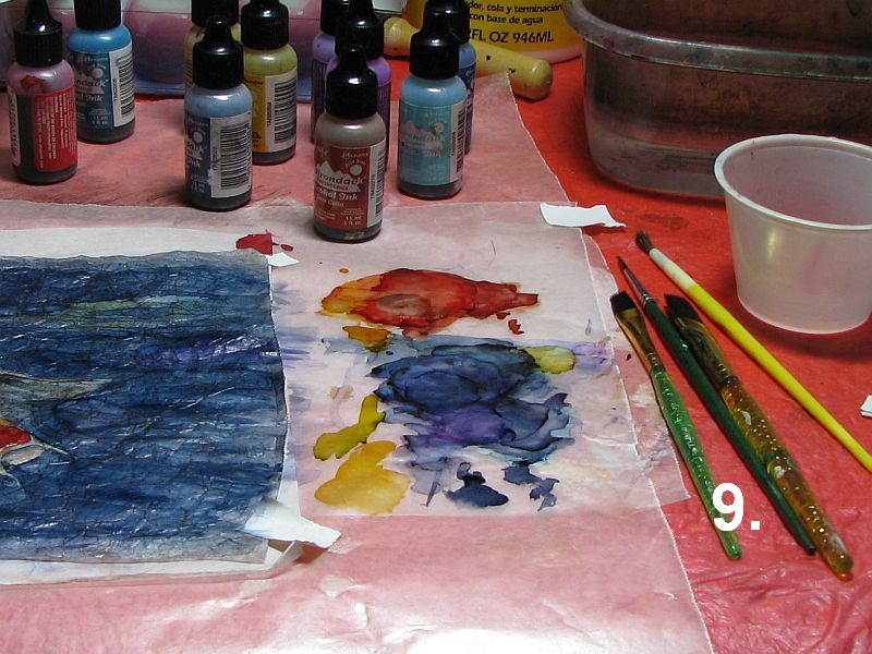
9.) Once I'm ready to paint, I place a small bowl of rubbing alcohol and another of clean water nearby to wash my brushes after each use. Also for cleaning brushes when switching colors. I mix my own colors by dropping the alcohol inks onto the protective waxed paper and picking the ink up with my brush. Use inexpensive brushes for these paintings as alcohol ink isn't very healthy for your good sables, etc.
10.) My painting is now finished and is ready to be glued to the backing paper.
11.) I apply Mod Podge with an old brush to the backing paper(in this case, a piece of Yupo) in a thin, even coat...
12.) and position my painting over the Yupo, making sure it's placed exactly where I want it. Then I use a soft brayer to press it into the glue, working out any trapped air bubbles. I also check for any places that may need another dab of glue, usually the corners. Lastly, I use a pair of scissors to trim away the excess waxed paper and the painting is complete.
NOTE: The koi fish painting has been sold.
Labels:
alcohol ink,
brayer,
demo,
faux batik,
India ink,
koi fish,
Mod Podge,
waxed paper
Saturday, January 05, 2013
Faux Batik Tulips ~ alcohol ink on waxed paper
Here's my latest 'batik' painting. This time I tried a floral. Just some simple pink tulips and their foliage. I'm working small...all are approx. 5" x 7". I haven't mounted this one yet but I may try adhering it to Yupo rather than w/c paper this time. The w/c paper had a tendency to buckle from the moisture in the Mod Podge. I plan to do a photo demo of this technique for my next post.
Wednesday, January 02, 2013
Alcohol Ink on Waxed Paper ~ faux batik
I wanted to create a batik-like effect for this painting so I used crumpled waxed paper for this purpose. After crumpling the waxed paper I applied black India ink to one side, allowing the ink to settle into the 'crumples' before wiping away all the excess ink with plain water. When it was dry I flipped the paper over and used alcohol ink to create my painting. I then mounted it onto 140# hotpress w/c paper with Mod Podge, using a brayer to work out all the air bubbles. I'm calling this one 'Winter Aspens'.
Labels:
alcohol ink,
aspens,
brayer,
faux batik,
India ink,
landscape,
Mod Podge,
waxed paper
Subscribe to:
Posts (Atom)