Translate

Thursday, April 24, 2014

Mixing Turquoise


Phthalos tend to be potent, staining colors. Almost violent. The addition of the Indian Yellow toned them down and brought out softer, green tones. Very aquatic.

Many Moons ago I painted a sea turtle from a photo ref on Wetcanvas. It was the first successful watercolor I ever painted and no one was more surprised than me that it turned out well. At the time I had only 10 paint colors, a small set of Robert Simmons synthetic sable brushes and no idea what I was doing. I managed to mix my own sea color, a lovely shade of turquoise, from D/R Phthalo blue,  Phthalo green and Indian yellow. I've got a request to recreate that same painting for a friend. The first sold a few years ago. Fortunately I have the same paints in the same brand (very important because colors can vary from mfg. to mfg.). Today I played with various mixtures to find the right shade and I think I've managed to do just that. I wish I could show a side-by-side comparison with the sample swatch but the image of the original painting appears too blue on screen for some reason. I'm just glad I remembered the 'recipe'.   

Sunday, April 13, 2014

Raven ~ complete?


I finally got this one done...I think. I hope she reads as a black cat because there is very little black in this painting. It's mostly Carbazole violet, Quin. violet, Cobalt blue deep and Moonglow. I only used the neutral tint to tone down the other colors. I cut it 1/2 & 1/2 with Carbazole violet to make my 'black'. Even Moonglow will go quite dark if used with enough strength. I did wind up playing with my color study and gave it a overall wash of yellow ochre. The results were pleasantly surprising and seemed to unify the entire painting without taking anything away or causing a distraction. I'm not sure yet if I want to go this route with the current painting.

Monday, April 07, 2014

Raven ~ color study


I've tried two different palettes and I think this one is the best. I did a couple of hasty drawings. The first I went kinda crazy. I used turquoise, green and a black I mixed from Burnt sienna and FUB. Not good. For this trial I did an under painting with various purples including DS Moonglow, one violet and cobalt blue deep. For the black I used straight neutral tint. I really love neutral tint. It produces a nice rich black and lifts easily. I went over my under painting with the tint after it was dry and lifted out my highlights/whiskers/etc. back to the under painting colors. Purple suits Raven. She was great at walking across my paintings, tracking whatever color she'd stepped in first. One particular painting that got the Raven treatment involved purple cat tracks. I still have that painting. I just can't seem to part with it. Also it happened to be a painting of another cat and that's when I decided purple and cats go together. A minor epiphany at the time. 

Saturday, April 05, 2014

Raven ~ drawing


I was looking through some old picture folders a few days ago and stumbled onto a photo of Raven I had completely forgotten I'd taken. I still don't remember taking that particular shot but it's clear enough to use for a portrait. Even though she's been gone since 2007 I haven't painted her portrait because I didn't think I had any decent photos of her. Not that I didn't try but black cats are difficult to photograph. I've always felt bad that I've never honored her memory in this way. She was the most beautiful black cat I've ever seen. Fur like silk and her eyes were the most incredible shade of green/gold with a bit of turquoise around the irises. Her ears were big and round. When she ran she would fold them back against her head and she looked like she was flying. For that reason my youngest son named her Raven. I hope I'm able to capture her beauty and spirit in a portrait.

Thursday, April 03, 2014

Merganser ~ complete


SOLD
I finished this up last night. Today it's gloomy so not the best photo. My Canon has a noise reduction feature that seems to have brought out the blue tones in the paint which aren't that noticeable IRL. Also my monitor shows all the greens as various shades of lime. Not sure how they appear to others. Maybe someone will stop by and let me know. Oh well. Here it is, warts and all.

Note: I've discovered I've been misspelling the name of the duck. It's 'merganser with an 'S', not a 'Z'. 

Tuesday, April 01, 2014

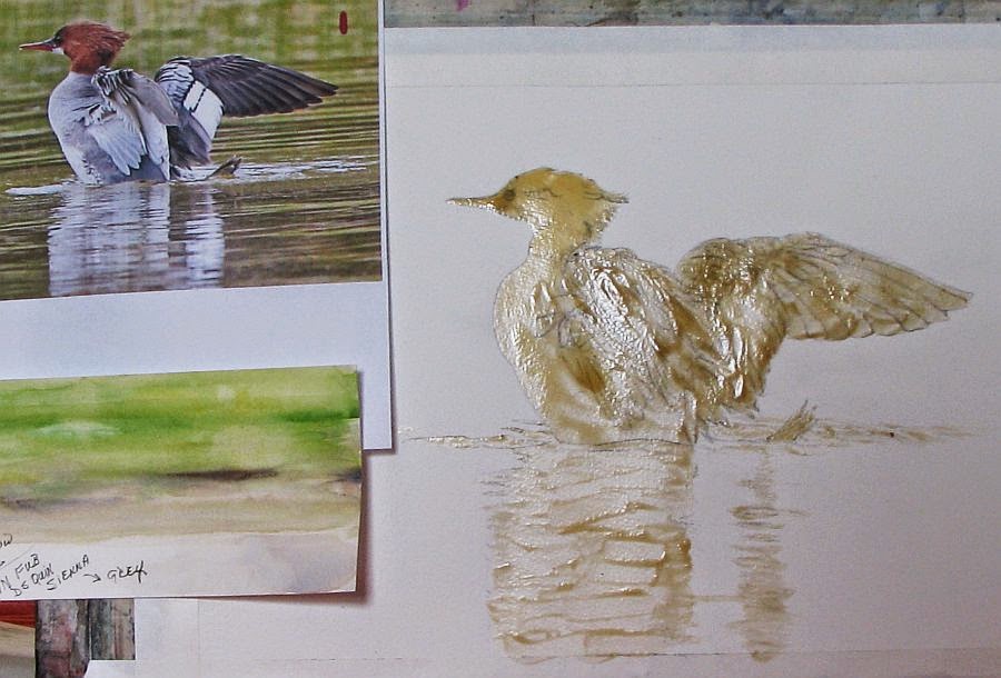
Merganser ~ WIP 2


I'm posting an update on my merganser. I will admit, I was dragging my feet on this. All those feathers! Somehow it's coming together even though I lost a lot of my drawing when I removed the masking and (as usual) I didn't take the time to redraw what was lost before beginning to paint. Patience was never one of my virtues and it's bit me in the rear end more than once. I'm calling this duck done. Now all that is left is the reflections in the water.

My palette is limited. I used W/N FUB and DS Quin. Sienna for my greys, browns and blacks. The water is W/N Sap green and D/R Indian yellow. I toned down the chroma of the Sap green with a little Quin Sienna in some areas.

Monday, March 24, 2014

Experiment ~ acrylic gesso and gloss gel medium on matboard


...and finished with Ranger alcohol ink. I've wanted to give this a try to see if it would work and I'd say it was successful. I used a dried bloom of a large ornamental grass and embedded it with Liquitex acrylic gesso onto 3/16" white matboard. I've done this before with dried oak leaves (link) . I then gave it a coat of Liquitex Gloss Gel medium diluted with a little water. When that was dry I rubbed walnut ink over the entire surface and wiped away the excess. The walnut ink ran into all the nooks and crannies and gave the piece an antiqued look. I could've stopped there but I wanted to see how Ranger ink behaved on the gloss medium so when that was dry I gave this another light coat of gloss medium. It served to preserve the effects of the walnut ink and gave me a slick surface to apply the alcohol ink. Then I added the ink and found it moved well on the gloss surface. I had a bit more control than on Yupo but the effects were basically the same. I used Ranger's Caramel, Clover and Copper mixative.

Saturday, March 22, 2014

Merganser ~ drawing


I may have been silent for awhile but I have been working on a few projects. One project is an experiment and is still in the works. I'll be posting about that in the near future. I did get this drawing of a merganzer duck completed and it's ready for transfer to working paper. I will probably be using watercolor to complete this one.

I'll never forget the moment I saw my first merganser. It was a very large female with her brood of 10-12 duckings. She was resting on a large flat boulder near the shoreline of Lake Michigan, her babies scurrying all around her. Mergansers have a impressive auburn 'DA' on their heads and I thought she was the most amazing duck I had ever seen. I can only hope to do this duck justice with paint.

Note: My reference photo is courtesy of Sandy Witvoet, an avid birdwatcher and fellow gardener. Sandy has a Michigan birding site, complete with interactive forum. If you are interested in joining or would just love to see all the incredible photos on the site, please check out Michigan Birding Network .

Sunday, March 09, 2014

Mr Doob Crows


I'm feeling much better but my time away from my art has left me searching for renewed inspiration. I've browsed my photo files but found nothing that excites me so today I played with Mr Doob. The weather here in northern Michigan has begun to shift from arctic tundra conditions to something near normal and it's brought out a flock of crows which I've enjoyed sketching. My sketches are crude so I decided to try my hand at some digi art. For those not familiar with Mr Doob (link) it's a free digital art program that tests not only your drawing skills but your skills at maneuvering a computer mouse as well. If you follow the link I provided, click on the color wheel icon on the menu at the top of the page to use the sketching features. I did put the top image into GIMP photo editing program to 'feather out' the feathers.

Sunday, March 02, 2014

A Cemetery Mink


Sometimes I don't feel like making happy, beautiful art. Sometimes it's fun to explore something a little darker in nature. For some odd reason I've had a quote from an unknown author running through my head lately and at the time I first read it, it evoked a visceral reaction that has stayed with me long afterward. It's from the book 'Silence of the Lambs' by Thomas Harris and although it was printed in italic(making the reader assume it's a quote) no author has been named. How delightfully mysterious. In context, it appeared as an errant thought/reaction FBI agent Clarice Starling, the heroine, had when observing the villain, Dr. Hannibal Lector during one of their encounters:

He's a cemetery mink. He lives down in a ribcage in the dry leaves of a heart.

How deliciously creepy! For all the descriptive passages I read regarding Dr. Lector, this quote made me truly feel the character. I thought of a black mink that had made a home by burrowing into an old grave and setting up home in a cage of rib bones, cushioned by rotting funeral garb. Makes perfect sense to a mink...right? As an analogy to a man though...well, it speaks volumes toward this character's 'creep factor'. But anyone that has read this book or seen the movie already knows 'creep' doesn't begin to describe Lector. One aside: I took a good friend to this movie when it first came out in a local theater. To this day I don't think she's forgiven me.

Wednesday, February 19, 2014

Need Spring!


Sorry I haven't been updating my blog lately. I've been battling lung issues for the better part of a month. Add to that, my doctor of almost 50 years retired the end of December so I've been shlepping myself to Urgent Care for treatment. Today I finally saw a new practitioner and will see my new official Dr. in March. I don't think I'm going to feel better until Spring, to tell the truth. Winter is always hard on my breathing and this year it's been worse than usual so I haven't been painting. I did find a photo I took last Spring of my weeping cherry tree so I thought I'd share it.

Wednesday, February 05, 2014

Garlic ~ thumbnail sketches


I've been on a bit of a hiatus. This winter has been rough on my lungs and I really haven't been in a very creative mood as a result. I finally bucked up and drew these simple thumbnail sketches the other night. I'm thinking of a small, garlic themed series. I've painted a garlic braid (ristra) before but I've never painted the scapes. When the scapes first appeared in my garlic patch I was quite enamored with them. For those that aren't familiar, they are the stems and flower buds of hardneck garlic and they look like graceful, long necked birds. They appear almost overnight and begin to coil around in the most amazing way. I haven't decided what medium I'd like to use yet. I'm thinking pen and wash. 

BTW, I'm happy to report the client loved the portrait (JUGGS). Yes! I found out later that this is his 40th anniversary gift to his wife. And here I thought it was for Valentines Day. I'm kinda glad I found out about the anniversary after the fact. It would've added that much more pressure.      

Monday, January 20, 2014

JUGGS ~ complete


It's finished! I fixed all the boo-boos and did a little clean up overall. The designs on the ladies' sweaters look more snowflake-y thanks to the Ranger alcohol mixatives and it's time to walk away. Put down my brushes and just walk-a-way. It is what it is and hopefully my client will like the results.

Sunday, January 19, 2014

JUGGS ~ WIP 3


This commission has taken over all my studio time. If I'm not tweaking it, I'm looking at it scanning for problems, adjusting values....the list goes on. After taking such care to not drop paint where it doesn't belong I still managed to put a red smudge on the BG. I can take care of that with a little white gouache fortunately. Last night I thought I finally had this where I wanted it but this morning I noticed a bit of black that has crept up onto the jawline of one of the women. Ok, it didn't creep. I accidentally put it there. And while this is going on, in the back of my mind, I'm thinking "This is a gift from a man to his wife. I know I'll never see her through his eyes. What if he hates this?!" I don't know how portrait artists do this sort of thing! Somehow I'm going to have to correct the jawline and then there are the snowflake details on the red sweaters to contend with and those I will deal with by using alcohol ink. I did a few test samples with the Ranger Pearl, gold and silver mixatives. I can add detail with the inks that pearlescent watercolors could never handle. They would disturb the red pigment and make quite a mess of things. BTW, sorry for the poor quality image. It's so gloomy here I can't get a decent photo, even with flash.

Sunday, January 12, 2014

JUGGS ~ WIP 2


Update: I've completed the background and started on the clothing. I used DS Payne's Grey mixed with FUB for the BG. Then I sprinkled on some table salt to create 'snowflakes'. I wasn't sure how much soaking the illustration board could handle so it was a heart pounding moment but it held up very well. I had discussed changing the BG with my client over the phone. The photo showed a Christmas tree, a fireplace...the list goes on. Too busy. Because I had been told the women meet at Christmastime I suggested a simple wintery, snow effect and he thought that sounded good. As it turns out it was the right decision.

I'm using Neutral tint mixed with the BG colors for the black vests, Perylene Maroon mixed with Pyrrol Red for the sweaters. The red mixture makes a nice, rich crimson. For the shadows I'm using more Neutral tint, then glazing over with the red mixture. Watercolor can be moved and pushed around on the plate finish fairly easy which is making my job easier, too.

Friday, January 10, 2014

JUGGS ~ WIP 1


I finally started painting this two days ago. I had to make some sketch revisions because the scanned image I'm using as reference isn't the best and it prints out even worse. It's times like this I wish I had a laptop I could mount within view. I've completed the faces and feel I've achieved a fair likeness of each lady. One face gave me a few fits but some faces are more complicated than others. It's too late and too dark now to continue so I'll wait until tomorrow. I don't trust myself to mix colors in the evening even though I have a daylight lamp. That will give me a day to decide if I want to tackle the background next or start work on the clothing.

Friday, January 03, 2014

JUGGS ~ a commission


Just before Christmas I received a call from the gallery. Apparently a fella saw my Red Hat lady paintings and wants a portrait painted in the same style. His wife has three close girlfriends and they have formed a group called 'Just Us Gorgeous Gals' aka JUGGS. I love it! They usually meet at Christmastime every year (from what I understand) and he provided a few photos I could use as reference. Not the best images but I think I can work with one of them. I've just finished the drawing and my Strathmore 500 plate illustration board arrived today. It's not something I usually keep on hand but it's great for portraits. The colors stay vibrant, similar to watercolor on Yupo only you have much more control of the paint. It's also great for fine detail work.

Tuesday, December 31, 2013

HAPPY NEW YEAR, EVERYONE!


I love to post animated fireworks each New Years Eve but I could find nothing this year on the 'net that wouldn't give my visitors and myself seizures so I went with this lovely wallpaper. I want to thank everyone for supporting me and my art this past year. You are the juice that keeps me going. Thank you!

Tuesday, December 24, 2013

Wednesday, December 18, 2013

A Faux Batik Xmas


Occasionally I will paint individual cards for Xmas. I find them labor intensive so I have to be in the mood and this year I'm in the mood. I decided to stick with my alcohol ink batik technique for a welcome change. These are not folding cards so I've used Yupo as my backing substrate. I'll be writing my message on the back of each card with Micron pen so they will need a coat of Krylon spray varnish to eliminate any smearing. I could not find my white fluid acrylic paint to create the snowy candy canes so I used White-out. It worked great but I had a devil of a time washing it out of my spatter brush. Here are a couple of my faves.