Translate

Friday, June 22, 2007

Two Pieces Sold!


Hemingway's Cat~SOLD
I contacted the gallery today and two of my pieces sold. YES! The Buckeye Butterfly and a print of Hemingway's Cat have now gone to their new homes.

Friday, June 15, 2007

Gallery Walk


The annual Petoskey Gallery Walk will be held June 21st, not the 23rd which I had previously thought. Eleven galleries will be participating and the walk will end with fabulous food and entertainment at Stafford's Perry Hotel. All the galleries will be donating artwork for a prize drawing.


Yesterday I took seven of my older pieces to Northern Michigan Artist's Market for a total of nine on display. I included a mix...one colored pencil piece, two watercolors, three graphite pieces and one print. When everything had been delivered and put into inventory I promptly went home and took a three hour nap. *huge sigh of relief* I had no idea I was stressing so much but apparently I was. I'm all better now.


While at the gallery I had a chance to chat with Martin Scott, one of the gallery owners. They're in the process of updating their website so buyers will be able to purchase their artist's work directly from the new site. As Martha would say, this could be a very good thing.

Tuesday, June 12, 2007

Peacock Orchid Completed


I finally had enough time to bring this one home, so to speak. There's a few spots I may wind up tweaking a little but for the most part I'm pretty happy with it.

Tuesday, June 05, 2007

Quick Update~Peacock Orchid

Center Completed
My Working Drawing


I finally started this one...my peacock orchid. I'm posting an update on my progress so far. I think the worst is over...the center is completed! I keep telling myself I need to work in a much larger format. Cutting away all those tiny bits and pieces is a bit nerve wracking.

Friday, May 25, 2007

Wonderful News!

Daffodil
Buckeye Butterfly~~SOLD


I know I've been MIA for quite awhile but things have been...well...things. Recently some of my artwork has been accepted by Northern Michigan Artist's Market of Petoskey, Michigan and I couldn't be happier! Today I delivered two framed pieces to the gallery so I'm officially 'being shown'. There's still a lot of work to do on my part, tho. The annual gallery walk starts June 23rd and I hope to have several more pieces completed and ready to submit to NMAM.


I'm doing my own mounting and framing. I found out I can cook up a mean batch of wheat paste now! This is a wonderful opportunity and it's certainly a learning experience for me.


I've submitted my sprayed daffodil and a buckeye butterfly done in colored pencil.

Tuesday, April 10, 2007

Peacock Orchid~Comp and Value studies

Quick color study with colored pencils.
Here are my two studies. I chose to try one with the foliage and one with the addition of a spent bloom. As this plant begins to flower the blooms start low with each new bloom being produced above the last as the plant continues to grow higher. One plant can produce as many as 10-12 blooms, one at a time as the one before it droops and dies. The spent blooms tend to arch downward gracefully in a bell shape. The foliage is thin, flat, strap shaped and stands almost straight up.

This is a photo I took in my garden last Fall when the orchids were blooming. It was a windy day so unfortunately the image is a little blurry.




I love peacock orchids. They're so architectural and their height and verticality makes them a stunning addition to the garden. The blooms remind me of an exotic duck coming in for a landing on a pond. Even though they aren't hardy in my zone 5 garden I buy more bulbs and plant them every year. They tend to bloom when all else is done and gone. I've chosen them as my next subject for a painting. Now I'm trying to decide on a composition that shows off their best qualities. I've done two studies both for comp and as a value study. I may do several more before deciding on one I like well enough to paint. My format will probably be approx. 11" X 14" and I want to showcase the bloom more than the height.

Monday, March 26, 2007

Matting and Framing


The right mat and frame can and should enhance a piece of artwork. On the flipside the wrong mat and frame can ruin that same piece of art. Taking the time to chose the correct matting and a good frame is well worth the time and effort.


I'll be matting and framing The Poppy for myself. This piece will hang in my home on a pale yellow wall. I've decided I want a square format for the finished hung piece. Since this painting isn't square(approx. 11" wide by 10 " high) the mat will have a 3" border on the bottom. The sides and top will have a 2" border creating the square. I know it may sound odd but it works. For the frame I've chosen two that are simple and contemporary with a matte black finish. I haven't decided how wide I want the actual frame so I've done a virtual frame up with two different width frames which I'm posting here. Then I can look at them both together for a few days and decided which one works best.

Saturday, March 24, 2007

The Poppy


This one tested my patience more than any other painting I've ever done...in any style. If my paper had been larger I would've chosen to do this in a much larger format. Also after it was completed (I thought) and I had removed all the frisket I decided the center of the flower was not dark enough. The frisket didn't want to stick well the second time around. Even after repeated burnishings I still had some bleed under it. I had to resort to a few dabs of opaque white to correct the problem. This finally became a quest! I was going to complete this or die trying. It's not my best effort to date but it's certainly been a learning experience for me. This taught me I have the stick-to-it-enuffs to stay with a difficult project and secondly, to get it right the first time!

Sunday, March 11, 2007

Virtually Framed


I just had fun matting and framing my last piece online. You gotta love the internet!

Friday, March 09, 2007

Daffodil wip

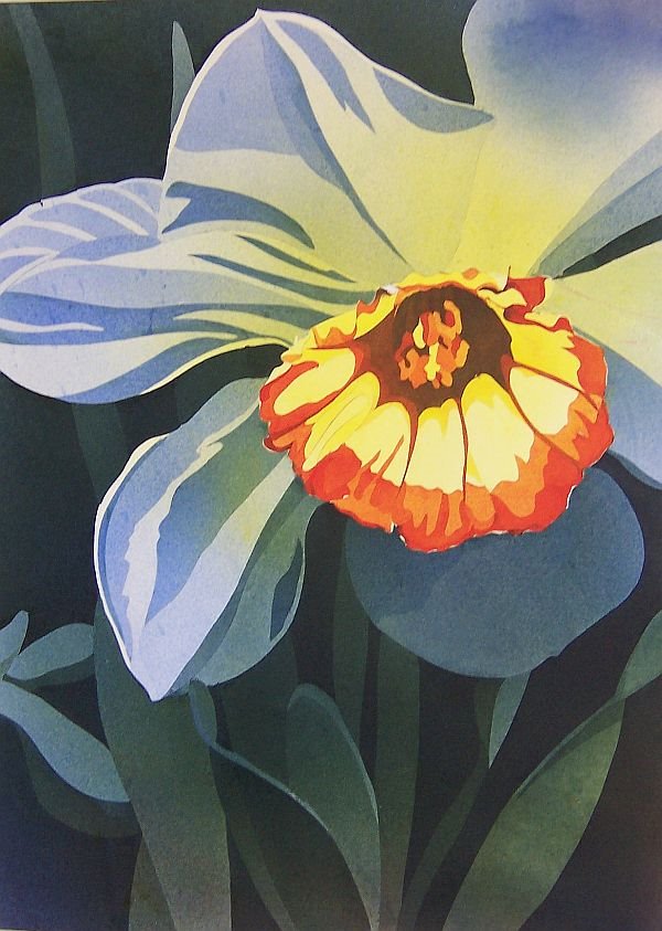
Here's the finished painting. I may decide to
do a little more tweaking or chalk this one
up to experience.

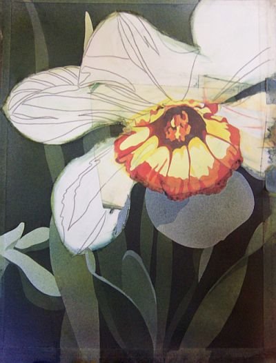
I've masked off the finished cup and
started working first on the background,
then on the foliage and the lowest petal.
I started with the cup first, then masked it off
before completing the rest.
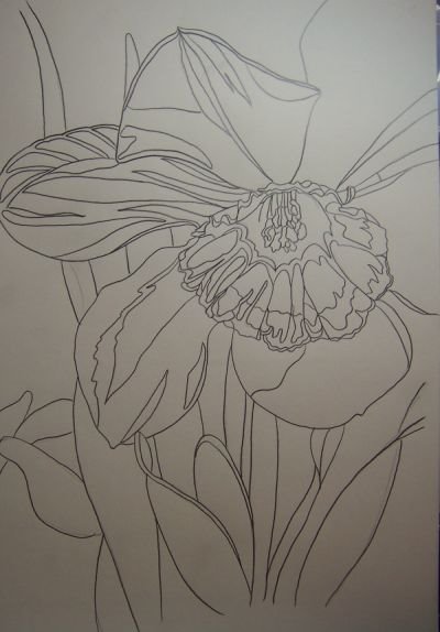
The sketch. I wound up tweaking this a little as I went along.
I enjoyed Mehaffey's technique so much I thought I'd try it again on another subject. I've used the same reference for this daffodil with graphite and really loved the results. This was much more difficult than the waterlily and I'm not entirely sure I like the results. It's all part of the learning experience, though.

Monday, February 26, 2007

Waterlily continued

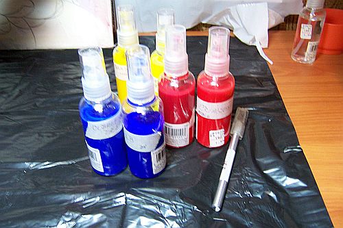
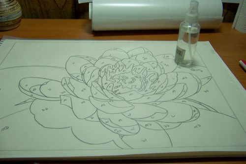
Almost forgot. These are the sprayers I used. They
spray a nice fine mist and worked like a charm.
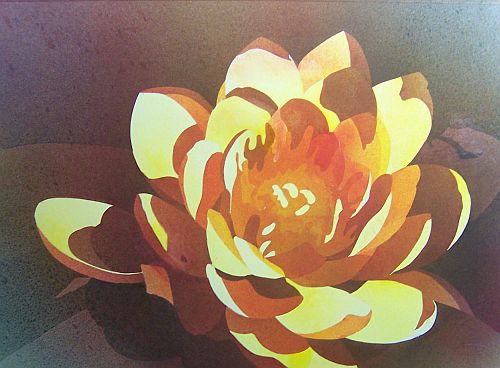
And here is my waterlily completed. There's many
things I'd do differently next time but not bad for
a first try.

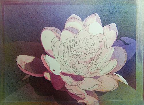
And more layers. It's starting to look like something!
Here's the first few layers of paint. I'm trying to
get a bounce of warm to cool going diagonally from opposite corners.

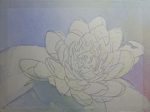
I've removed my frisket from the drawing and placed it on
my working paper. I burnished it down with a spray bottle.

Blogger is acting up today so I guess my waterlily posts will be in installments.

Waterlily

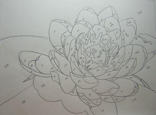
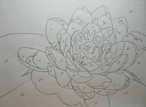
Here's my line drawing. I penciled in my values:
D=dark, M=medium, L=light, etc.


I tried a new painting technique. It's very different from anything I've used before. I purchased a demo on DVD from Creative Catalyst featuring Mark Mehaffey. It's called Build Design & Color Using A Mouth Atomizer.

He uses a mouth atomizer but I decided to try the little spray bottles that spray a fine mist. The basic idea:
1. Create a simplified drawing of your subject using approximately 5-7 values.

2. Make a line drawing of your subject using at least a 4B pencil.

3. Using mat frisket film lay the film down on your drawing and burnish to release air bubbles and transfer the graphite onto the sticky side of the frisket.

4. Making sure you've taped down your drawing well, peel the frisket off and lay it over your working paper.

5. Working from the center outwards smooth down the frisket, working out any air bubbles. You now have a clear image to work from but nothing is actually on your working paper. The pencil lines are on the underside of the frisket.

6. Start with the areas that will be the darkest. This is the opposite of how watercolor is usually applied. Using a #11 Exacto knife with sharp blade remove the frisket in the areas you wish to spray. Keep changing blades often! Once you feel it dragging, change it! The frisket is very thin so I made sure not to cut too deep to avoid scoring my paper.

7. Another consideration: after each spraying wipe the remaining frisket with a paper towel (in small areas I used a Q-tip) so the paint doesn't build up and obscure your lines.

8. Keep spraying to build not only values but color. I used the 3 primary colors, one warm and one cool of each. Doing this allowed me to not only change color but temperature.

9. Let the fun begin!

Sunday, February 18, 2007

Time Out to Paint the Rose


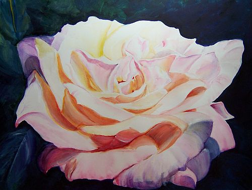
Having never painted a really good rose I'd have to say that statement still stands. Also painting on hot pressed watercolor paper proved to be quite the challenge. The paint tended to sit on top of the surface and lift when I tried to glaze over it. I finally resorted to breaking all the so-called rules of watercolor to rescue this rose to the point of considering posting it here. I used opaques! Shame on me. LOL

Saturday, February 10, 2007

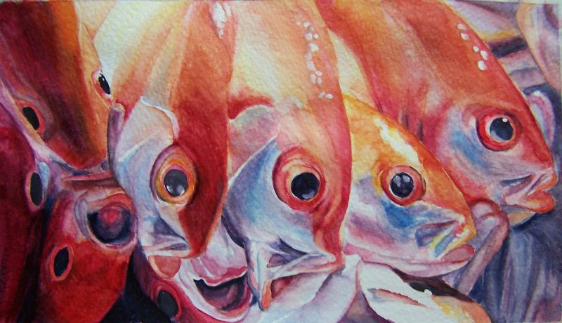
Catch of the Day


Ha! Not exactly what I had in mind when I decided to paint fish but I saw this photo and couldn't resist.

Wednesday, January 31, 2007

Going Fishin'


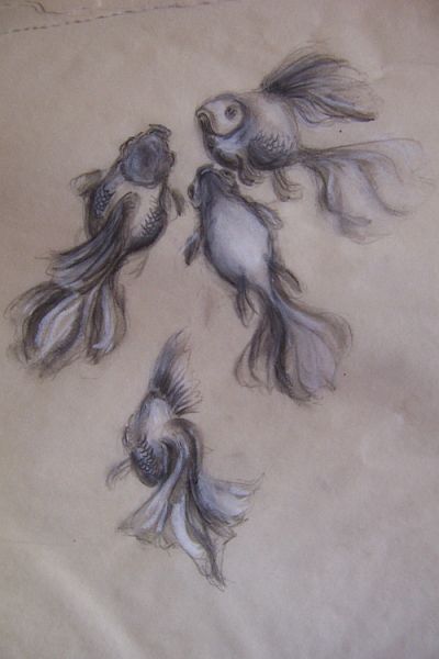
I've always wanted to paint fish. Why? I don't know...just one of those things. I do not own fish and I can't seem to find any decent reference photos online so I've been studying the anatomy of veiltail goldfish instead. I love their long fins and tails which would lend themselves well to some exciting movement in a painting. These sketches are from my imagination, done with water soluble graphite and white charcoal on some odd paper I found on my studio shelf. It reminds me of a cross between yellowed tissue paper and tracing paper. Wish I knew where I got it. The results were rather sumi-like in style. I do like the look here but the search for THE fish will continue.

Thursday, January 11, 2007

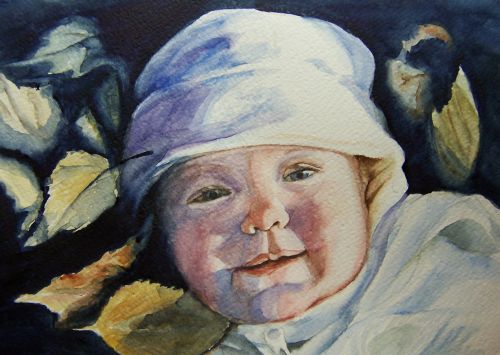
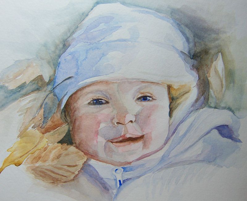
Ellie in the Fall


I've finally completed this. I had my doubts how well this one would turn out but I'm pretty satisfied with my results.

Saturday, January 06, 2007

Ellie #2 wip


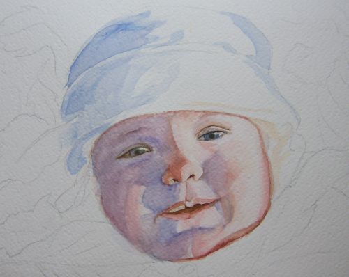
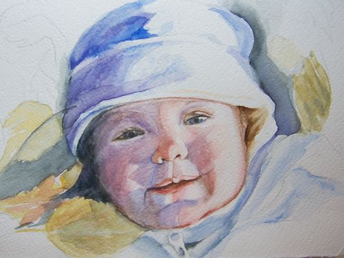
This is my second painting of Ellie. I chose to stay closer to the values in the reference photo. Also I'm going for more detail and a credible likeness. As I build washes I'm working tighter.

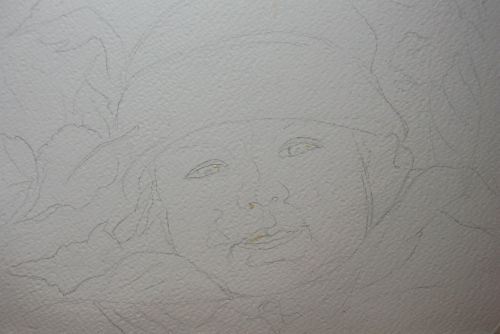
The first image is my sketch.

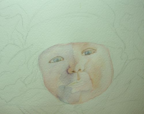
In the second image I've applied some masking fluid to the catchlights in the eyes, lip and a spot on one nostril. I'm starting to apply my first washes.

At stage three I've begun to define the features...eyes and nose mostly. This is where I've begun painting much tighter.

Stage four...strengthening values of the shadows and working on the mouth.

Stage five...I've started the background and clothing and have begun fine tuning Ellie's features.

At this point it's time to put this down and let it rest for awhile.

Saturday, December 30, 2006

Ellie #1


Making the leap from tight detail work to a much more 'loose' style has proven to be quite a journey for me. I've been particularily fascinated with the paintings of Jean Haines aka Aquarelle10 on WetCanvas. Her style is so removed from what I usually do that I felt challenged to give this a try. In July of this past year she did a wonderful tutorial in the Learning Zone on painting children and I've been studying it recently for this portrait. The subject is baby Ellie, my dear friend's first granddaughter experiencing her first Fall lying in the autumn leaves and obviously enjoying herself.

This painting is a dry run(a bit of a misleading statement as this style is done very wet) for the completed portrait. The paper I've used is not my favorite...a cheap store bought brand that loves to buckle the moment it gets wet and(I'm guessing here) is not good quality rag. It's good enough for trials and testing mixes, though. I did a quicky sketch without worrying too much about a likeness at this point.

One of the tricks to this style is selecting what's important and pertains to the subject and getting rid of unnecessary details. Cutting things down to the bare essentials, so to speak.

Secondly, keep washes light and very wet. I believe Jean uses the word 'whispery' a lot. After each wash has completely dried more washes can be added to build color and create contour and volume. She paints in suggestions of detail rather than actual D-E-T-A-I-L and isn't afraid of the dreaded backrun but instead uses them to her advantage. I call this style of painting controlled chaos but I'm sure Jean would disagree on the 'chaos' part. For me, it's still chaos but in a fun way.

Even though I wasn't really concerned with capturing a likeness at this point I was surprised how much this first attempt resembled my subject.

Monday, December 18, 2006

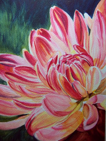
Dazzling Dahlia Again


After posting my dahlia on WetCanvas and getting some sage advice from the skilled watercolorists there, I decided to tone the background down a few notches. It was competing too much with the flower. It still looks a bit bright in the image but is much more subtle IRL.

Saturday, December 16, 2006

A Ball and a Box


I'm getting into the Xmas mood finally. In tweaking my decorations last night I got the bright idea to take a couple framed botanicals I bought from a flea market and replace them with more Xmasy(?) themed paintings. I spent all of 15 minutes on each of these and had the time of my life. They'll be hanging in my diningroom for the Holidays.