I decided I should get back to the inks for awhile so last night I prepped some waxed paper with black ink for faux batiks. I treated the paper with Krylon's 'Make It Acid Free' spray this afternoon and while I was waiting between coats (btw, I only apply one coat to each side)I sketched my cat Gizmo sitting in one of the front windows soaking up the heat from the sun. She's black furred so she really gets hot in a short amount of time and it seems to send her into a Zen-like mode. Her eyes are barely half open but I know she's looking at nothing and she remains perfectly still until the sunbathing session is over which isn't long. I took the opportunity to scribble a quick sketch on a scrap of paper with a black ballpoint pen. Now to look for inspiration for my next batiks!
Translate
Thursday, June 20, 2013
Gizmo Sunbathing ~ sketch
I decided I should get back to the inks for awhile so last night I prepped some waxed paper with black ink for faux batiks. I treated the paper with Krylon's 'Make It Acid Free' spray this afternoon and while I was waiting between coats (btw, I only apply one coat to each side)I sketched my cat Gizmo sitting in one of the front windows soaking up the heat from the sun. She's black furred so she really gets hot in a short amount of time and it seems to send her into a Zen-like mode. Her eyes are barely half open but I know she's looking at nothing and she remains perfectly still until the sunbathing session is over which isn't long. I took the opportunity to scribble a quick sketch on a scrap of paper with a black ballpoint pen. Now to look for inspiration for my next batiks!
Sunday, June 09, 2013
Hostile Takeover ~ fighting roosters
I had an idea of adding fighting roosters to my corporate chicken collection. Somehow it seemed appropriate. Anyway, I thought if I planned to paint them I should see them in action so I browsed some Youtube videos. No illegal cock fights to the death, just barnyard quarrels. It was fascinating to watch these birds spar off. They mean business! Each rooster will fan it's neck feathers out to create an impressive frill or mane as the first act of aggression. With heads down they circle each other, looking for an opening much like human wrestlers. Then the feet with those sharp talons and leg spurs will start to fly. The loser was bested when the opposition was able to plant himself on the other's back. I do know some roosters will fight to the death but thankfully the pair I watched did not.
I couldn't help but look at all the various roosters online and found a breed, the Asil or Aseel that is bred specifically for it's aggression. It's bred in the Middle East and is a rather odd, almost prehistoric looking bird. Tall, very small breasted and very long legged, it's a formidable looking creature:
http://indianrooster.blogspot.com/2011_01_01_archive.html
This painting was a quicky. I did a freehand sketch directly on my working paper and worked fast with broad, expressive strokes to hopefully capture the action and violence. This is mostly transparent watercolor, a touch of India ink and Caran D'Ache water soluble crayon.
Thursday, June 06, 2013
Board Meeting ~ complete
I had planned to paint this as a work in progress but it's been so gloomy lately I couldn't get decent photos of the steps. Finally I decided to forge ahead or this painting would never be finished and I completed this last night. And today we have sunshine! Perfect timing (for once).
The chickens (and one rooster) were painted with transparent watercolor, the background is tinted gouache. As for the steps/tips, chicken feathers(or any feathers for that matter) equal a nightmare for me. I hate painting tedious details so I made short work of them. With my easel at a sharp angle, I applied my various mixtures of watercolor in the approximate areas they belonged, letting them run and blend as they will. I came back when the paper was completely dry and lifted out a feather here and there, hopefully to create the illusion that I did much more than I actually did. The lifting also helped give the chickens contour and volume. My entire palette consisted of FUB, Quin. gold, burnt sienna, Quin. red and white gouache. I tinted the white gouache with Quin. gold for the background and applied it with a 1/2" synthetic flat in crisscross strokes. I love using gouache for my backgrounds because I can get a very painterly effect that works well in contrast to the watercolor.
Regarding my new Silver Black Velvet brushes, I was very happy with them. Especially with the rounds. They hold a nice sharp point so I didn't have to use so many different brushes to get the job done. They carry more water than straight synthetics but are stiff enough to control. I highly recommend them to artists who want more from their brushes but don't want to spend a fortune.
Note: my reference photo is courtesy of photographer Anita Guinane from PMP
Note #2: It seems I can't get a decent photo of this painting although not w/o lack of trying. I hope the background looks like a soft ocher on other monitors and not neon greenish yellow like on mine. *sigh*
Thursday, May 30, 2013
Board Meeting ~ WIP 1 (more chickens)
I've had this drawing completed for 4 days but have been waiting for my new brushes to arrive before starting to paint. I ordered 4 Silver Black Velvet brushes and I'm anxious to try them out. They are a Taklon synthetic/squirrel hair combination that I've been looking at for months. Jerry's Artarama is running a sale so I took the leap and ordered a med. Jumbo round, a #8 & #10 round and a 1/4" dagger striper. I do love my synthetic sables(great spring) but they have limitations and my one squirrel quill is wonderful but sometimes too soft for my needs. I'm hoping the Black Velvets will be the best of both worlds. I'll post my review after the painting is completed.
Thursday, May 23, 2013
Rooster 2 ~ 'Middle Management'
SOLD
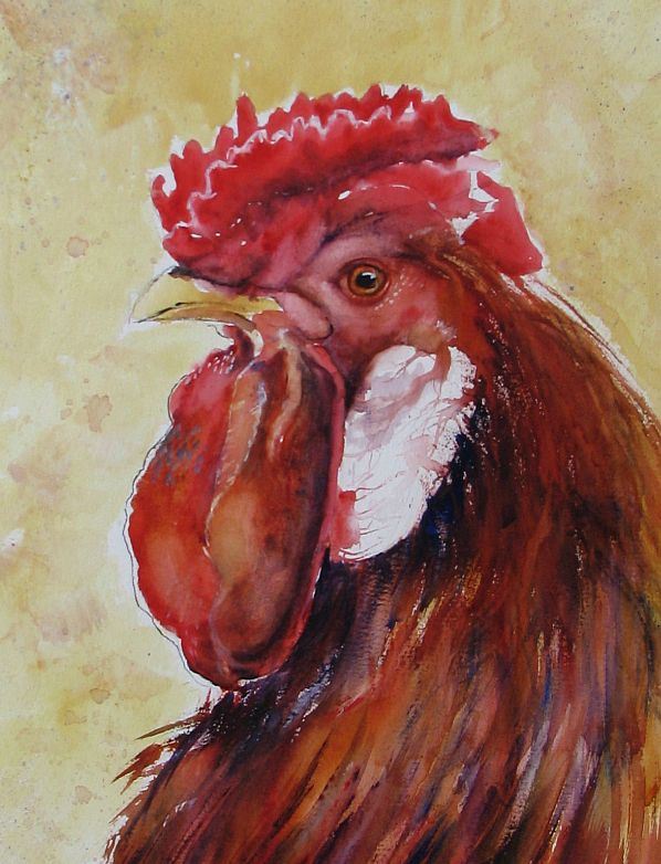
I painted this fella 3 days ago but it's been so gloomy I couldn't get a decent photo until today. Our sun came back along with much cooler weather. This back & forth with the temps is raising hob with my sinuses and my nose is running like a tapped tree but I know it won't last and summer will come soon.I named my last rooster 'The CEO' and in keeping with the same theme I should call this one 'Middle Management'. It's not a position I would ever hope to hold. A slam sandwich between upper management and the hourly workers, it's maximum stress. I have a very dear friend that works in middle management and although this rooster doesn't resemble her in any way(thank God for her), if her stress level ever took form I think it would look something like this.
Btw, this particular rooster is a Polish Crested and I love the wild 'do' it's sporting. I didn't exaggerate it at all...honest!
Labels:
gouache,
India ink,
Rooster,
transparent watercolor
Sunday, May 19, 2013
Rooster 1 ~ 'The CEO'
Sorry again to be late in posting an update. I'm refurbing and downsizing my garden beds and with my lung issues it takes the wind out of my sails in more ways than one. I wanted to get back to the watercolors for awhile and found some wonderful chicken photos on Paint My Photo that needed to be painted. Always on the lookout for a new approach to a subject, I stumbled onto Jon Lovett's blog. He's an artist I admire very much and I was taken with a few chicken paintings he posted. He managed to capture the craziness, silliness and potential danger these lowly birds possess with a limited palette and wild, expressive brush strokes.
This rooster was painted from a photo submitted by Gary Jones from PMP. I think he looks like he could be a CEO of some Fortune 500 company. Regal and in charge on the outside, ready to draw blood should competition get in his way. Painted with a palette of Quin. Gold., Quin. red and French Ultramarine with white gouache and India ink.
Wednesday, May 08, 2013
Homemade Stencils
Often I've wished I had a particular stencil for a project but couldn't find exactly what was needed online. Also I knew I may only use it once or twice so why pay a hefty price? One of my friends is an avid scrapbooker and she suggested, "why not use cardstock and coat it with Mod Podge?" Why not indeed! She has a Cricut so she cut out various shapes for me to try. For this demo I cut my own. I used 90# cardstock and cut out my pattern with an Exacto knife. Then I coated both sides with one coat of mat Mod Podge, allowing the first side to dry completely on waxed paper before covering the opposite side. This makes the stencil fairly waterproof so it can be rinsed off after use. I tried out my dragonfly stencil with Speedball silkscreen ink and a roller first with so-so results. I washed off the Speedball ink and tried again with metallic fluid acrylic and a makeshift stencil brush with slightly better results. Note to self: make sure the stencil is completely dry before reuse so the paint doesn't run under the stencil.
Note: 2nd image down>Notice how clean the stencil is after being covered with black Speedball ink. I just rinsed it under running water and voila!
Tuesday, May 07, 2013
Faux Batik Sunflower 2
I chose to revisit Faux Batik Sunflower using a different palette of colors. Also I used walnut ink in place of India ink during the process. The walnut ink toned the entire piece of waxed paper and gave it an antiqued look which, of course I totally obliterated with my color choices. Next time I will work with the result and not against it.
Next post: I will show you how to make stencils with 90# cardstock and Mod Podge.
Labels:
alcohol ink,
faux batik,
sunflower,
walnut ink,
waxed paper,
Yupo
Friday, May 03, 2013
One More Ink Painting on Copper Leaf
I'm finding that Simple Leaf is very delicate and can scratch easily. The silver leaf goes down on Yupo like a mirror (without burnishing) and is slightly resistant to the inks. Even after I allowed the ink to dry for a full day I could wipe it off with a dry finger and a little rubbing. I had used Tim Holtz blending solution on the silver leaf and that seemed to compromise the adhesion to the Yupo. When it was lightly scratched the leaf came off with the ink. I tried several (6) coats of Krylon UV gloss varnish spray in hopes of eliminating the problem. It helped but wasn't a perfect solution. At this point, I believe the blending solution is the problem. It doesn't play well with Simple Leaf on Yupo. Things fared better on the copper leaf so I was able to produce one decent painting.
FYI, these paintings are miserable to scan or photograph. The purple is actually blue.
Tuesday, April 30, 2013
Krylon 'Make It Acid Free'
I have had questions put to me and my own concerns about working with alcohol ink on waxed paper. How archival could these paintings be? From my online searches the coating wax is described as purified paraffin but I can find nothing about the paper that is used in the process. Is it acid free? Probably not and because I crumple the paper to expose it I felt I needed to address this issue. I found Krylon's 'Make It Acid Free' spray
, (link) available at Dick Blick or Jerry's Artarama in the US. I crumpled my paper, then treated both sides with this spray before applying the inks. I found no difference in the way the inks reacted on the treated waxed paper and feel much better about the longevity of my faux batik ink paintings.
Labels:
acid free,
alcohol ink,
faux batik,
krylon spray,
waxed paper
Monday, April 29, 2013
Alcohol Ink on Copper Leaf
Another experiment and I think this has definite possibilities! I applied Mona Lisa copper Simple Leaf with Mona Lisa leaf adhesive to a 5" x 7" piece of Yupo. I then applied the inks, hoping to create a semi-abstract seascape at sunset. The inks reacted well on the copper leafed surface giving me slightly more control than on plain Yupo. I was even able to apply ink in a more painterly fashion to the sky area with a small flat brush. I did add a little rubbing alcohol to the lower portion to get ink moving but it didn't seem to affect the leaf at all. I also like the texture the leaf created when applied. I've got another piece in the works using silver Simple Leaf. The silver leaf went on with much less texture so we'll see what I can do with that.
Labels:
alcohol ink,
copper Simple Leaf,
seascape,
Yupo
Sunday, April 28, 2013
Back to the Inks
Butterfly I
5" x 7"
April 2013 has not been a productive month for me. I managed to create more paintings than usual, all of which landed in File 13. It seems that not only trying a new style but also a new subject has proved folly for me. I had hopes of whipping up a Shirley Trevena style still life but that didn't happen. In the meantime a laundry list of to-dos was piling up behind me so I had to stop and take care of business. I didn't expect to lose Digby either but it happened and I've needed a few days to grieve. It really threw me for a loop to be honest. Maybe as I get older these things hit harder.
Art is good therapy so I got out the one medium that gives me the most pleasure at the moment and painted this butterfly using my faux batik technique .
Note: My reference photo was courtesy of Veronique on Paint My Photo.
Labels:
alcohol ink,
butterfly,
faux batik,
Micron pen,
speedball ink,
waxed paper,
Yupo
Wednesday, April 24, 2013
With Heavy Heart...
...I had to say goodbye to my cat, Digby today. I gave him several nicknames over the years but 'Bubba' seemed to stick. He was a rescue, less than a year old, when he came to live with us permanently. He'd lost trust in humans but once we resocialized him we couldn't ask for a better cat. I live in a park and he became quite a fixture here among the other residents. Everybody knew Digby because he was everybody's friend. In the warm months he would make his rounds of the park and do his 'sociables', visiting anyone that was home and had an open door he could wander through. He never overstayed his welcome, so I was told, and kept his visits brief. He adored kids, even the little ones that pulled his tail, and would head anywhere he heard kids playing. One summer the neighborhood kids must have been playing with squirt guns filled with colored water. Digby came home with his white fur covered in pink and blue splotches. I wiped him off but he must have rejoined the games because he showed up more than once that day sporting pink and blue fur. He was gentle and patient with me, slept in bed next to me and once he discovered how great a lap was he became 'the lap monster'. He left me alone if I was busy but when the day was done and I sat down on the sofa to watch TV it was 'lap time' and he was a great lap warmer in winter, a wonderful companion and a very special kitty. I will miss him so much.
Sunday, March 24, 2013
Grandma's Singer ~ experimental
Okay....I think I finally got myself headed in a new direction. I'm not there yet by any means but I'm working on it. I have my grandmother's old Singer sewing machine and have always wanted to include it in a painting. I used to do a lot of sewing with it and am no stranger to those ole Jiffy patterns so one thing lead to another. I cut the last painting in half and flipped the pieces over. Waste not, want not and also it takes the pressure off to create something frame-worthy and allows me to relax and experiment.
Funny where inspiration can come from. I was looking online for different decorative patterns but found nothing I liked. Then I received a home decor catalog in the mail and found wonderful patterns on their selection of rugs. This is also a new composition for me but I think it works. My palette consisted of Ivory Black, Prussian blue, cerulean blue and Quin. pink. The pattern piece is diluted walnut ink and I added some silver leaf to the Singer and the bobbin in the lower left corner.
Wednesday, March 20, 2013
Studio Cat 2 WIP ~ a bust
Where have I been? Lost...totally. I admit it...this style change is not going to be easy for me. After spending an entire afternoon freehanding my sketch onto my working paper I began painting and it immediately got away from me. Foolishly I didn't realize it at the time. My first clue that I was headed in the wrong direction should've been the fact that I took so long with the sketch. So meticulous rather than expressive. At some point I noticed I had three separate paintings happening in one and, over a period of days, battled to tie it all together and (hopefully) rescue it. Too many ideas/styles equals no cohesion and no amount of color blending can bring it back from disaster so it's back to the drawing board.
(1.) I need to learn how to set up a proper still life. Don't rely totally on imagination.
(2.) Don't sweat the details. If it looks good in 2-D, leave it! It's about the basic shapes, not contour and volume ie. realism.
(3.) Don't choke up on the brush. Holding a brush near the bristle end tends to make one want to focus on fiddly details. Instead hold the brush high on the handle and be confident/expressive with the strokes.
(4.) Find interesting patterns/textures to incorporate. This is what makes Shirley's work so exciting and that's why I was drawn to it in the first place.
(5.) Not sure yet. Probably lots of practice with lots of failures. I hate failing but I seem to learn something from each disasterpiece I create.
Note: a good thing...I've been sketching more than I have in months and that's never a bad thing. I'm not a sketch artist nor do I aspire to become one but practicing observation and honing basic drawing skills is/should be the core of any good artist.
Tuesday, March 12, 2013
Metal Leaf on Watercolor Paper
I love metallics but am never sure how to incorporate them into my artwork effectively. Recently I purchased a few packages of Simple Leaf from Daniel Smith. I like it because it's cheaper than gilder's leaf and it doesn't require sealing to prevent tarnish. I chose silver and copper w/a bottle of Mona Lisa leaf adhesive. Last night I experimented on Fabriano 90# w/c paper and found the cotton rag drinks up the adhesive like crazy. In order to get the metal leaf to stick I had to apply it within moments of painting on the adhesive. Afterward I thought "WOW...is that bright and shiny!" To tone it down I tried some Ranger alcohol ink over the leaf and got some interesting results. It did tone down the brilliance of the copper as well as the silver and, depending on which color ink is used, I believe it's possible to create some really exciting effects. I'm posting a sample piece so you can get an idea of my results. Metallics are difficult to photograph but I did my best.
Note: The sample is partially silver leaf and copper. I used Ranger's Expresso and Clover on the copper and just Clover on the silver.
Sunday, March 10, 2013
Studio Cat 2 ~ sketch
First sketch for Studio Cat 2. I wanted to include the same elements and shapes from the first painting but switched around. Working off a basic theme/concept but with a purely decorative intention is proving to be a challenge. The flowers will be on the vase, not in it. I wanted to keep the fan shapes from the tray and also the stripes. The fan shape has now become a Japanese paper fan, the stripes are on the 'wallpaper'. The cat has been stylized and will remain completely white. I borrowed the tea cup in the lower right corner from one of Shirley's pieces. Thanks, Shirley!
Labels:
cat,
decorative art,
shirley trevena,
sketch,
studio cat
Saturday, March 09, 2013
The Studio Cat ~ complete
I finished this one yesterday but some buckling occurred that needed to be corrected so I wasn't able to photograph it until today and, of course, it's very gloomy outside. I did the best I could with my photo editor. This is a painting I've needed to get on paper for months. It has been rattling around in my head but I just wasn't able to bring it together until I studied Shirley Trevena's work. I know....it looks nothing like Trevena's work but her (sometimes)blatant disregard for perspective, placement of objects, etc. gave me the impetus to get it done. I'm not a still life painter but it's a direction I'd love to explore. I plan to do this painting again, this time more in Trevena's style and see what happens. I like surprises(mostly).
Labels:
cat,
still life,
studio cat,
transparent watercolor
Thursday, March 07, 2013
The Studio Cat ~ WIP 1
Sorry it's taken me so long to post an update. I wanted to take my sweet time deciding how to approach this style of painting. Tranferring a drawing to working paper would lose the spontaneity so I freehanded my sketch instead. Then I 'danced' around this for days, trying to choose a palette, etc. The trouble with this method is there comes a tipping point when one loses momentum and fear sets in. Fear is the death of creativity. I grabbed my new colors (in this case DS Quin. Burnt Scarlet, DS Prussian blue, DS Undersea Green and also a tube of Quin. gold) and dove in. I knew I could achieve a full range of values with these colors so I held my breath and took the plunge. Right away I saw it begin to tighten up on me. At that point it was time to walk away and regroup. Today I forged ahead with the cat and immediately thought I'd lost the painting. I took it off the easel and set it up in my living room against a shelf to get a long view and there it was...the painting I envisioned was underway! Why is it so hard to trust my instincts and let go of control?
Friday, March 01, 2013
Shirley Trevena in Action
For those that may be interested, Shirley has a few videos available on YouTube that are a must-see. I'm still working on a setup for my 'still life with cat'.
Subscribe to:
Posts (Atom)