Translate

Monday, July 23, 2012

If at first you don't succeed...

The after

The before


...keep on trying. With Yupo that isn't difficult. Man, is this stuff forgiving. I wanted to try watercolor on this surface to see just how much trouble it would give me. You can push watercolor around on Yupo all day and into the night but I didn't want to spend the time so I got out my inks, an Exacto knife & some markers and started playing. I scanned my original results (which were boring, BTW) and I'm posting both the before & after. I think it's much more exciting now. I may even continue playing with this one. I'm not the least bit happy with where the stems cross so I should correct that mistake while I'm at it.

Sunday, July 22, 2012

Ants on my plants


I got up earlier than usual today. I'm a night owl so I normally sleep late. It's a glorious summer morning. Perfect temp, humidity level and the sun is shining. I took my Canon S5 IS outside and took a few floral macros. I won't say what flower this is. I'll let you guess. It wasn't until I uploaded my photos that I noticed a surprise...two ants enjoying the summer flowers as well.

Saturday, July 21, 2012

A Cat of Color


My latest alcohol ink project. Yup, another cat. I noticed when I wiped a failed painting off the Yupo with isopropyl alcohol it left behind some pale color. A pleasant, rather neutral watercolor affect emerged. A perfect background for many subjects. I lightly scored the shape of a cat into the Yupo with an Exacto knife. Then I added more ink. I made sure to use one of the darker inks, (in this case, Eggplant), then wiped that away. The ink settled into the score lines as I had hoped. When this was dry I filled in the shape of the cat with more ink, using a small paint brush. I'm very pleased with the results!

7/27/2012 - Prints of A Cat of Color are now available via Imagekind: http://www.imagekind.com/A-Cat-of-Color-art?IMID=534cc677-63e4-4fb6-af8b-fb031152ba33

Thursday, July 19, 2012

It's Tulip Time Again


Another alcohol ink painting, this time a group of red tulips. This style is so far outside my wheelhouse I'm not sure where it came from but I had fun painting it.

Sunday, July 15, 2012

A Few Old Crows & a Feather


These crows are painted on Yupo with Speedball ink. I let them dry completely before applying the alcohol ink to my stamper and tamping it right on top of the birds. I did notice the Speedball ink eventually began to lift in spots so I stopped, then made a few corrections with a black Micron pen after everything had dried.


This crow was drawn on Yupo with a black permanent marker. Then I applied the alcohol ink over top same as I did with the first crows.

This one has a little bit of everything going on. I wanted to see what the inks would look like on a field of black so I painted an area with black Speedball, let dry completely, then tamped on some red and copper alcohol ink. That's the dark area you see. I created the feather by squeezing a large drop of white fluid acrylic onto Yupo, then used the tip of the handle of a paint brush to 'pull' the acrylic into a feathery shape.


I've been trying other mediums this evening with the alcohol ink to see what effects I can achieve. I didn't actually mix each medium with the ink. I did try the other day and found out alcohol ink and fluid acrylic do not mix! However one applied on top of the other can get you some interesting results.

Saturday, July 14, 2012

Alcohol Inks ~ more supplies & colors


I've been waiting for more supplies and they have finally arrived. Most of them anyway. Still waiting for the alcohol pens from Nona Designs. I think they were on back order.

I now have a few new colors plus two mixatives... metallic copper and pearl. I played with the copper mixative last night and combined on Yupo with Clover ink, which is very similar in color to Pthalo green, I managed to pull off a decent facsimile of verdigrised copper. Got some nice texture going on as well. I posted an image of my results above. Not the best image but metallics are difficult to photograph.

I also took time to start a color chart. Ranger alcohol inks have a total selection of 48 colors and 4 mixatives available. I detest taking the time to create color charts, trying to make them look halfway decent. All the measuring and drawing of lines, labeling...yuck. Lo and behold I found Ranger inks offer a color chart template (link) in PDF form. Print it out on a sheet of glossy craft paper or Yupo and just add a drop of the ink under the corresponding name. Voila! Wish I had found this last night.

Saturday, July 07, 2012

les compagnons

SOLD

I can't explore a new medium without getting a few cats involved as subjects. This is alcohol ink on Yupo again but this time I added some Micron pen and black permanent marker. Both pen and marker ink will move and blend nicely with a little rubbing alcohol so I was able to soften edges/harsh lines where needed. The violent yellow in the background is actually a soft golden yellow IRL. I've been scanning these small pieces rather than photographing them and scanners tend to blow up certain colors. Unfortunately the photos I took were even worse.

Thursday, July 05, 2012

Alcohol Ink on Yupo ~ still going


My latest ink painting at the top. This time I went a little larger, roughly 8" x 10". Honestly, I've tried a lot of mediums but never ran into one I could not leave alone. I can't say that anymore. 

More about the products and supplies: Tim Holtz has a blending solution that Wendy highly recommended. The blending solution is applied to the surface of the Yupo prior to adding the ink. She also suggested it be used liberally(I stress liberally) before the inks are added to create lovely soft color blends and edges. It also helps the ink move across the surface of the Yupo and delays drying time. Alcohol ink on it's own dries very fast. You can use plain rubbing alcohol in place of the blending solution but the results won't be the same. I know this because I've tried.


The stamper has Velcro on the ink side and comes with removeable felt pads which the Velcro holds in place. By dropping small dots of ink on a felt pad and gently stamping it on your painting, lovely little colored blooms are created which can indicate leaves on trees, small flowers in a field, etc. Straight rubbing alcohol can also be spattered on the ink to create various textures.

FYI, the bottles of ink are small, .05 fluid oz. each, but a little goes a long way.

Right now I'm waiting for another tool to arrive. An alcohol pen which can be filled with blending solution or ink and used to produce even more effects. Tim Holtz online carries this product but they are currently out of stock and I wanted to catch the free shipping deadline(which ends today) for my next order of ink. I found another online supplier, Nona Designs. Their prices are a little higher but they have what I need now. I'm impatient sometimes.

Wednesday, July 04, 2012

Alcohol Ink on Yupo ~ continued


I was introduced to alcohol ink on Yupo by Wendy Videlock who I chanced to meet on Facebook. I thought her work was exciting so, of course, I wanted to know more. I checked out her blog, The Fifth Element (link) and was happy to discover she sells DVDs demo-ing her process. I ordered the demo which was very well done and full of information.

Wendy buys her supplies from her local Michaels store but we don't have one nearby so I ordered from Tim Holtz online (link) . She recommends his line of Ranger Adirondack acid free inks, claiming they are the most vibrant of any she has tried. When I went to the Tim Holtz store online, I searched 'alcohol ink' and a page opened with a list of most all the supplies needed. I've been intending to try my hand with Yupo for a few years so this was the impetus to order a few sheets from Blick and since all my supplies have arrived I've been hooked. Playing with ink on Yupo is addicting.

As Wendy recommended in her demo, I've been experimenting on small (4" x 4"/ 4" x 5") squares of Yupo, getting accustomed to the way each different color of ink reacts/behaves, alone and together with other colors. I'm posting today's samples to see what they look like on screen.

To anyone who would like to try alcohol ink on Yupo and is interested in Wendy's DVD, here is a link:

http://nutshell-wendy.blogspot.com/2012/06/alcohol-inks-on-yupo-tutorial.html

Note: You can contact Wendy via Facebook or by email

Tuesday, July 03, 2012

Alcohol Ink on Yupo


I've been playing with a new(to me) medium today. It's called alcohol ink. Normally used by scrapbookers and crafters, it has potential for the fine art world, IMO. I'm going to post some samples I've been working on today and I'll do a follow up post with more information, some links and hopefully more results very soon.

Monday, July 02, 2012

Miss Willmott's Ghost ~ 2012


Miss Willmott's Ghost (link) (aka Eryngium giganteum aka giant white sea holly) has graced my moon garden this year with not one but two blooming stalks, each roughly 36" tall and both are loaded with blooms. This doesn't happen every year. These plants come from the seed of a parent plant I added to the garden back in 1997. Here are a few photos I'd like to share.

Wednesday, June 27, 2012

More Weeds


I have a lovely weed border growing in front of my home between my sidewalk and the drive. Before it succumbs to the weed whacker I thought I'd use up the last half sheet of the dark pastel paper from my prior post and sketch a small snippet. I have to say I really hate this color of pastel paper. It 'eats' light colors (mainly white) and it seems there's nothing that can be done about it. I tried white charcoal, Chinese white and white colored pencil w/o luck. It also shows every little smudge and piece of dust. Nonetheless, here is my sketch.

Sunday, June 24, 2012

Another Shell Sketch


I've got a rather large conch shell I've used as my model this time. I'm not quite as happy with this as I am with the first shell sketch. I think my pastel paper may have been too dark. I'm posting it anyway. I had plans of doing a series and calling it 'Shell-f Life'. I may still follow through. Have to see where inspiration takes me.

Friday, June 22, 2012

Joseph Zbukvic ~ video demo

To anyone that works with watercolor, Mr. Zbukvic (or Mr. Z for short) is a very familiar name. He paints the most incredible urban landscapes in watercolor with poetic ease. I wanted to share this video demo with you, my visitors, so you can all enjoy seeing a master at work. I need to mention that he demos his entire process (creating the comp) and paints a piece to completion in the 20 minutes this video runs. It's really worth the time to watch.


Joseph Zbukvic gives a studio demo from web3media on Vimeo.

Thursday, June 21, 2012

Back to the Drawing Board


I found myself stuck on a problem with my cat collage *sigh* so I decided to go back to my roots...drawing. I haven't sketched much of anything in quite some time. Being able to draw and sketch should be a basic skill of every artist. I realized I had grown lazy, using my computer screen as a light box to trace simple outlines for my paintings from photo references. I was always so eager to get started on the painting I was neglecting my prep work.


I have this shell that has sat on the tank lid of my toilet as decoration for years. It's a crazy looking thing. Well armored with spikes poking out at every angle. This must have been one bada** snail when it was alive and I'm sure it died of natural causes.


I sketched this shell from four different angles with ballpoint pen. I used a pen to keep myself honest. No erasing. Then I found a few sheets of sanded pastel paper. I hunted through my art supplies and found my sketch set...one sepia pencil, one sanguine, one china white and also I grabbed a medium charcoal pencil and went to work. I'm posting my current results for Operation Snail Shell.

Wednesday, June 13, 2012

A Dip into Digital Art


I'm not a huge fan of digital art but if it's done really well I can certainly appreciate it. The skill level and work involved in creating something visually stunning and/or unique using computer technology is a part of the future of art.

These pieces, which I just uploaded, are not one of those stunning and unique bits of artwork I speak of but I thought they were kind of cool so I'm posting them. I filled a vase with a bouquet of chive blossoms and created a still life with a cluster of grapes and a bell pepper, then photographed it. I began to play in my photo editor and voila! Art!

Truth be told, I ran into issues with my collage so that's staring at me from my studio table begging for a solution and I haven't picked up a brush in awhile. I had to create something today so this is it.

Thursday, May 31, 2012

Petoskey Gallery Walk

                                                 The Twelfth Annual Gallery Walk (link)


The art world will descend upon Downtown Petoskey for its twelfth annual Gallery Walk. This evening of art and entertainment has definitely become a community tradition.


Participating art galleries will greet guests on the third Thursday in June, June 21, 2012, from 6:00 to 9pm in an open-house format and offer delights for your eyes, ears, and taste buds. Many of the galleries will have the artists present to introduce their works.


Gallery Walk is sponsored by the galleries of Downtown Petoskey with the support of the Downtown Management Board and Crooked Tree Arts Center.  Participating galleries are:  Arlington Jewelers, Art Cats Gallery, Crooked Tree Arts Center, Art Tree Sales Gallery, Hramiec Hoffman Gallery, Luciano's, Mitchell Street Frameworks & Gallery, Northern Michigan Artists Market, Shadetree Stained Glass Studio, Stafford's Gallery of Art and History,  Ward & Eis Gallery, and WARD Gallery at Ciao Bella!

Wednesday, May 30, 2012

New Header

The photo for my new blog header is courtesy of Julie Christiansen, a wonderful local photographer. Thanks, Julie!

Sunday, May 27, 2012

The Gardener's Cat ~ collage wip 2


Here's a quick update on my first collage. I may have bit off more than I can chew but I'll perservere. It's slow going, though. I'm beginning to question my choice of colors. The cat is starting to get lost in the background. I'll have to figure something out to make it work. Gotta love a challenge!

Wednesday, May 23, 2012

The Gardener's Cat ~ collage wip


I hatched this particular idea because I've always admired the work of really good collage artists. Patty Henderson (check my link list for her work) comes to mind first because she creates the most beautiful collages. Absolutely stunning!


My subject evolved in due part to the many nursery catalogs that appear in my mailbox every year. I thought enough ahead to save many of them as source material. The plan is to use the lovely flower photos in these catalogs to create my cat and it's surroundings. I've never done a serious collage and realize now I wish I had a much smaller pair of sharp scissors and can already see this will push my patience to it's limits.


All I have to share at the moment is my intial sketch of the cat with some garden foliage. I've also begun adding values and have been playing with some different 'palettes' of cut out flower photos. This will not be a quick project but I will update as things develop.

Sunday, May 20, 2012

Disposable Palettes


Remember that stack of styrofoam plates I bought to make stamps? Well, I switched to recycled styrofoam meat trays for my stamp making needs because they're thicker. So what to do with all those plates. I found out they make the best disposable palettes! Even better, when leftover paint dries on the plates I can stack them (dried paint and all) out of the way. Whenever I need a color, I can browse through the stack and usually find it. Why didn't I think of this sooner?

Saturday, May 19, 2012

Stalker


This is another small piece ( 3 1/2" x 5 1/2") that I painted this afternoon. I used black Speedball ink and transparent watercolor on #140 w/c paper. I love the intense stare of this cat. It's definitely in stalker mode.

Friday, May 18, 2012

Experimenting with Watermedia


I truly enjoy mixing it up when it comes to different mediums. In this case, all the mediums used I consider water mediums (meaning they will combine readily with water). There is some debate on what actually constitutes 'watermedia' so I'm using my own understanding of the term.

The right image is black Speedball ink, thinned with a little water and applied onto damp w/c paper. Then gold metallic fluid acrylic was dropped in and allowed to mingle with the wet ink. I did direct some of the metallic acrylic with a bamboo skewer. While the paper was still damp I added some Quin. pink here & there. I dropped a little granulation medium into one of the pink 'runs' just to see what would happen and got some extra texture going.

The left image is phthalo blue fluid acrylic applied to damp paper with the gold metallic fluid acrylic added. This time I let the gold go where it wanted with no coaxing from me.

Thursday, May 17, 2012

Painting on Black Paper


I've spent the last few weeks experimenting with all sorts of ideas. Most wound up in the bin but I thought I'd share this one with you. This was painted on black Strathmore Artagain paper with regular watercolor and a little white fluid acrylic. I was pleased with the effect I was able to achieve painting those lovely semi-transparent fins and tails on the black background. This was also a real bugger to photograph. I've found black usually is problematic for the camera, especially for this cameraman/woman.

Sunday, May 06, 2012

An Exploration of Chinese Style Painting


I've always admired the look of the more loose style Chinese painting aka Freehand - Shui-mo (水墨). Last night I again tried my hand at painting fish, this time Black Moors. I love their bug-eyes. Having no rice paper or Chinese ink on hand, I used 110# cardstock and black India ink. For a brush I employed a #4 Kolinsky sable round. I did use photo references but no prior sketches. I'm posting my results above.

I still tend to go too detailed. The art of Shui-mo says that to add more detail is to lose the vitality or life force of the subject. Having never studied art history, it makes me wonder how much impact this philosophy has actually had on Western art, particularly watercolor painting. I enjoy a well done, detailed painting but usually react more positively to something less detailed and more spontaneous. In fact, this is why I took up watercolor in the first place...to loosen up. I wish to strive for more expression, less technique but am continually fighting the urge to focus on unnecessary details. My quest is ongoing.....

I have found a few videos my visitors may find interesting. The first is a demo of fish painting using the art of Shui-mo brushwork on rice paper. The second is how to mount the finished painting onto 300# watercolor paper with silicone release paper .


Saturday, May 05, 2012

Goldfish ~ Oriental Style

I've been browsing through Youtube looking at Japanese and Chinese painters in action. Some very incredible work going on over there! The style is so simple but so effective. There's a real art to keeping things simple. Every line means something and not a one is wasted.


Watching these artists, I was inspired to try my hand at goldfish. I know I keep saying I would love to paint fish but never seem to make it happen. Well, today I painted goldfish. I'm still working in a small format so this one went quick. Little space forced me to keep the detail to a minimum. This is mostly walnut ink with a bit of gouache and transparent watercolor here & there. I actually cropped the painting to include the Chinese word for 'goldfish' in the finished piece but my photo editor would not recognize the symbols. I finally just added it in English.

Tuesday, April 24, 2012

Milkweed ~ watercolor on gesso

SOLD


One more, this time the ubiquitous milkweed pods going to seed. It's a perfect subject for this type of surface because lifting is so incredibly easy. I created the fluff with nothing more than a 1/4" stiff bristle brush.

Monday, April 23, 2012

Watercolor on Gesso


Another small work, this time on acrylic gesso coated 90# Fabriano watercolor paper. I really love working with transparent watercolor on gesso. The paints reacts very different on this surface and if I add texture to the gesso while it's still moist, it creates the opportunity for some interesting effects later on. This is a fantasy floral, no reference used. I find, while texturing the gesso, if I don't have any plan in mind beforehand and simply allow the resulting texture to guide me, I can get more spontaneous results.

Sunday, April 22, 2012

Feathers ~ #5


Yesterday I played with my feathers again, coating them on one side with walnut ink and using them as stamps. Afterward I embellished with more ink, Quin. gold and phthalo turquoise watercolor. This one is also a small work, roughly 4" x 5".

Saturday, April 21, 2012

Looking Back


I've been looking through some of my past work lately and came across some pieces I actually like. I can see that I've progressed in some areas, stayed stagnant in others. The bane of not attending workshops or the lack of any professional instruction, I guess. I also believe I have not found my artistic voice yet, whatever that is. I can't seem to find a comfortable niche but maybe that's a good thing. I've concluded that I'd rather continue the hunt than keep cranking out the same thing over, and over, and over. Still there's a nagging feeling that I need to land somewhere and find my own style. Can you tell I'm feeling a little lost today?

I've posted a cat (above) I painted a long time ago following an online demo by Jean Haines, the queen of loose style watercolors. I thought it was horrible at the time but now I can see it's merits. I had no idea what I was doing and can still remember how scary it was letting all that water and paint loose on paper. Somehow it all came together to form a cat. Maybe my naivety was my advantage. My fear, my friend back then.

Sunday, April 15, 2012

Feathers ~ continued


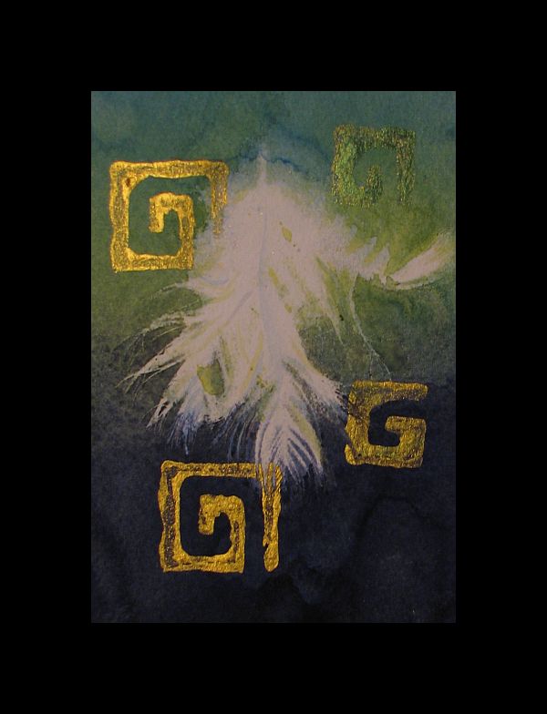
I'm still at it. This time with a cluster of three feathers, new colors in my atomizer bottles(Phthalo turquoise, indigo and green gold) and more of my homemade stamps. I've got this 'thing' for metallics right now so I've been trying to find ways to incorporate them into my work.