Translate

Wednesday, February 16, 2011

Contemplation~WIP 2


I started this yesterday but couldn't post an update until today. My camera batteries died.:( Today was in the mid 40's so it was just too nice to stay inside. This is where I am at the moment. Tomorrow is supposed to be rainy so good weather for painting. My palette is fairly limited...DS Indigo, DR cobalt blue deep & warm sepia, DV burnt sienna and MaimeriBlu crimson lake.

Monday, February 14, 2011

Contemplation~WIP 1


Marcia Van Osten has graciously given me permission to use a photo of one of her beautiful Persian cats as inspiration for a painting. This is Phoebe deep in contemplation. I've substituted a real mouse for the toy mouse in the photo and drew my sketch directly on watercolor paper, in this case Arches #140 coldpress. I've found sometimes the more often a drawing is transferred the less 'life' is carried over. By the time it finally arrives on the working paper it's lost it's vitality. I realize some subjects would be very difficult to freehand onto the final paper but in this case I think I can get away with it.

Wednesday, February 09, 2011

Cawcus~Completed

Here I've taken the liberty to mat and frame the painting online...a simple pale gold metal frame with jet black mat.


I've included two closeup shots to try and show the blue iridescent paint and gold ink which doesn't want to show up well in photos. IRL the blue is less apparent and the gold is more apparent. I could not correct this in my photo editor.:(

To complete this piece I've added the eyes of the crows and embellished their feathers with DS Iridescent Electric Blue. I also added some metallic gold ink for highlights and to help tie the crows into the background so they don't look cut out and pasted on. I've been wanting to do a painting in a narrow horizontal format for a long time but couldn't decide on the subject. This gathering of crows turned out to be just the ticket. Final dimensions are approx. 25 1/2" x 11 1/2".

Wednesday, February 02, 2011

Cawcus~WIP Update


I have been working, albeit slooowly, on this project. I decided on a Venetian plaster look for the background. I wanted something predominately warm so I started with a little perm. yellow, then switched to DS Quin. gold, Quin. gold deep and D-R Warm Sepia applied with a sweeping cross hatch motion using a damp 2" synthetic brush. Since I'm using black Speedball ink (which is opaque) for the crows I transferred my drawing first and brushed on the background paint right over the unpainted crows. I've found painting with Speedball ink works very well. It washes off/out with water so I was able to use my good watercolor brushes and it's wonderful for producing a deep, rich true black. Today I finished painting the crows. I'll be adding some iridescent paint to the feathers, possibly some colored pencil, finishing the eyes and after a suitable amount of 'look time' I may tweak a few areas before declaring this complete.

Saturday, January 22, 2011

Cawcus~Developing composition

3.)More size adjustments, more birds, more 'attitude'. I think this will be the final composition. I can individualize each bird more as I paint them.

2.)Here I've adjusted the sizes of a few birds, corrected the feet and played with attitude(posturing).

1.) I tightened the grouping so the birds relate more to one another.

I seem to be slow out of the starting gate this year artwise. Looking back over previous years I see this is a pattern for me. Maybe I tend to be more thoughtful and not as impulse and consequently less productive in midwinter. In the meantime, I've been staring at my storyboard and knew something was 'off'. I just couldn't put my finger on it so I decided to let things marinate for awhile.

I was watching the finale of The Housewives of Beverly Hills a few nights ago(inspiration can come from the darnest places) and the episode ended in a huge explosion of verbal dynamite. This particular group altercation took place at a large gathering, a birthday party actually. Long story short, it was interesting to observe how various individuals reacted to the con-flab. It gave me some added inspiration to apply to my composition. I've added more birds, grouped them more tightly and adjusted their sizes and attitudes. I decided I wasn't concerned about realistic size relationship(perspective), leaving larger birds behind smaller birds. I've also experimented, painting with a different medium...Speedball ink. DS Iridescent Electric blue watercolor paint applied over black Speedball ink makes a pretty convincing crow. Who knew?

Friday, January 14, 2011

Cawcus~Developing a Concept


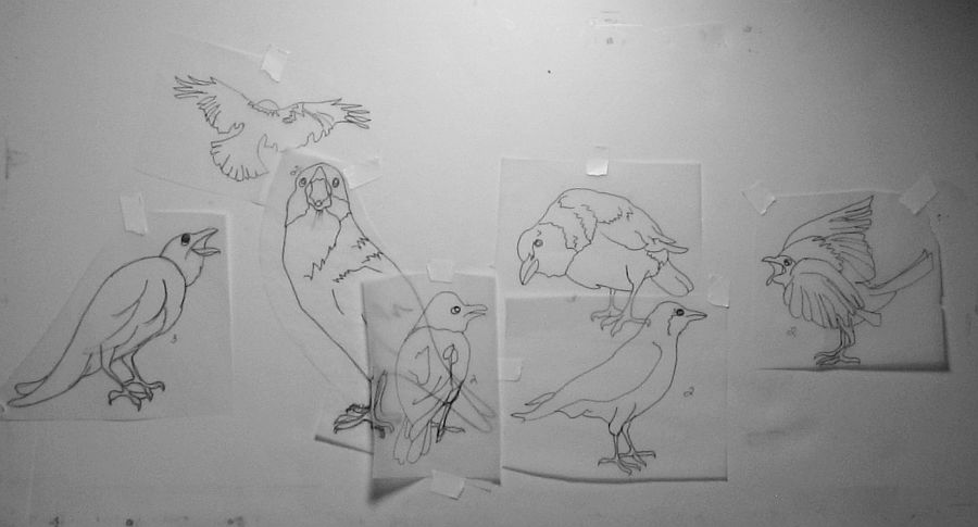
I've been observing a flock of crows that have been visiting the park this winter. Actually I think they may be ravens because they are huge. I keep a tripod in the front window and take photos whenever the opportunity presents itself. The title is a play on words, the word being caucus (link). Here I've gathered various sketches of crows, some from my own photos, some from imagination and others from images online and created a storyboard of sorts. The sizes of the birds in relationship to each other and within the composition are off and the placement is still a work in progress but my ultimate goal is to create the illusion of a town hall meeting or 'crow caucus'. Because these birds seem to always be communicating with each other in some fashion, seemingly having discussions, the idea just naturally evolved.

Friday, December 31, 2010

Happy New Year!

Photobucket

I want to wish all my visitors the very best for 2011. We will shortly be entering a brand new year. At this time many of you may set goals and make resolutions. Personally I like to roll with the punches. I learned long ago to make plans but not to plan outcomes. Goals are not outcomes but aims. May you all reach as many of your goals as possible. Resolutions are another thing entirely. I'll leave you with these quotes.

Many years ago I resolved never to bother with New Year's resolutions, and I've stuck with it ever since. ~Dave Beard

May all your troubles last as long as your New Year's resolutions. ~Joey Adams

Saturday, December 25, 2010

HAPPY HOLIDAYS!


To all my visitors...thank you for visiting my blog and special thanks to those who took the time to leave comments and feedback. It means a great deal to me. The image above is the last Christmas card I painted which, as predicted, I finished just in time for the holidays.

Wednesday, December 22, 2010

Now Playing~Catitudes on Broadway!


HA! I can pretend...right? Courtesy of Photofunia. Myrna Wacknov posted the URL on her blog: photofunia.com

Friday, December 17, 2010

Making Christmas Cards


This year I decided not to do cards for printing. My printer is acting up again and I don't want to pay a print shop right now. Instead I'm painting individual cards for immediate family and I've worked all afternoon on just these two. What have I gotten myself into?! Of course this is a labor of love and I want them to be special for each person. These are the two 'guy' cards I've created for the men in my family. I used black, some muted colors, plaid, metallics...guy stuff. I'm not the least bit concerned about minor imperfections. They are homemade after all and come from the heart. I have to add that crafters impress me more and more. I'm not terribly crafty anymore. If I ever decide to make handmade cards full time I would definitely have to develop a better system.

Wednesday, December 15, 2010

Winter Scene on Matboard


One surface I love to use for painting is matboard, not to be confused with mountboard. Whenever I mention matboard in a post I'm referring to the paper plyboard that is normally cut to frame a piece before the actual glazing and external frame is added. This time I decided to try working on the reverse side of the board. This side has a small amount of texture to it and it looks like it might be more absorbent. I wanted a soft muted appearance for my winter landscape so I coated the entire surface with white gouache and let it dry before beginning my painting. This worked to soften my colors as I painted and allowed for better lifting where needed.

When a painting is completed many artists clean their palettes and begin again with fresh paint. I like to dabble in 'palette muck', the leftover colors that have inadvertently run together. I've discovered some amazing greys this way and for certain applications the low chroma colors that the muck can produce are perfect. This scene was painted entirely with muck. I finished it off with white fluid acrylic 'snow', spattered on with an old toothbrush.

Monday, December 13, 2010

Bandit & 8 Ball~update


Bandit~closeup

8 Ball~closeup

I made a few adjustments last night and called this done. Working without a reference photo certainly has it's challenges. I also added whiskers with colored pencil. They aren't as prominent IRL as they appear in my images. I wasn't able to tone them down in my photo editor unfortunately.

Sunday, December 12, 2010

Bandit and 8 Ball w/ WIP

Close to completion. Bandit's fur beneath his chin got a little heavy. It looks more like a goat's beard at the moment. I'll probably try to lighten it up a bit with white gouache and see how that works out.

The second series of washes. Bandit gets his mask.

The first washes

I wanted to pay homage to Bandit the lop ear which I mentioned in my previous post. I gave him a friend aptly named 8 Ball, a black rabbit with one white spot on his forehead. They turned out looking like a couple of rabbit desperadoes which I find amusing. My palette was very limited. Just Phthalo blue, burnt sienna and a little Quin gold deep.


Since we're experiencing an ongoing winter storm here I decided to pick up my brushes and finally get to work on the lop eared rabbits. I had been doing sketches of lop ears, working from online resources including Youtube videos. The videos definitely tested my sketching skills as I'm not used to drawing moving targets. Some of these videos were very entertaining. These rabbits are quite the little characters it seems. I also noticed a lot of variation in their facial features from rabbit to rabbit.

Tuesday, December 07, 2010

Cutie Pie


I've had the urge to paint lop eared rabbits but I don't happen to know any at the moment. I do remember a boy in my childhood neighborhood that had a pet lop ear named Bandit. What a character that rabbit was. He acted a lot like a little dog and the bond between that boy and his rabbit was amazing. Bandit would fetch for him and they'd lay on a fold out chaise and just hang out afterward.

I wound up searching online for photos to reference and found dwarf lop ears. Talk about cute ! These rabbits look like a cross between a guinea pig and a basset hound. I plan to do several of these sketches to become familiar with how they look from different angles, study their markings and color variations, etc. I'd also love to find some videos so I can see them in motion. I have an idea for a painting but I want to be as familiar as possible with my subject first. Always a good idea.

Sunday, November 28, 2010

The Young Equestrian~Completed

Transparent watercolor on a half sheet of 140# Arches bright white CP paper.

I've been puttering away at this one for a couple of weeks now. I decided to veer from the more posterized reference I posted and instead play with unexpected colors. I probably should re-title this, A Horse's Tale (Tail?) I may darken the background more. I'm still unsure about that. As usual, I think it needs a few tweaks here and there but I'm considering this pretty much done.

Monday, November 15, 2010

The Young Equestrian~experiment with Elements 6

After cropping, applying the cutout filter and greyscaling the image. Gotta love technology.:)

View to the east. The original photo.

The view to the west.

During the peak Fall color season I took my camera and tripod and drove to a lookout at the end of Maple Grove Road, not far from my home. From this particular vantage point one can see for many miles in all directions. On a clear day Beaver Island is visible out in Lake Michigan, a 2 hour boat trip from the mainland. I decided to create a panorama using Photostitch for the first time. As I was setting up my camera several young ladies drove up hauling horse trailers and proceeded to get their horses ready for a Sunday autumn ride. I asked if I could photograph them and the horses and they were happy to oblige.

One photo really appealed to me. The youngest rider was so proud of her palomino(which is obvious in the picture)and I love photographing animals of any kind at odd angles so this image has it all as far as I'm concerned. Tonight I was playing in Elements, working out an idea for a Christmas card and decided while I had the program open to pull up the image of the young equestrian and her horse and experiment. I have problems seeing shapes(my eye still searches for detail) so I used the cutout filter to break the image down into...well, shapes! I was impressed with the results and may give this a go with paint.

Friday, November 12, 2010

Lucy & Ethel~Update


I decided to change the title of this piece. These two hens remind me of Lucy Ricardo and her friend Ethel Mertz of 'I Love Lucy' fame. I'm not sure I'm entirely happy with the background so I'm not ready to call this one complete yet. Cloudy day today so colors are not entirely accurate in the image but they're pretty close.

I'm also mulling over ideas for a new Christmas card for 2010. I'll probably wind up waiting until zero hour before pulling that project together like I did last year. If I'm really good at nothing else I AM a master of procrastination.

Monday, November 08, 2010

A Couple of Hot Chicks~WIP


I was going through some photos I took this past summer of my friends' chickens and found a good candidate for a painting. Chickens can be incredibly funny sometimes. I was snapping shots of an Isa Brown hen when another hen decided she wanted to get into the picture, too. I still have the chicken wire to paint, the Isa Brown to finish and more work on the background in general. I didn't plan a background beforehand this time. Sometimes I let the main subject/subjects dictate that for me. I'd rather not make it too busy and draw attention away from these two 'hot chicks'.

Sunday, October 31, 2010

Painting 'Jean Haines Style'


I recently received my copy of Jean Haines's new book, How to Paint Colour & Light in Watercolour . I've admired Jean's style since I first saw her work on Wetcanvas.com. During my early days dabbling in watercolor I followed a class Jean was giving on the w/c learning forum and found her style was beyond me at that point. I had just left realistic drawing and was relatively new to this medium. My intent was to pursue a medium that would allow (ok...FORCE) me to be more free and expressive. I found Jean's 'beyond' loose watercolor paintings fascinating but I just could not let go of that much control at the time. I'm better now (I have been able to loosen up) but this is taking it to the extreme , IMO and it's exciting.

This is my first humble attempt (I'm not counting those horrible paintings I created in her class years ago) at watercolor 'Jean Haines style'. My subject is one of my own cats. I'll leave my visitors to figure out what the cat is doing. Please take time to post your answers or guesses. Thanks!

Friday, October 29, 2010

Daniel Smith's 66 Color Try It Sheet~product review


FYI...Daniel Smith Art Supply offers a product called the 66 Try It Sheet (link), an 8.5" x 11" sheet of watercolor paper with 66 sample dots of their various extra fine watercolors, including many of their specialty colors such as interference shades and duochromes complete with all color information such as ASTM LR rating, degree of transparency, etc. I think it's a brilliant sales tactic on their part because it gives the artist a sampling of each of these colors for very little money. I ordered my sheet and today I wet most of the dots (some colors I have and am already familiar with) to see with my own eyes what they look like IRL and how they perform. I highly recommend this product to any artist if DS products are available in their country.

Sunday, October 24, 2010

Berries & Birch~photo


Because of the odd weather last summer there were no ash berries. This year the mountain ash that flanks the birch trees across my drive is loaded with berries and I snapped this shot which I wanted to share. I love the colors of the berries and mountain ash leaves, the white flash of the birch bark and the Fall colors of the birch leaves. The color combination is amazing and looks bright, even on a rainy day. This may be inspiration for a future painting or just give me ideas for color combinations.

Friday, October 22, 2010

Beach Babies & Gremlins

The Beach Babies are done! This is one of those paintings that I could sit and tweak until the cows came home but I think it's time to stop. I don't want it to begin looking overworked, overwrought, over-thought, etc. I hope it shows up correctly on screen. I'm still fooling around with my new monitor, trying to calibrate the colors, contrast, etc. Umm...looks like the colors of the water & sand are off on my screen but the babies look pretty accurate. I just wish I could know what my visitors are seeing.

Note: I swear...I have a gremlin visiting. I have had more things go wrong in the last few weeks, all mechanical in nature. The most recent 'happenings'...my computer mouse died. No big deal, right? Then the new one malfunctioned a day after I bought it and also had to be replaced. Two days later my computer monitor gave up the ghost. Fortunately my oldest son came to my rescue and found a great deal on a 19" flat screen to take the place of my poor little 15". All this made me nervous enough to call a local plumbing & heating contractor to come inspect my furnace as it's getting old and with winter coming that's one thing I can not live without. He'll be here next week and hopefully the news won't be too bad. Last night I took the time to sketch what I imagine my gremlin looks like. Nothing terribly threatening, just up to no good, throwing his wrench into things.

Saturday, October 16, 2010

Beach Babies~Sketch


I've finally decided on a format for this commission. The current sketch is only 10" x 14". I'm going to go ahead and paint this but may wind up enlarging the sketch and redoing. I'm not sure I can work this small and include enough detail. I'll also be matting and framing this so I don't have to worry about keeping to any particular size. The hands will be the most difficult, especially since I changed a few things. I may have to borrow my neighbor's kids as models to sort things out.

I haven't been painting a lot these past two months but have been taking lots of photos for possible future references. Hopefully they will provide me with plenty of inspiration during the coming winter months. Fall in northern lower Michigan has been unusually pleasant weatherwise this year but I know it won't last much longer.

Thursday, October 07, 2010

Peacock Orchids~WIP 2


A quick update on my progress. Poor quality photo but it's the best I could manage today. At least the colors are more accurate than the image in my previous post. There's still hours of work ahead so I may wind up having to set this one aside (it will haunt me)so I can start my Beach Babies commission.

I love Doris Joa's work (link) and hope to capture some of her style for the Beach Babies. I checked to see if she had a book out on painting figures, particularly children but I found nothing available so I'll be winging it. Under these circumstances I'd better get a jump start as it may take more than one try to get it the way I want it.

Sunday, October 03, 2010

Peacock Orchids~WIP 1

I've done all my shadows with fluid acrylic, then started glazing over that with watercolor, in this case Daler/Rowney's Vivid Green. The actual blooms are still protected by frisket film. I'll be tackling those last.

It seems like ages since I updated my blog, probably because I was locked into what I call analysis paralysis ie. over thinking. I'm also not the type of artist to have several projects going at once. If I have a piece that's not completed pushed to the side it tends to haunt me to distraction. This is also my first full sheet piece. It may not be a big deal to some but it's huge to me. I'm loathe to waste anything, especially paper so the thought of ruining a full sheet was rather numbing and counterproductive soooo.....I've been 'pecking' away at this for a few weeks. I'm not crazy about Arches #140 HP paper either. I've had problems in the past removing masking fluid and frisket film from the surface which tends to rough up very easily and I'm having the same issues with this recent batch. I should've ordered Fabriano. :(

As my reference for this piece, I used one of the photos I took last month in my Moon garden. I used frisket film to protect the flowers and foliage, masking fluid to protect areas of smaller growth at the bottom. I chose to pour my background using Da Vinci fluid acrylics. I took the whole painting, board and all into the bath tub and did my pouring there. Worked like a charm..no muss, no fuss. I washed the excess paint down the drain with my detachable shower head. I may do all my pours in the tub from now on.

Monday, September 13, 2010

Beach Babies~commission

I wanted these children to relate more to each other within the scene, possibly by connecting their shadows or their footprints in the sand. I drew a rough sketch of the background on a sketch pad, then each child separately on small bits of tracing paper so I could move them around and try different placements. It was a little like playing paper dolls. By bringing the boy closer to his sister and lowering his position his left hand 'fit' into her right hand perfectly. Issue solved.

The reference photo

I've received a commission to paint this adorable scene of two siblings, a sister(age 3) and her brother(age 14 months) enjoying a day at the beach. Even though I've only painted one child(a portrait) and I've never painted a beach scene, how could I resist this? I have until Christmas to complete this commission so I plan to take my time and hopefully do these babies justice.

Sunday, September 12, 2010

New Easel!


I just bought my very first easel! What(?!) you say? Truthfully, I probably would still be propping my work up against a wall or on boxes to work but after finishing my drawing of the peacock orchids I realized there was no way I could handle this large of a format without an easel. I found a great deal at Jerry's Artarama on a Renoir tabletop model (link). It cost about half what some of the tabletops I looked at were priced and Jerry's was even having a sale on the usual sale at the time. Got this for $39.99 US. I always miss sales so I was delighted to have caught this one. It just arrived this past Friday and I love it. It has a storage drawer with adjustable partitions, weighs practically nothing and will adjust to angles 0°-90°. Perfect for watercolor.

Tuesday, August 31, 2010

Plotting a Painting of Peacock Orchids


I put the original photo into Irfanview, greyscaled it, then selected 'emboss'. Much to my delight(!) the nepeta in the foreground (which I plan to include and was dreading painting) looked just like textured acrylic gesso so the gesso will definitely play a part in this piece.

Art Nouveau? Needs a fancy graphic border.


I have a wonderful stone aggregate birdbath that didn't make it into the original photo. Ummm.....

I have not been updating my blog much lately but I have been working. Mostly I've been printing and packaging notecards for the Artists Market. Labor Day weekend is basically our last hoorah for tourist season, then art sales tend to drop off drastically during the winter and card sales have been really good this season. I also chose the photo I posted August 21st as a reference for a painting. I loved the comp, the lighting and I especially liked the silhouette of the grasshopper showing through one of the leaf blades. To me, it's little unexpected details like this that make a painting special. I've also played around with a couple of possible additions. See above.

Nick Simmons has mentioned several times that a painting will tell you what size it needs to be. In the case of the peacock orchids my usual working size of 16" x 20" wasn't going to cut it. Right now I estimate this painting will probably wind up taking roughly a full sheet....22" x 30". I've been itching to paint in a larger format lately but have been dragging my feet. I have nowhere to store this large of a painting, nothing to safely store it in and because my studio is so small, hardly any room to even paint it. Minor issues........

Wednesday, August 25, 2010

Gizmo the Cat

I couldn't resist...I brought out her inner lion.


If there's anything harder than photographing a black cat it's photographing a pastel or colored pencil piece on a black background. }:( This pencil painting is of Gizmo, my youngest cat who I have tried many times to photograph without success. She's all black and her fur just 'eats' light. She hates the camera and usually scowls when I point it in her direction but I got lucky the other night and managed to snap a halfway decent pose that I felt I could work with. I posted earlier, then took it down because I noticed the perspective was off on the flooring in the background. After correcting the problem I can NOT get another acceptable photo of this piece so I'm posting what I have, warts and all. If I can get an acceptable photo later I will repost.

This is done on black Artagain with Prismacolor colored pencils.