Translate
Friday, April 30, 2010
Peaches Strikes A Pose
I recently visited a friend of mine that raises laying hens in her backyard. I was excited to hopefully get some photos of her chickens for a future painting, however most did not want to cooperate. One exception was Peaches, an Isa Brown. I went right into the pen and sat on the ground, camera in hand hoping for a few good shots. Once Peaches noticed I was focusing on her I swear she began posing for me. I'd bring the camera up for the shot, Peaches would position herself and freeze in place until I took the photo. Then she would go about her business until I brought the camera up again. As a model she was very professional.
Wednesday, April 28, 2010
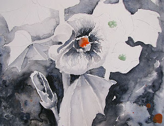
Hollyhocks~Completed

Actually this was more of an experiment in color or lack thereof than a serious floral. I still can't decide if I like it or not so I'll be putting it away for awhile. Someday I'll get it back out and either love it or wonder what the heck I was thinking at the time. I did add a little Cad. yellow light to the centers of the flowers. That orange was much too jarring all by itself, IMO.
Monday, April 26, 2010
Review~Cirrus Floating Picture Frame~Update
I've just completed framing three paintings using the Cirrus floating frame system. See my initial review here. I really like the glass for these smaller frames. The extra weight isn't an issue at this size and I'm always so nervous when working with Plexi for fear I will inadvertently scratch it. Glass also doesn't collect static as much (cat hair is a major problem at my house).
I see Framatic has corrected their instructions regarding the adhesive tabs. Unfortunately the adhesive provided was not strong enough to support even a small piece (7" x 9") of 3/16" matboard. I'm not quite sure if it was the weight or the paper on the back surface of the matboard that was the problem. Either way it's of concern so I chose to use another adhesive I had on hand. For larger pieces I wouldn't bother with the tabs at all and instead use acid free foamcore in the traditional way.
July 6, 2010~Update: Framatic no longer produces the bronze floating frames which I show in the above images. The only colors now available are silver and black.
Labels:
metal float mount frames,
pond life,
product review
Tuesday, April 20, 2010
Hollyhock~Update 2

This will be my final update until the painting is completed. As you can see, I've gotten the buds finished on the right stem and have started working on the last blooms and leaves on the left. I've also been adjusting values and will probably continue to do so as I go along. Still not sure if I like this or not but it's growing on me(no pun intended).
Monday, April 19, 2010
Hollyhock~Update

This is turning into a monster. I have to go back again and again to adjust the values making the matboard more & more absorbent. As for flower form, I'm pretty much flying blind although when I look at reference material I tend to make more mistakes. I seem to be better off using instinct to judge where petals go and at what angle they turn and fall. I do plan to see this one through to the end though it may take me longer than planned. In the meantime I may start another project so I don't get frustrated and go stale on this one.
Sunday, April 18, 2010
Hollyhocks~Experimental Palette

I've always wanted to try this sort of two tone palette...one color that will give me a full range of values and another as an accent color. Daler/Rowney Payne's grey is my main color and DS Pyrrol orange is the accent or 'pop' color. I like working with a limited palette so why not take it to the next level? Not sure if I like it, though. It's too soon to tell. Also I want to mention I'm working on white matboard.
I'm also currently cleaning mini blinds, a chore I hate with a passion. I had to have the blinds with ladder tape so I can't throw them in the tub and spray them clean. Oh no....that would've been too easy. Nope, I'm wiping each individual blade, one at a time. I'm taking frequent breaks though and working on this painting in the 'tween time.
Friday, April 16, 2010
In The Mood for Hollyhocks


Actually I'm in the mood to paint something in a long, narrow format and hollyhocks came to mind. I doodled up a sketch last night, working from memory. Today I found a photo I took of some double hollyhocks I grew a few years ago. I think the photo may already be on my blog somewhere but I'm too lazy to go hunting. The light source isn't the best so I will have to work that out in the sketch and I see I forgot what lovely large sepals hollyhocks sport. Now to decide if I want to do this painting loose style, more realistic, on paper, on gesso, on matboard....decisions, decisions.
Labels:
composition,
establishing values,
hollyhock sketch,
study
Wednesday, April 14, 2010
Turtle on Matboard~Complete

I'm calling this one done. I took a few snapshots of the painting, adjusted the colors & resized the image in my photo editor, then realized my fly needed a couple of legs. I added the legs, went through the whole process all over, then saw a few areas that needed some tweaks...blah, blah, so on and so forth. I think I'm finally happy with the finished painting and the image now, thank God.
As I was painting this I was reminded of Jimmy the Turtle who I rescued from certain death when I was just a kid, probably around 4 years of age. He was trying to cross a busy road near a pond when I spotted him. Despite turtle's reputations for being slow they can actually move pretty darn fast when they want but they tend to pull back into their shells when they hear cars coming. I begged my parents to let me keep him so I brought him home, gave him a name and he lived in a galvanized laundry tub with all the amenities in my side yard for a few weeks. My Dad finally made me realize that Jimmy needed to be back with his family so I had to let him go. Man, that turtle sure hustled when I turned him loose in that pond! It was my first lesson in "If you really love something, sometimes you have to let it go".
Tuesday, April 13, 2010
Turtle on Matboard~ Update 2

Here's where I'm at today. I decided I like the turquoise and I'm glad I decided to add it. The turtle is basically done. I've got more work to do on the branch he's resting on and I have a fly in the sky to add that my turtle has his eye on. Working on matboard is very different than working on w/c paper. It's difficult to add glazes as the paint tends to lift more easily on this surface, even after the first layers have completely dried, but I believe the textural effects are worth the trouble.
Labels:
pond life,
turtle,
watercolor painting on matboard
Monday, April 12, 2010
Turtle on Matboard~In Progress

I just finished painting the turtle's shell so I thought I'd post an update. Much more to be done on this one before it's completed but I'm very happy with the way the shell turned out. Not too sure about the turtle itself yet but he's not completed anyway. I stayed with my previous palette of carbazole violet, perylene green and Quin. gold but added some Phthalo turquoise and I'm questioning the wisdom of that right now. We'll see what happens.
Labels:
pond scene,
turtle,
watercolor painting on matboard
Saturday, April 10, 2010
Dragonfly~Complete
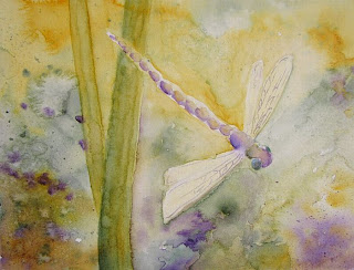
I punched up the values, added more texture and glazed the dragonfly wings with iridescent medium. The dragonfly still needed something more so I found a tube of DS Iridescent Electric Blue (no idea when or why I bought this color) and gave it a 'charge'. It certainly made this dragonfly 'pop'!
Friday, April 09, 2010
Dragonfly~Update

I've been playing around with this one today and thought I'd better put up an image on screen before going any further. Funny how I can spot things that need to be tweaked or changed better on screen than off. I'm staying with the same palette and starting to define the dragonfly. I added some blades of marsh grass for composition's sake and deepened the values in a few areas. My instincts are telling me I need to get some darker values going on, especially on the main subject to make it pop.
Thursday, April 08, 2010
Dragonfly on Matboard~WIP

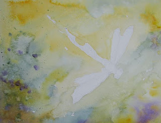
I just started this a few minutes ago so not much is done but I thought I'd post a quick update. I truly enjoy painting on matboard. I like the interesting textural effects that can be achieved so easily on this surface. I started with a loose sketch of the dragonfly, then brushed on some juicy Quin. gold, perylene green and DS carbazole violet. I spritzed the painting lightly with an atomizer bottle/water to move the colors and let them mix and mingle on the board. I encouraged a few blooms and splattered paint here and there. No plan in mind, just seeing where things lead me. After this dries I may add some ink, colored pencil, more watercolor...I'm only limited by my imagination. This is the method of painting that relaxes me.
Correction: I previously titled this post 'Dragonfly on Mountboard'. I'm working on matboard, not mountboard. Sorry.:(
Saturday, April 03, 2010
Delphiniums~Loose Style

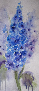
I act as the moderator on a Michigan gardening site and recently someone started a thread asking members to name their favorite flower. I didn't hesitate to choose delphiniums as mine, particularily the Pacific Giant cultivars. Delphiniums are one of the few true blue flowers found in nature. Related to the buttercup (can you believe that?!), their common name is larkspur. Like roses, many gardeners have excellent luck growing them while others do not. I've been one of the lucky ones. They make the perfect subject for a loose, juicy watercolor, too.
Thursday, April 01, 2010
Chocolate~Complete

I've finally completed Chocolate, the Great Dane. I'm just not sure if the background is complete. As this is basically a full length portrait of this dog, I didn't want to create any detail in the background but I had to find a way to ground him. I used various washes of my original palette (FUB, burnt sienna and cobalt blue deep), applying them at different angles to give a faint impression of backdrop and floor. The reference photo showed the light coming from above which didn't leave many shadows and highlights to work with. As I look at this my instincts are telling me I need to bring in a dark value somewhere to make the dog better relate to the background. I'm just not sure where to place it yet. I've printed out a few copies and experimented with different options but I think at this point I need to set Chocolate aside for a few days until I have an epiphany.
Labels:
backgrounds,
Great Dane,
transparent watercolor
Subscribe to:
Posts (Atom)


